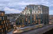
In the early 20th century, when silver was still booming in Utah, the Silver King Coalition Mines Co. constructed an 80-foot tower in the middle of Park City to be used as the terminal point of an aerial tramway that would move ore from the mountains into town. It was industrial in scale and aspect, a severe wood turret with a gabled roof punctuated by rows of small vertical windows. After mining operations ceased in the 1950s, the Coalition Building remained, looming over Park City as an important local landmark. In 1982, it burned down. Even so, it remains omnipresent: an area ski resort uses a graphic of the building as its logo.
It was this historic structure that served as an important point of inspiration for BIG (Bjarke Ingels Group) in designing a proposed renovation and expansion for the city’s Kimball Art Center, a small, non-collecting institution in the heart of the historic district. The plan, first presented in early 2012, consisted of, among other things, adding an 80-foot, torqued, stacked-timber tower made from reclaimed railroad ties. In its height and its weird woody austerity, the design paid tribute to the old mine building. And it gave the Kimball badly needed space. The current structure is a 13,000 square-foot former parking garage that is jammed with upward of 100,000 visitors a year. The expansion would have almost tripled the space. (Elliot Workgroup of Park City is on board as project architect.)
BIG’s design unanimously beat out proposals by four other studios, including Brooks + Scarpa and Tod Williams Billie Tsien Architects, for the Danish firm’s first North American competition win. In announcing the jury’s selection, Kimball executive director Robin Marrouche anticipated that the building would become “a bold, poetic new landmark.”
And that’s pretty much where everything ground to a halt.
BIG’s proposal was immediately set upon by members of the community who were concerned about the proposed building’s form and scale. Nearby property owners, reported the Park Record, were worried that its size could lead to a drop in property values. Others fretted that it didn’t fit in with the historic district’s frontier-style structures. One resident grumbled that it looked “like E.T.” The structure was going to need a number of zoning easements, its height being one of the major sticking points. (The city has a height limit of 48 feet.) In a town of less than 8,000 permanent residents, where everyone knows everyone, it soon became evident that those easements simply weren’t in the cards. “The building got a mixed reception,” Marrouche says. “And it was clear that the people who make decisions on zoning — we just didn’t have the necessary support.” When asked what aspect of the design had drawn the most ire, Ingels told ARCHITECT: “It was a little bit of everything.” He adds: “We spent two years getting almost nowhere—literally, nowhere.”
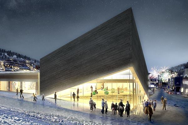
So Ingels and his team went back to the drawing board and reconceived the plan from the bottom up. The new design, unveiled earlier this month consists of a low-slung box that lifts up at one corner to reveal the innards of the museum (in a way that subtly echoes the look of Diller Scofidio + Renfro’s design for The Broad in Los Angeles). Where the first design bore the warmth of the reclaimed timber, the second was made of chilly Béton brut concrete. Where the former was distinctly of Park City; the latter felt like, well, another concrete box. Shortly after BIG’s revamped design was unveiled, Gizmodo ran a story with the headline “Architect Repays Fickle Utah Customers With Anonymous Concrete Bunker.”
Ingels says that while he enjoyed the Gizmodo story—“I thought it was pretty funny”—he also says that there is nothing ironic about the new design. “Do you know long it takes to make a project?” he asks. “It took us two and half years to get this far. And it will probably take us another two or more years after that. That’s a lot of work for a bad joke.” He adds: “We really loved what we did in the beginning. We had to swallow the fact that it is never going to happen. That said, I think the new design has a lot of merit.”
The new building, he says, still honors its surroundings. The straightforward boxy-ness of the volume plays off of the Kimball’s functional garage architecture. The pointed roofline takes inspiration from the pitched roofs of the city’s mountain chalets. “It’s a funny hybrid of the boxy volumes and pitched roof volumes,” he says. “In the end, it’s honestly going to be an incredibly interesting building.” More significantly, it appears that it will be one that can get built. Marrouche says that community feedback has been “largely positive.” And the Park Record ran an editorial in support of the redesign, stating that “the current proposal still makes a dramatic architectural statement but is more in keeping with the spirit of Park City’s cherished Historic District.”
Today is the last day that the city’s planning department will accept public input on the project. After which, the department has 45 days to render a decision on the structure. (It will still require city approvals, since the peaked roof over the entrance will have to be approved as an architectural feature.) Marrouche is hopeful that the plan will go through. “It is about having a building that can be built,” she explains. “Being a non-profit, we just weren’t going to be able to spend years tackling zoning changes.”
But one can’t help but feel an air of lost opportunity. And much of this has to do with what is considered appropriate in the historic districts of American cities. Park City has 84 pages worth of design guidelines for its district, governing everything from building heights to handrail design to exterior lighting to how to appropriately screen garbage cans. In its universal guidelines, the rules state: “Styles that never appeared in Park City should be avoided.” It’s the sort of document that explains why so many historic districts descend into pastiche, full of new buildings that adhere to strict rules about height and color, but that come off, architecturally, as pale imitations. (This is a topic that Rem Koolhaas touched on, quite melodramatically, in Cronocaos, an exhibition he organized at New York’s New Museum in 2011.)
None of this is to say that cities should mow down their built heritage in favor of bland condos. But, in this case, it’s worth asking the question of what qualifies as historically sensitive. One critic of Ingels’ Park City designs wrote in an op-ed in the Park Record that even his new building is “not in keeping with the spirit of Park City’s mining-era Main Street.” Yet what exactly is that spirit? Is it a limitation on height? Or a decree about the exact position of window openings? Or is it a more intangible idea about material ingenuity and can-do gumption? Ingels took the most potent symbol of the area’s mining past—the Coalition Building—and reinterpreted it for the tony resort ski town that Park City has since become. History doesn’t have to stay stuck in the past. It can point to the future, too.