
Exterior finishes can come together to tell a powerful story about a building’s purpose and people—and strategic use of color and materials makes sure it’s a story worth sharing.
These three projects are impactful examples of what the right combination of colors and finishes can do: convey specific emotions, provide indications about what’s happening inside a building, and connect people to compelling messages.

Highlighting a Community Anchor
As Red Lake Band tribal members move into Minneapolis’ eight-block American Indian Cultural Corridor, the new Mino-Bimaadiziwin Apartments provide affordable housing to better serve the neighborhood.
As the only part of the corridor that can be seen from the East Franklin Avenue thoroughfare, the building represents the people who now call this area home. Finishes have a tremendous effect on the way the building is perceived by the people in and around it.
“When it came to establishing an aesthetic, the focus was contextualizing the project,” says Jeremiah Johnson, senior associate at Cuningham design firm. “It needed to convey an urban, contemporary feel that would attract attention without clinging to typical Native American architectural tropes.”
With the Red Lake Reservation more than 250 miles away, Johnson wanted to integrate pieces of home—from the prairies to dense white cedar forests—into this new urban space while highlighting it as a community anchor.
To accomplish this, he chose contrasting metal panels in black and white to break up the structure and enable a play of light and shadow. To honor the reservation’s many trees, he used easily maintainable metal panels with a red-toned wood grain finish to add framed façade elements that represent Red Lake Nation’s seven primary clans.
“The design reflects the level of symbolism everyone was looking for,” Johnson says. “It’s not overtly symbolic or caricature in nature, but it respectfully nods toward Red Lake Nation’s reservation.”

Conveying a Message of Hope
For the Ronald McDonald House in Cincinnati—the largest Ronald McDonald House in the world—colors and finishes were used to convey feelings of hope and playfulness for the families and children who stay here while traveling to Ohio to receive medical care.
Taking cues from the building’s surrounding garden elements, GBBN Architects chose to clad the building’s exterior courtyard walls in neutral gray metal panels that help the playful pops of greens and yellow stand out around the window openings and along an inset wall. The colors reflect warmth, comfort, lightheartedness, and friendliness as they help create a space where families can rest, relax, and connect with other people going through similar experiences.
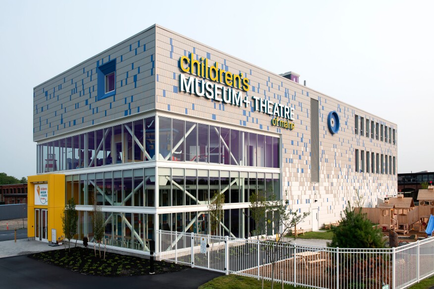
A Design Nod to the Past & Present
To showcase the Children’s Museum and Theatre of Maine in Portland as a learning space that opens its doors to the community, Bruner/Cott Architects took a unique design approach. Located on the site of a former railyard that’s being transformed into an arts and entertainment area, the building’s exterior is covered in metal tiles.
Together, these tiles create a multicolored pattern that shifts from cream to mottled grays, with splashes of sea and sky blues. This pattern pays a subtle tribute to the former industrial site while being inspired by Maine’s regional ecosystem, featuring colors chosen to represent rippling water, butterfly wings, fish scales, and tree bark.
Learn more about these projects and others at PAC-CLAD.com.


