We too often forget that memory can be radical, that history can be subversive, and that looking back can be as important as imagining future worlds. Knowing how we got here can help us cut through unfounded claims about a bright, shining future. In fact, the obsession with building the ever-new—committing oneself to a false notion of invention and assuming there will be solutions to everything in the future—is as reactionary as any return to the past. It is a way to avoid looking reality in the eye and making something better from it.
Luckily, the last year has seen a wholesale resurrection and rewriting of history, from the 1619 Project in The New York Times, to attacks on the canons in every field, to the toppling of icons and statues. Only architecture lags behind, having relegated its embrace of history to the dark realm of Postmodernism. Now comes a strangely beautiful missive from the far reaches of that colorful realm, showing us a radical alternative in design. The Best of Nest (Phaidon, 2020) is a compendium of the short-lived magazine that published all of 26 issues at the turn of the millennium and yet served, as Rem Koolhaas, Hon. FAIA once said (why does he always get the best lines?), “like the explosion of a flashlight in a grotto.”
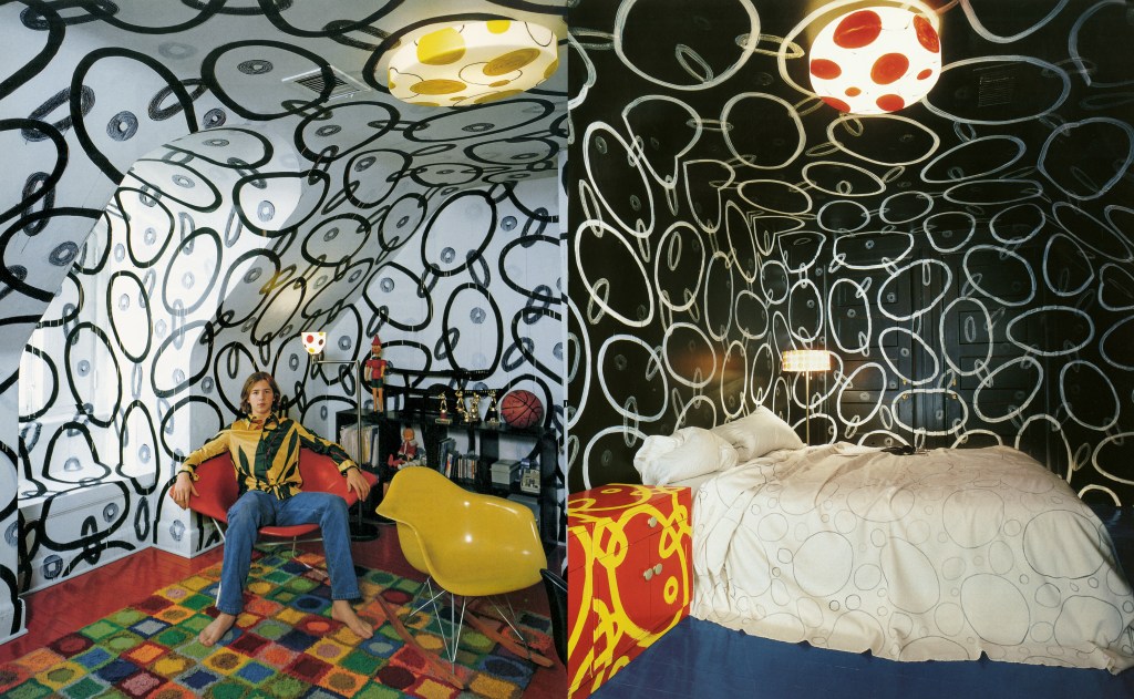
Nest never looked revolutionary, nor does this compendium, which was assembled by longtime fan and contributor Todd Oldham. (I also contributed a few pieces to the magazine, and was one of the many people Joe Holtzman consulted when he was setting up the venture in the mid-1990s.) Instead, the magazine looked like a mess. Holtzman, who had no training as a graphic designer (or a publisher, for that matter) assembled issues on instinct, and it was an instinct for excess. He packed every spread to overflowing, and when he could not fit enough visual information onto the glossy, heavy-stock pages, he rounded edges and even had the scalloped borders ooze what might have been a representation of snow. Style changed depending on an issue’s content or other whims, as did the rhythm of articles and the structure of the longer and shorter pieces that usually give a magazine a sense of order. Nest was a hot mess, and a delirious one.
Phaidon
What made this glorious excess all the more bizarre was the collection of subjects it embraced. To describe it as “eclectic” does not do it justice. Flipping through the pages, you might bounce from Buckingham Palace to the slums of Baltimore, from a teenager’s fascination with Farrah Fawcett to an Italian Prince’s collection of heirlooms and knickknacks stored away in a crumbling palazzo. The whiplash was extreme, until you rubbed your neck and realized that perhaps the Hanoverian kings’ love of gilt and lack of good taste was not that different from the average American’s (or potential potentate’s for that matter). Nest featured design that was not good by any standard of graphics, interior design, architecture, or furniture design. It was work that sought to associate itself with class, memory, and luxury, and thereby gain a sense of belonging to a wider range of time and place. In the pages of Nest, empires of sensuality were to be found in tables full of knickknacks.
There was a method to this madness, whether anybody involved with it knew it or not. What Holtzman did was to channel the sensibilities of fellow Baltimorean John Waters into the rarified world of shelter books (magazines such as Elle Décor, House and Garden, and Metropolitan Home that presented domestic interiors for emulation, inspiration, or envy). This was the interior design equivalent of posing, of grand camp transvestites, of taste so bad it was good.
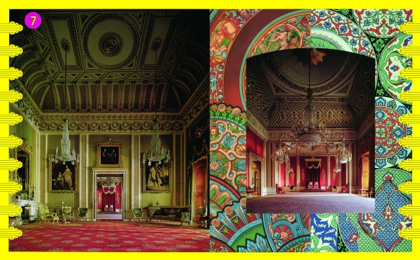
Phaidon/Derry Moore/The Royal Collection and Her Majesty Queen Elizabeth II
Buckingham Palace as featured in the Summer 2002 issue of "Nest"
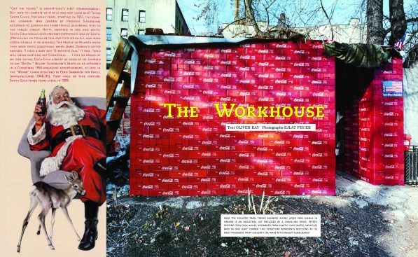
Phaidon/Ejlat Feuer
A house in Harlem made from plastic Coke crates, as depicted in the Winter 2002-03 issue of "Nest"
There was also a sense that everything in Nest was a record of something that was lost or almost gone. The grand apartments that oil drilling magnates such as the Schlumbergers once assembled, the artist’s havens and fantasy worlds teenagers created in their attics before moving on to college, and the sexuality of interiors assembled with too much to feel, touch, and see—without enough reality mixed in—all seemed ripe for the wrecking ball. And in a sense they were, thanks to the internet, where you can now assemble such things more quickly and densely. The expensive pages of Nest make no sense in our online age. Its true heir is TikTok.
From a financial perspective, Holtzman burned through what we all assumed was his inheritance, publishing issues that lost money despite their popularity, and after the gig was up he went back to being a painter. The other shelter books held on, for a while at least, and one or two of them still survive, though today they have a profound sense of irrelevance.
Now, thanks to this new compendium, we can nestle back into Nest. We can revisit the talents not only of Holtzman, but also of the magazine’s “literary editor” and de facto Editor-in-Chief Matthew Stadler, a fiction writer whose dreams of decadence and deviance seep through every page, as well as those of photographer Richard Barnes, the documentary architecture specialist who manages to suffuse his images with a sense of dread and romance. We can slip into this hot bath of memory and wallow in its excess.
Phaidon
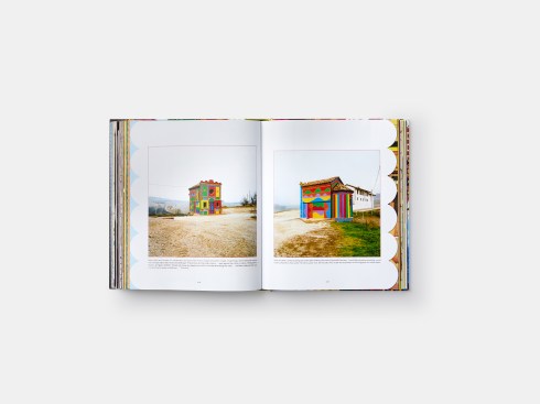
Pages from the Summer 2003 issue of "Nest" featuring the Chapel of Barolo in La Morra, Italy
As we gaze on both trash and treasure alike, we are reminded of how transgressive Nest was by placing these images next to or even over each other. On your computer, images and words glide by, but on the pages of Nest, they endure, making impressions that won’t fade. You can’t help but look at all the images and text in relation to each other, instead of swiping away the discordant of disturbing. This is true collage, collecting fragments and publishing them in the malleable frame of a magazine, allowing ragged edges and associations.
This is why Nest epitomized, however absurd it was, both its era and its medium. Holtzman and his staff realized the potential of the magazine as a regular and valuable assembly of curated material that was also ephemeral, that was soon filed away and superseded by the next issue.
Nest was not so much a movable feast as a circulating potlatch, celebrating excess in consumption, and reminding us of the vanity of all things. It represented the best of Postmodernism, bringing all of history together to show us what was lost, what we could pillage from the past, and how we could construct our own value out of the detritus we had inherited.
Aaron Betsky is a regularly featured columnist whose views and conclusions are not necessarily those of ARCHITECT magazine nor of the American Institute of Architects.