From the moment of ribbon-cutting, a building ages in a planned downward curve. The architect is judged by how well his or her plan accommodates its use over time, and it is in the nature of architects to imagine that they can put in place now something that will reflect well on them for the future. Thorough preparation, careful execution, a shaking of hands, and the building is launched.
But Bruce Mau, who just finished redesigning www.som.com, the internet presence of Skidmore, Owings & Merrill (SOM), has brought a new perspective. Mau’s team tossed out the notion that a firm’s brand on the web should be prepared and executed like a grand, fixed façade. Instead, Mau showed the partners that the inner workings of an architecture firm—its internal research, its water cooler epiphanies, its aborted projects—best reflect its strengths.
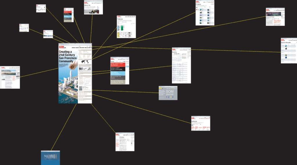
The SOM site that Mau is replacing was built by Tanagram Partners, a Chicago firm, in 1999. The organizational concept was complicated. Inspired by Thinkmap, a visual thesaurus software that creates constellations of related words, SOM wanted to reflect the interconnected constellation of work the firm had done in its 60-plus years. The goal was to create a visually interesting experience without relying on endless photographs of the projects themselves.
Looking at the site, you can see what they were after. The original SOM.com is dignified and attractive, and the constellations of words burst into intuitive groupings. Related concepts—“News,” “Awards,” “By Date”—slide into proximity as you click, and the effect is that of navigating forward through a starscape. But as a business tool, it’s severely limited. And like the occupants of a poorly designed building, the firm quickly discovered that it was trapped in an inflexible structure and soon outgrew it.
SOM’s site was based on Flash, a web design standard that in effect draws pictures rather than printing text. It’s an easy way of putting glitzy animation into a site, and web designers still use it for certain dynamic objects and features. But when the whole site is built on Flash, it offers nothing for text-based search engines like Google to analyze. In effect, the site doesn’t reveal itself—you have to go through its glitzy front door and wander the halls to find what you need. Once inside, even the internal search function on SOM.com is spotty. Type “Freedom Tower,” “Kahn,” “Bunshaft,” or “Sears” into the home page’s search box, and a PC user sees only a handful of results. Mac users (journalists, an important audience, tend to favor Macs) get no results.
Bruce Mau Design (BMD) spent most of 2004 faithfully observing and analyzing SOM’s traffic to the website, but found that the design—politely referred to in Mau’s brief as “the site’s idiosyncratic implementation”—made it nearly impossible to determine who was using the site and how.
It’s accepted wisdom among web designers that internet ventures live or die by their ability to study the behavior of their customers. The most advanced sites—those like Amazon and Google—strive for the godlike ability to predict what visitors will want and continuously analyze their customers’ behavior to do so. SOM’s site, by comparison, might as well have been a luxurious, bound monograph, mailed blindly to its clients. The slick-but-unanalyzable site robbed SOM of the ability to determine in detail whether visitors were coming from educational, commercial, or governmental domains, how many foreign visitors they were getting, how long each visitor stayed on the site, whether they returned, what links elsewhere on the web were most helpful in driving traffic to the site, and what search engine terms (“Bunshaft”? “Modernism”? “Corporate Architecture”?) were leading visitors to SOM. And those are the most basic considerations; never mind the possibility of distinguishing the surfing behavior of idle visitors from that of potential clients.
“The website is our first interview with a client,” explains Ross Wimer, SOM’s design partner in charge of the redesign project. “In one case, because our site wasn’t really searchable, a potential client went to Wikipedia”—a publicly edited online encyclopedia—“to read our partner bios. One partner had a false bio someone had written, and the client was so turned off that we didn’t get a shot at the project.”
BMD quickly established certain baseline standards a new site must meet. SOM.com must offer immediately relevant information and services. Rather than entice users with a restrained, mysterious home page design, the site should immediately allow users to “sort, select, combine, collect, and subscribe” to what they need. And recognizing that most Internet users find what they need through search engines like Google—not truly visiting sites, but touching down on the specific information they’re looking for, then leaping somewhere else entirely—the site had to be legible to search engines. But these were mechanical considerations. The challenge was making it all reinforce SOM’s brand.