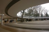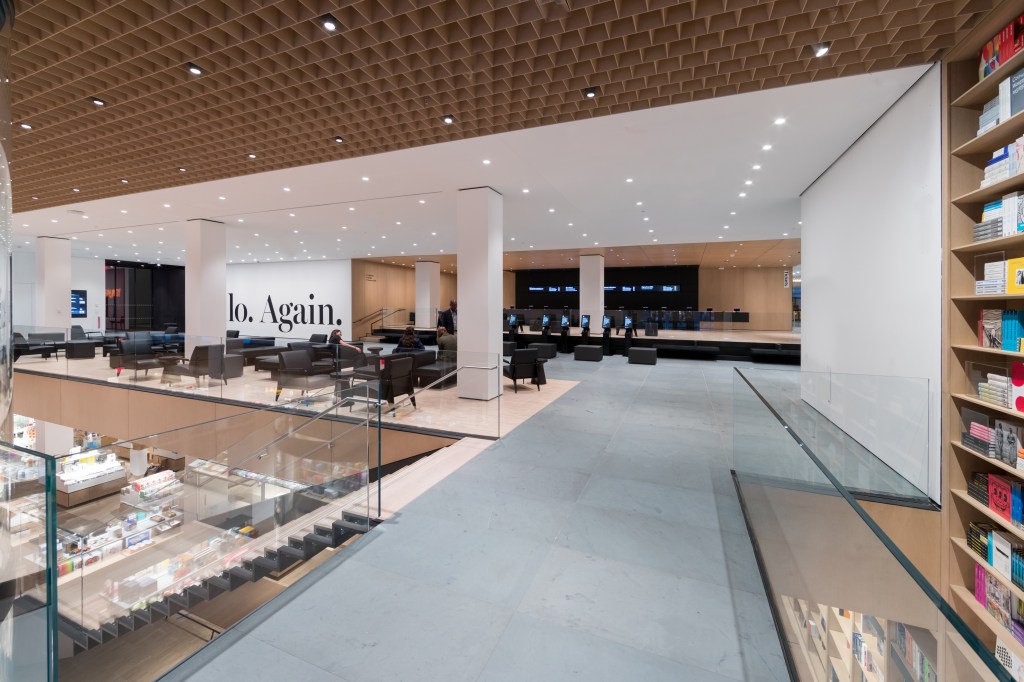
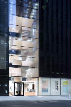
The best thing about the the Museum of Modern Art 5.0 is what is around it. That is to say, this fifth version of New York’s temple to high Modernism, whose design was overseen by Diller Scofidio + Renfro (DS+R) (in collaboration with Gensler), is its views of Manhattan and, to a lesser degree, the people-watching opportunities within the building itself. If previous versions of the museum focused just on providing ever more space, the place now actually feels as if it is part of the city, while the experience of viewing art now has spaces and mechanisms for the social act it is.
Having said that, this is still Mother MoMA, the aircraft carrier of Modernism, riding the waves of social media and mass tourism, as well as high-end collecting and philanthropy, to provide you with too many mixed messages as well as media. As a result the site remains, despite the fetishization of abstraction and minimalism both in the work the institution collects and in the architecture it has commissioned, a place of confusion. Put simply, this is still a mess of a building.
Iwan Baan/Courtesy of MoMA
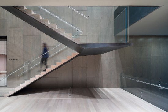
The blade stair
Iwan Baan/Courtesy of MoMA
Fifth-floor stair
There are now so many circulation routes, several of which do not connect to each other, and such a mass of galleries buried underneath not one, but two skyscrapers (including the new super-tall, designed by Jean Nouvel, that paid for all this), that the place makes no sense. Perhaps that is deliberate: the curators wanted to complicate what had previously been a linear progression through the styles; now the museum is divided more or less into time periods, but with many different forms of expression, both in terms of art making and in term of styles, mixed together. And yes, there is more work by women and people of color or from other continents on view.
Surprisingly, all of that makes the experience of going to MoMA more fun than it has been in a long time. The new lobby and those various circulation routes seem to devour the tens of thousands of visitors who stroll by the art every day, while the new mix offers surprises and aperçus. Most of all, the windows DS+R cut through to the outside and from one gallery to the other give you a sense of the metropolis as the true setting for this art. They make it clear that what most artists were and are trying to do—and what Modernism is—is to condense, represent, picture, criticize, mythologize, idealize, or otherwise make their art out of the condition of modernity, and that Manhattan as a whole and this art museum in its heart is one of the largest, densest, and most exhilarating expressions of that condition.
Iwan Baan/Courtesy of MoMA
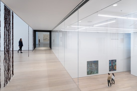
New galleries at MoMA
Iwan Baan/Courtesy of MoMA
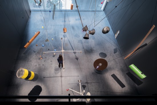
The Marie-Josée and Henry Kravis Studio
That is about all there is, though. Given the many demands on the space, DS+R had little chance to strut their architectural stuff here; the best they could do was to detail the hell out of every staircase and window, and just let the curators take over. They could not solve the problem that has beset MoMA for most of its life: that its collections and its ambitions are both too large for its site. There is just no way to funnel that many people past that much art and not have the whole experience feel like waiting for your luggage in an airport. There is not enough space for circulation that would truly make sense of the whole, there is no room for a variety of spaces (although DS+R has managed to make at least one double-height gallery), and there is no way to bring enough daylight into anywhere but the top galleries—which are, ironically, the places where the museum places its major special exhibitions, many of which do not need or want such light.
Flickr/Creative Commons License/furtherandfurther
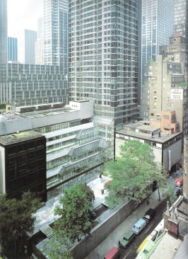
Pelli's greenhouse at MoMA
The only addition that has made some sense of the place was Cesar Pelli’s much-maligned effort of 1984. Although its galleries were not particularly good, the greenhouse filled with escalators that architect added onto the building’s north side also opened the institution up to its site, while providing circulation that—even if it did resemble a shopping mall’s—was logical and ample.
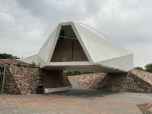
Even better was George Howe and William Lescaze’s original 1930 design for what was to become the modern behemoth. Before the realities of money and space hit home, these architects proposed stacking the galleries on top of each other in individual boxes, every one at a right angle to the ones above and below it, along a vertical spine. In that way, individual groups of art could have their own space, and each could have daylight. If it were up to me, I would tear down the subsequent additions that have now ballooned to fill half a city block down and go back to that original idea. By my quick calculations, a skyscraper 50 to 60 stories tall would take care of all of MoMA’s basic needs, perhaps on top of a plinth of social spaces and an underground gallery for special exhibitions. Then MoMA would truly be a condensation of Manhattan and all that makes Modernism so exciting.
That is a utopian dream. For now, we should be glad that going to MoMA is no longer the excruciating experience it was. Now it is at least a mediocre one with touches of elegance you glimpse in details or through the window before you turn your gaze back to, say, a mind-blowingly beautiful Matisse.
A last note on architecture: Yes, MoMA still exhibits architecture and design. It is one of the few major art museums in this country to still do that, and do it in a respectful, responsible manner. The department is no longer a monolith, having been broken up into galleries spread throughout the museum. I wish I could say it was better or worse. It just is: unimaginative, but correct, showing us all the greatest hits and a few surprises. It is, in other words, like much of MoMA: a beautiful corpse with modernist bones and a sheen of contemporary interpretation and critical framing. We will have to wait for the next time Paolo Antonelli or one of her associates gets a chance to organize a major exhibition to see if it is actually still alive.
Aaron Betsky is a regularly featured columnist whose views and conclusions are not necessarily those of ARCHITECT magazine nor of the American Institute of Architects.