Graham Downes Architecture
There are a few architectural moments in the Love Culture store …
Retailing merchandise to a generation raised on the internet, music videos, cell phones, and incessant texting calls for new strategies. Lighting remains an essential element, but it has evolved to grab young consumers’ attention in a way that’s probably distracting, even off-putting, to their parents. Graham Downes, of the eponymous San Diego?based firm, has designed the prototype stores for Love Culture with this change in perception as an essential part of the recipe.
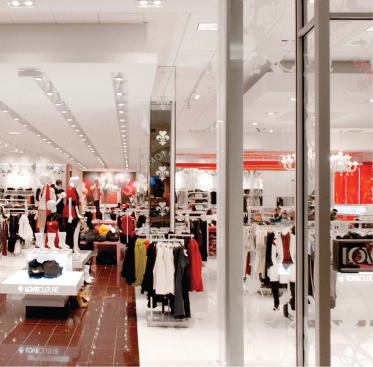
The stores sell inexpensive “fast-fashion” clothing for young women, mostly in mall locations of approximately 7,000 square feet each. The first ones opened last year in Southern California, with additional outlets debuting regularly throughout the country. Each of the stores is white and bright. The palette of materials is simple, durable, and low maintenance. Porcelain floor tile, glass walls, gypsum board, and acoustical tile ceilings set the stage for the few dramatic architectural moves that allow the product to become the focus.
“The baby boomer generation cannot handle visual clutter,” explains Downes, who at 52 should know. But this is apparently not an issue for Gen Y consumers. “They bounce around the store,” says Downes. “They’re used to seeing multiple images on a screen, watching MTV, where there’s no sequential story line.” The more traditional approach to retail lighting is to maintain an ambient light level of 30 foot-candles and to use spotlighting at 150 to focus attention. The approach at Love Culture is to keep a relatively constant 70 foot-candles throughout the store.
Glare is also reconsidered through a generational prism. “A tasteful store didn’t have glare,” says Downes of the longtime norm. “You hid all your lighting in coves, cans, and deeply recessed troughs. Now, you need to see the activity.” This is accomplished in the Love Culture stores through three means?a white ceiling, illumination shining up onto that ceiling, and the use of mostly exposed light sources. The white floor helps reflect light onto the ceiling, too. Track lighting increases the visual intensity on the ceiling plane. “You can’t oversmack these people,” says Downes of what might otherwise be considered overkill.
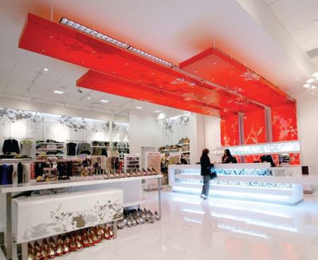
“We don’t leave any surface not illuminated,” says Downes which includes the store’s enclosing walls. This is the one place where some lighting is at least partially concealed. Coves surround the store and wash the walls with light in what would be a relatively conventional lighting scheme until you recognize the wall material it’s glass. Downes notes that the surfacing material is one of the more expensive design moves in the stores, but the glass allows for the application of varied motif decals on both front and back surfaces to create a layered sense of pattern as well as varying translucency. The very high gloss of the glass reflects the lighting from the otherwise concealed cove throughout the space in a way that a more conventional installation of translucent sheet plastic products could not. Nor would it produce the resulting and desirable glare. “The effect is open and honest,” says Downes.
The walls are also where the design expression becomes a touch representational. The tone on tone application of decals depicts a repeating pattern of motifs prairie growth, shrubs, bushes, and brocades that goes all the way around the store. The patterning of the decals makes an impression separate from the lighting, explains Downes, and the two work together to create a subtle brand identity. How do you know it’s a girls store before you see the merchandise?” asks Downes. The foliage is a first hint, followed by a strong infusion of cranberry red in select locations. It’s an intense color chosen for its emotional associations with love and girls but it’s intentionally not pink in order to target a slightly more sophisticated clientele. The color occurs in three places within a typical store in the center of the floor to create a runway effect, in a three-part Lucite soffit that marks the cash/wrap station, and in an identifying box that’s located at or near the entry and that acts as a principal identifier for the store. The plastic soffit lighting is as simple as possible ordinary 4-foot fluorescent fixtures recessed in the ceiling above provide a soft glow through the translucent boxes. The four-sided red glass element is appropriately overlit from above, inside, and outside. Brocade, foliage, and fleur-de-lis patterns echo the exterior wall motifs. Despite its size, this element serves as the primary signage for the store, even though it’s so small. Downes likens it to the identifying tab on a pair of Levi’s jeans.
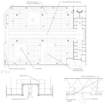
Graham Downes Architecture collaborated with CS Illumination on the lighting. The architects set the parameters fixture type for aesthetic effect, color rendition and performance, budget, and energy constraints and the lighting consultants sourced fixtures to match the criteria. “We’d like to floodlight the stores, but we don’t want to add heat,” says Downes noting that energy constraints are becoming more challenging. Plus, he says, they vary between jurisdictions, so the lighting needs to change a bit depending on store location. A modest-sized typical store might have as many as 15 fixture types but the current generation of compact fluorescent and high-intensity lights can run cool enough and be energy efficient with careful planning.
Love Culture sells what Downes characterizes as “throw-away fashion,” with an immediacy implicit in its products for teenage girls. But the freshness and openness of the store needs to be enduring, he says. By keeping the design white and bright with light, he’s created a store that can remain a beacon in the mall for years to come.