Wreckers came this spring for two of my favorite modernist buildings here in Washington, D.C.—the Third Church of Christ, Scientist, by I. M. Pei & Partners, and a handsome companion office building for The Christian Science Monitor. I’d read how the 1970 church, an octagonal concrete drum two blocks from the White House, had long been disliked by its congregation, but Washington doesn’t have many modernist landmarks, so losing these two hurt—especially since they’ll be replaced by yet another office building.
It took the American Institute of Architects (AIA) to restore my faith, reminding me that one of Modernism’s biggest, best, and busiest successes is literally right beneath my feet: the 106-mile, 86-station Metrorail system. The Twenty-Five Year Award honors Chicago-based Harry Weese & Associates, the subway system’s architects, for a “striking” prototype station design that the AIA said “revolutionized public perceptions of mass transit in the mid-to-late 20th century”—and that has helped the system grow to a 2013 average of 725,770 weekday trips.
Still, as a longtime Metro rider—I moved to Washington in 1980, when the system was only four years old and 34 miles long—I realized I’ve been taking its design for granted. While waiting for trains I typically spend more time reading email on my phone than admiring the lighting (the original design was by William Lam Associates) or appreciating how smoothly the mezzanines accommodate throngs of commuters. I resolved to have a fresh look around.
A good place to start is Union Station, Daniel Burnham’s magnificent 1908 fix for the worst of the city’s 19th-century transportation woes. What was designed as the main waiting room is arguably Washington’s grandest secular interior, a barrel-vaulted re-creation of Roman-scale splendor with a coffered ceiling and smaller arches opening off the main axis. I find the station as crowded as Burnham anticipated. Tides of Amtrak passengers and commuters on trains to Maryland and Virginia meet rivers of bus riders and floods of tourists.
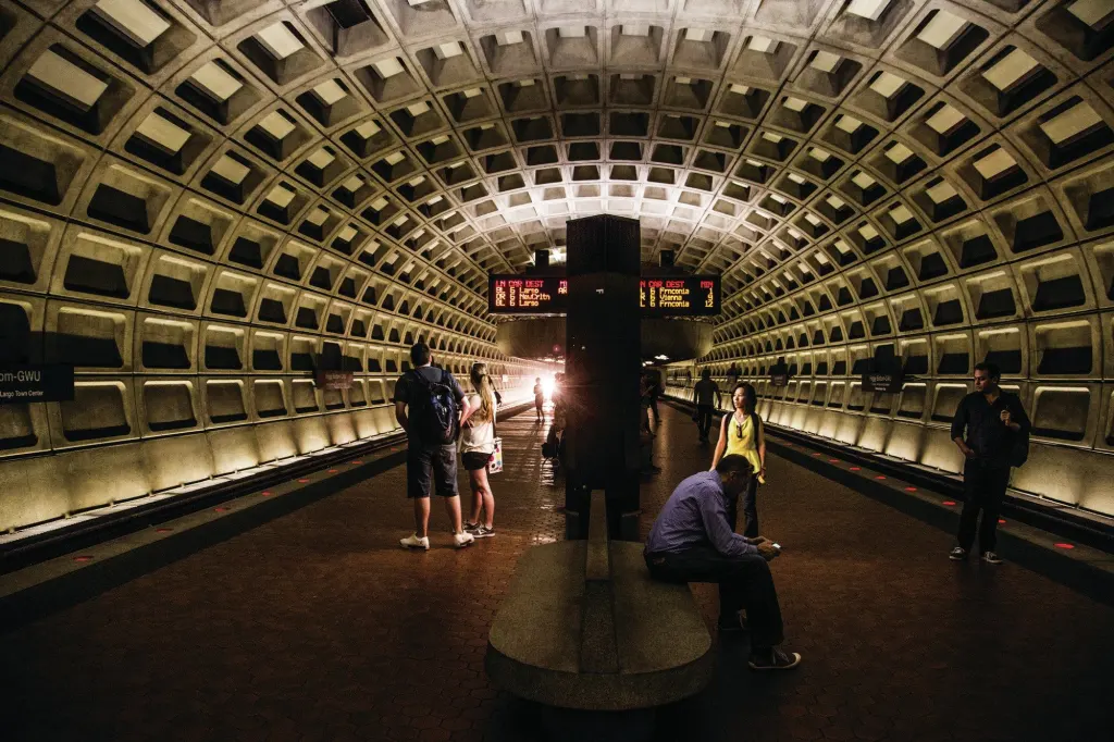
I head down the escalators to what is Metrorail’s single busiest stop. Like the system’s other downtown stations, it is every bit as impressive as the Burnham building. Soaring above the tracks and a center platform tiled in Metro’s signature red hexagons is an elliptical concrete vault with bold rectangular coffers. Lighting recessed between the tracks and the sides of the vault creates vivid shadows, particularly in the coffers, and the space—Metro calls it a train room—comes off as a sleek and powerfully simple modernist reinterpretation of Burnham’s classical splendor. It’s the perfect design for Washington, splitting the difference between Caracalla and Louis Kahn.
Two stops west is Gallery Place–Chinatown, a station that is one of the system’s showpieces. Here the Red Line crosses above the Yellow and Green Lines, and at the intersection of the two enormous vaults their coffers elongate into elegant facing points. On the Yellow and Green Line level, the platform is again between the tracks, but on the level above, the Red Line platforms are on either side of the rails, and the two tracks are separated by a narrow band of lights. More lights are hidden between the sides of the vault and a waist-high concrete wall that marks the back edge of the platform. Even on the raised mezzanines on which riders enter the train room and cross above the Red Line, the vault is always far enough away that I can’t touch it.
The coffered vault is easily the most memorable aspect of Metrorail’s station-design template, which came together in 1966 and 1967. Weese’s firm had been given co-equal status with a Chicago engineering firm, De Leuw, Cather & Co., that had a fair amount of experience with subway systems; Weese did not, so he and several others toured systems in Europe to get ideas. The architect’s preliminary designs—which included pointed-arch vaults for deep stations and boxier plans for shallow cut-and-fill stations—won approval from the the local National Capital Transportation Agency, the predecessor to the current Washington Metropolitan Area Transit Authority, but faced a rough reception at the federal government’s Commission of Fine Arts, whose members included the architects John Carl Warnecke and Gordon Bunshaft.
You can read all about the evolution of the design—and the egos and clashes involved—in Zachary M. Schrag’s detailed 2006 book The Great Society Subway, published by Johns Hopkins University Press. Suffice it to say that commission members pushed Weese to make all the stations look as much alike as possible—hence the template—and that the design that the Twenty-Five Year Award honors is in fact the cumulative work of many people. The coffers I like so much, in fact, were a late design refinement at a Saturday meeting of Weese’s staff in Chicago not long before the Commission of Fine Arts gave its final—and finally warm—approval.
The coffers are just one of the design elements that work their way into your mind and make the system instantly recognizable, no matter where you are in it. Just as important are the gentle curves of the concrete mezzanines, the red floor tiles, the deep bronze of the escalators, and the dark brown of the station kiosks, sign pylons, elevators, and farecard readers. (A companion shade of orange that was common in earlier years is now hard to find.) Where the tracks emerge from tunnels to run above ground, the design template offered station shelters with paired concrete roofs curving out above the rails like the wings of great birds.
Such a robust design template gave Metrorail plenty of flexibility in planning stations for a wide variety of locations. A station may have a single entrance or multiple entrances on different levels and at different angles, and riders may enter on stairs, escalators, elevators, or through shopping concourses or parking garages—all deftly handled by mezzanines that funnel the throngs toward the fare gates. The Fort Totten station is partly in a tunnel and partly outside of it, while at the Pentagon station, the tracks run parallel but on two different levels—and in the same train room. The Silver Spring station in Maryland bridges busy Colesville Road, while the Arlington Cemetery station is bridged by the avenue approaching the Virginia cemetery. In the Anacostia station, where space constraints made a single long vault impossible, a series of smaller crosswise vaults are used instead. The design template easily accommodates them all.
And while other subway systems have always had a variety of station types, it’s worth thinking back to 1976, when Metro’s first stations opened. Imagine how spacious, how modern, how majestic they looked at a time when riders were mostly familiar with the cramped, warrenlike stations of systems in New York, Philadelphia, and Boston. It’s true that New York’s splendid City Hall station has Guastavino-tiled vaults, but it was closed to passengers in 1945. And while Moscow’s subway has a number of vast, vaulted stations, they’re as fancifully ornamented as Fabergé eggs. Metrorail’s modernist design is on an altogether different—and thoroughly distinctive—level.
But the farther I go from the original downtown stations, built before construction costs became such a big issue, the more often I encounter stations that rely on the less expensive design elements. Early on, the system’s designers began cutting costs by using less detailed vaults, so that in many underground stations acoustical panels imitate the pattern that would have been made by the absent concrete coffers. Some above-ground stations dispense with the system’s signature curves altogether. When I get off the train at the King Street–Old Town station in Virginia, its angular roof looks more like an overgrown garden shed than like anything connected with the original design template. Only the red tiles and the brown kiosks signal that I am, indeed, on the Metro.
As you might expect, not all of the system’s original design choices have stood the test of time. Outdoor escalators proved to be such a maintenance headache that Metrorail eventually gave in and sponsored a design competition for glass shelters to protect many of them. While the shelters compromise the granite-and-brown-kiosk simplicity of the original station entrances, almost no one is eager to praise great architecture while trudging three stories or more up a stalled escalator. Worse, poor engineering choices made decades ago have resulted in continuing water leaks in some Red Line tunnels. The repairs could require closing the busy line for months.
And while Metro administrators have, for the most part, stuck as closely to the design template as money has allowed, clutter has wormed its way into the system in various ways. Arriving-train displays are popular with riders—I look at them as much as anyone—but anything that intrudes on the original spare look of the platforms is unwelcome from a design perspective. At the elevated Ronald Reagan Washington National Airport station in Virginia, I note that the area of the platform that’s under cover has been extended, but with a new roof that doesn’t match the paired-wing original and disrupts its clean lines.
Less clear is what the future holds. In April of last year, Metro officials announced in a video uploaded to YouTube that they planned to test “several new design concepts” at the Bethesda station in Maryland. Among the possibilities are new lights to create “a brighter, more welcoming atmosphere,” metal mezzanine wall panels, and replacing Metrorail’s signature brown with stainless steel and light gray. Also possible: lighting suspended from the vault in the train room, new and bigger information pylons on the platforms, and replacing some of the curving concrete mezzanine walls with glass—all changes that seem to me as welcome as the wreckers at Pei & Partners’ church.
Meanwhile, the much-delayed opening of the first phase of new Silver Line is expected later this year, which will eventually take Metrorail out to another modernist landmark, Eero Saarinen’s 1962 Washington Dulles International Airport terminal in Virginia. Since the opening date hasn’t been set yet, it’s hard to know what elements of the original design template have survived, if any. From a distance, the new stations appear to emphasize angles rather than re-create the Weese template’s curves.
But maybe that’s just as well. I wrap up my tour at the Dupont Circle station. It has one of the original all-coffered train rooms—which deserve to be spared cheap imitation as well as disfigurement—and I stop to enjoy the shadows that race along the coffers as the departing train plunges into the tunnel. Then, a final pleasure: The three long, bronze-trimmed escalators of the Q Street NW entrance emerge on a broad plane that bisects a granite-rimmed drum set into the earth beside Connecticut Avenue NW. The escalator I’m on is crowded with chattering tourists and preoccupied locals, but as we ascend into the drum, the burst of daylight and the scale and boldness of the geometry delight, even awe. Moments later, the escalator deposits me back in the busy everyday city, at the intersection of two of the streets that Pierre Charles L’Enfant drew on a plan of Washington way back in 1791. It’s as fine a subway station, as wonderful an experience, as any modernist could hope for.