It hardly seems right to call ARCHITECT a magazine anymore, given how dramatically the media landscape has shifted since our debut in 2006. With eyeballs migrating en masse from print to Web to mobile, our staff now spends so much time on digital production that the editorial rhythm is no longer measured in months, but in minutes. I’m proud to report that we’ve just won top honors for Best Overall Use of Social Media and Best Use of Twitter in 2014 from media-industry magazine Folio. And in keeping with the new media mantra, “disrupt or die,” our website will soon relaunch with a smartphone-friendly design.
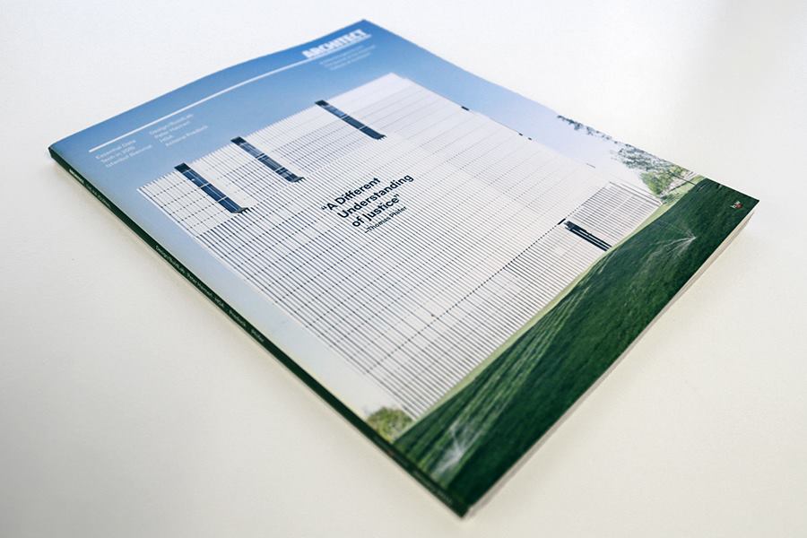
So much has changed, in fact, that we felt the need to reboot the ARCHITECT brand. The new look and feel of this January 2015 issue is one outcome. However, it seemed counterproductive for a print product to mimic Silicon Valley. Rather than amp things up, à la Wired, we determined to slow down and embrace the inherently static nature of ink on paper.
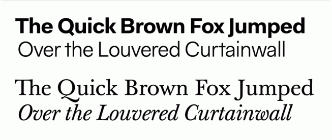
Our art director Robb Ogle, in consultation with designer Gillian Goodman, made it his goal to rid the page of optic interference, to let the text, drawings, and photos speak for themselves. The white space is plentiful, the grid system rigorous, and the typography self-effacing. (For my fellow font-geeks, the sans is Thomas Thiemich’s suitably named Fakt, and the serif is František Štorm’s revival of good old Baskerville.)
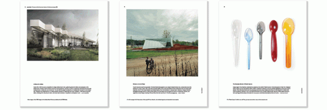
Building on feedback from focus groups, surveys, and informal conversations, the publication is now divided into four parts, each with its own purpose and identity. There’s an entry sequence of design images, offered up like appetizers at the start of a fine meal.
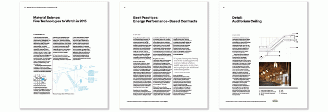
A meaty technology and business section, where peers share best practices.
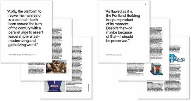
A group of long-format reports and essays to stimulate architectural discourse.
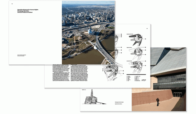
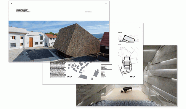
And, for the finale, a collection of richly illustrated building features.
As a bonus, there are the insights in AIArchitect, produced by our partners at 1735 New York Avenue.
The takeaway, we hope, is an Architect that excites and challenges you, that reminds you of why you became an architect in the first place, and that earns a lasting place in your hearts, minds, and libraries. Periodicals no longer make sense if they’re intended as ephemera, tossed out after a quick once-over. We mean for every issue of Architect to have enduring value.
Highlighting the transformation, we no longer refer to ourselves as the “AIA Magazine.” Now we are the “Journal of the American Institute of Architects.”
This difference in taglines is more than semantic. The small print on our table of contents labels this issue as “Volume 104, number 1.” Since each volume represents a year, and Architect is less than a decade old, why “104”?
A few weeks before the launch, you may remember, our publisher Hanley Wood bought Architecture from a rival company. And if you trace the genealogy of ownership back through each and every title change, you’ll wind up at the AIA headquarters, circa 1913. That’s when this selfsame publication got its start—as the Journal of the American Institute of Architects. I can think of no better foundation upon which to build the future of architectural journalism.