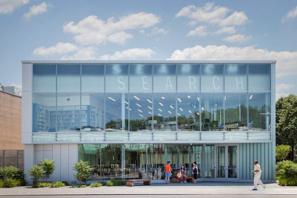
Before there was Google, public libraries were the primary portal to the wide world of information. New York architecture firm Marble Fairbanks reminds us that they still serve this purpose for many people by incorporating the word “search” above the entrance of the 18,000-square-foot, LEED Gold–certified Glen Oaks branch library in Queens. But rather than using painted letters or signage, the firm lets natural light do the talking.
On dark or cloudy days, the northern façade’s curtainwall is blank and unassuming. But on clear days, sunlight streaming through the back glazing of its parapet projects the word “search” onto the curtainwall glass a few feet away. The luminous effect is dynamic, changing continuously each hour and each season.
The projected letters begin compressed beyond legibility in the curtainwall’s top right corner at sunrise. Throughout the morning, they drift to the left, extending to a full height of nearly 5 feet at noon, when the sun reaches its highest point in the sky. Then the letters slowly compress and disappear into the curtainwall’s top left corner. In the winter, the letters follow a similar path, though their projected height is halved because of the sun’s lower transit. “We wanted to highlight the ephemeral qualities of digital information by relating it to the ephemeral qualities of light,” says firm partner Karen Fairbanks, AIA.
During the design process, the team used Autodesk Maya software to simulate the letters’ change in appearance in accordance with the sun’s position. They built one more physical model, this time at half scale and made with foamcore and a sample of the actual glazing, to fine-tune the text resolution through trial and error. Marble Fairbanks designed the custom typeface of the stenciled letters, which are 20 inches tall with a stroke thickness of 3 inches and edges feathered with a halftone pattern.
When projected, the word “search” appears suspended between the parapet glass and the 6-foot-tall curtainwall façade, rising above the second-story children’s section. “Sometimes you see double letters,” Fairbanks says. “As you move around the façade, what you see changes.” She and her colleagues were pleased to discover other serendipitous effects, including the reflection of letters off the translucent façade glass and back down into the children’s section, where they fall on desks and tables.
Supplied by Pulp Studio, in Los Angeles, the curtainwall glazing, which is insulated, has a translucent finish to intensify the graphic’s visibility and to help mask the parapet structure and lettered glass beyond.
When the building opened last fall, Fairbanks says that community members were intrigued by the glowing, beckoning “search” and curious about why the letters change shape, position, and legibility. “For children, it’s kind of a science project,” she says. And if they want answers, they merely have to step inside the library and search.