In the Oscar-nominated film The Big Short, the narrator occasionally breaks from the story of America’s housing and mortgage bubble to explain, in plain English, the confounding and complicated lingo that defines contemporary banking. The movie underscores a truth about the financial world these days: Customers often feel like a cog in the wheel of an unwieldy financial system, where transparency and service get short shrift.
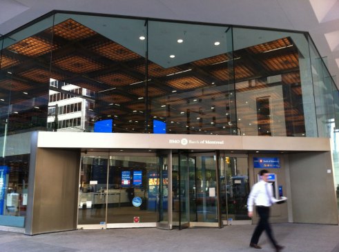
In contrast, with the redesign of its corporate identity and its flagship branch in Toronto, the Bank of Montreal aimed to elevate customer experience to one where transparency, service, and simplicity now takes priority. The 26,000-square-foot branch is located in the base of the Bank of Montreal tower in Toronto’s busy Financial District. The building was designed decades ago, and the interior was dark and cloistered, with staff offices secured behind walls and a customer floor that felt less than inviting.
Steve Tsai
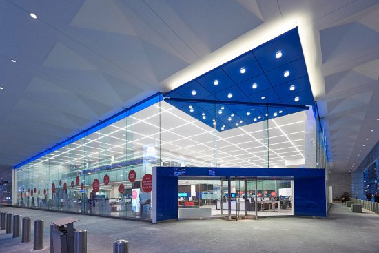
The new lighting treatment extends to the adjacent exterior sidewalk area giving the bank a greater street presence.
“It was a very 1950s bank that had a secure, ‘We’re guarding your money’ kind of feel,” says Jesse Blonstein, a senior associate with Toronto-based Lightbrigade Architectural Lighting Design. “It was totally suitable to the design of those times, but from the outside, during daytime hours, you couldn’t really tell that it was open for business.”
Steve Tsai
A view of the bank, prior to renovation, with the old fluorescent lighting system in the ceiling.
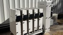
Steve Tsai
The new lighting (left) being installed in the ceiling; the old lighting (right) with its copper louvers.
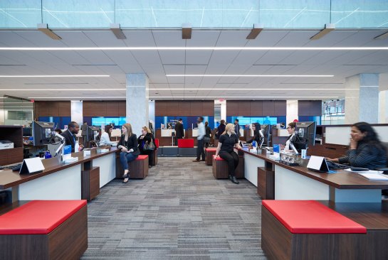
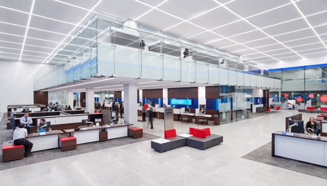
To transform the bank’s interior and reflect contemporary design aesthetics, Lightbrigade worked with Toronto-based Kearns Mancini Architects on overhauling the interior. The bank consists of a main floor with a mezzanine that floats over the inner core of the room. Prior to the renovation, everything beneath the mezzanine was strictly for the bankers. A counter wrapped the perimeter. “It was public on the outside of that counter, and private behind it,” Blonstein says.
In the new open layout, the architects kept the teller counters under the mezzanine, but designed them in such a way so that customers can move freely through the space, with customer representatives and bankers seated in clusters, called hives, out in the open. “The challenge, then, was to incorporate not just navigation and circulation light levels, but office light levels as well,” Blonstein says.
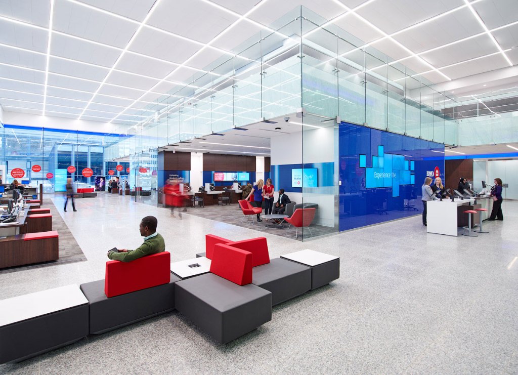
Steve Tsai
The new lighting strategy provides uniform illumination at the customer service desks, which are located under the mezzanine and extend into the double-height banking hall.
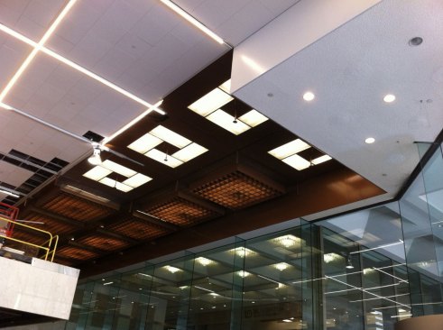
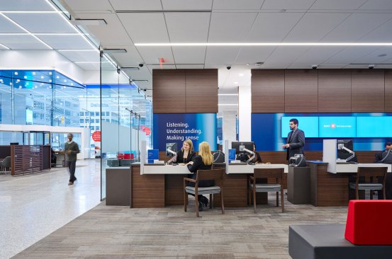
Kearns Mancini opted to keep the existing 10-foot by 10-foot architectural grid in the 27-foot-high ceiling. “There was an existing system of copper louvers that were suspended below 2-foot by 5-foot fluorescent troffers,” Blonstein says. The existing grid was reused as support for the new luminaires: surface-mounted, 8.5W per foot, linear 80-plus CRI LED fixtures with continuous illuminated intersections. Under the mezzanine, and running parallel to the transaction counter, recessed, continuous 8.5W per foot, linear LED luminaires align with the 10-foot grid.
Steve Tsai
A view of the teller area. A row of LED linear fixtures in the ceiling provides illumination to the desks below.
The selection of 3500K as the color temperature throughout supported both the bank’s blue corporate color scheme and the material palette of warm woods. “We didn’t want to have it too cool, but we didn’t want to warm things up too much either,” Blonstein says. “We picked 3500K because it fits in well with an office environment.”
Lightbrigade also had to determine if the lighting grid could serve as the illumination strategy to support all of the different programmatic requirements in the bank, or whether specific areas such as the offices would require focused task or downlighting. “We found that the right light level was achievable without any task specific downlight, which helps for maintenance. Now the client has just one system to maintain in that high ceiling.” Blonstein says.
Steve Tsai
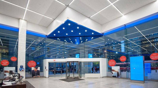
The main entrance is accented with a grid of 27W 3500K decorative-trim downlights in the entry bulkhead.
The ceiling luminaires are tied into a programmable control system, so the light levels of the fixtures under the mezzanine, which are closer to work surfaces, can be lowered as necessary. “There’s also a daylight contribution into the space [through large glass windows], but we’re not relying on daylight to make up for electrical lighting during banking hours,” Blonstein says.
In addition, decorative 27W 3500K LED downlights and 3.7W per foot covelights were clustered over the dropped bulkhead of the main entrance ceiling. “The canopy at the corner offers an extension of the interior illumination out onto the street,” he says.
The client also asked that an accent stripe of blue light, to reflect the corporate blue color scheme, wrap the edge of the space. A continuous ribbon of blue LED-edge-lit acrylic traces the perimeter. The branch, which opened in December of 2014, now presents a vibrant face to the surrounding city. “It has great street presence,” Blonstein says. “It’s definitely an eye catcher.” •
Steve Tsai
The renovation maintains the existing 10-foot-by-10-foot architectural grid in the 27-foot-high ceiling and provides a design datum for the entire space.
Details
Project: BMO Bank of Montreal—Toronto Main Branch, Toronto • Client: BMO Bank of Montreal • Architect: Kearns Mancini Architects, Toronto • Lighting Designer: Lightbrigade Architectural Lighting Design, Toronto • Project Size: 26,000 square feet • Project and Lighting Costs: Not Available • Code Compliance: ASHRAE 90.1-2010 • Watts per Square Foot: Not Available • Lighting Manufacturers: Ardron-Mackie; Philips Lightolier; Selux