Artistic and special effects lighting aside, almost all architectural lighting uses white light. Until only very recently, however, the designer has been forced to choose a particular color temperature. With fluorescent lamps, the light color can be varied by the particular phosphors to create just about any desired hue, ranging from incandescent-matching 2700K to icy blue-white 7500K and higher. The most popular choice currently seems to be 3500K, as it strikes a comfortable balance between warmth and daylight.
But in the last 20 years, there has been a new wave of research in vision, photobiology, and human factors. The results clearly indicate that human health, visual preference, visual acuity, and visual task performance can be affected by certain qualities of light. Combined with the latest lamp technology, some of these findings might affect designers’ choice of white in a major way.
BASIC PRINCIPLES OF THE LIGHT COLOR SPECTRUM
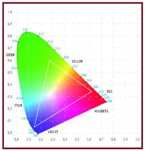
The international standard for describing the color of light is the 1931CIE Chromaticity Chart. The apparent color of light can be plotted using X and Y coordinates, with the area in the center of the chart being white and the areas surrounding being the various colors of the rainbow.
The black body locus (curve in the middle) describes the color of light emitted by a theoretical non-oxidizing object as it is heated. The temperature of the object is measured on the Kelvin scale. When heated to about 1000 degrees Kelvin (K) the object will radiate a dull reddish light. As the temperature increases (counter clockwise motion) the color of the object’s light becomes warmish white, then coolish white before becoming blue above 10,000K. It’s tempting to refer to the black body’s white light as “perfect”. Among practical light sources, there are only two that emit white light in a manner closely resembling the black body, the sun and the incandescent lamp (until the filament melts). Dim an incandescent lamp and watch the color temperature vary.
Compared to the black body, almost all other white light sources, especially modern light sources like fluorescent, LED, and HID lamps, are not perfect. Nonetheless, we can describe their color by the point on the black body locus to which the color of the real source is most closely matched, called the correlated color temperature (CCT). The problem with this system is that a practical light source, such as a fluorescent lamp, is often far different from the color rendering qualities of the black body’s light. In order to help judge the quality of the light source, a system called color rendering index (CRI), is employed. It is a 0-100 scale in which 100 means, effectively, color rendering equal to that of the light of the black body. CRI is not a perfect system, but it is generally a very useful indicator of practical color quality. As a general rule, light sources less than 50 CRI render colors poorly and should not be used when color discrimination is important. Because of their abundance and low cost, most architectural light sources today should have CRI of at least 80.
COLOR TEMPERATURE AND HUMAN PREFERENCE
In 1941, the fluorescent lamp was newly invented, and the color of white to be manufactured was an open question. A. A. Kruithof, a scientist working for Philips, performed informal studies and created Kruithof’s Curve, a graph suggesting color temperature preference as a function of light level. Because of the informal nature of his study, most lighting experts do not take this curve too seriously, but intuitively it often tends to match our experience. For example, there appears to be a preference for warmer light sources in colder climates, and vice versa. Likewise, many individuals prefer higher color temperature sources by day, and lower CCT sources by night, similar to Kruithof’s findings.
One explanation for this kind of innate human response to seek complementary color temperatures pairings can be derived from nature. Because the color temperature of daylight varies between 1800K (rising and setting sun) and 5500K-plus (noonday sun and sky), these preferences may in part be due to solar or circadian cycles. There is also the suggestion that very warm sources are reminiscent of the fire used for light at night.
But these explanations are not perfect; history and culture sometimes work to the contrary. In several Asian societies, high CCT lamps seem to be preferred indoors at night in restaurants, homes, and stores, differing both from Kruithof’s Curve and natural light cycles. Nonetheless, for those of us designing for western society and taste, the ideal lighting system would most likely be cool by day and warm by night.
COLOR TEMPERATURE AND VISION
From the 1960’s to around 1990, an unexplained phenomenon called “visual clarity” was a common discussion topic among lighting practitioners. When viewed under the light of high CCT, high CRI lamps, many tasks appeared easier to see, yet the cause could not be explained by the vision scientists of the era. Starting in the late 1980’s, important new work by Dr. Sam Berman and his colleagues at Lawrence Berkeley National Laboratory finally provided an explanation. An abundance of shorter wavelength blue light causes the pupil of the human eye to contract, and through increased depth of field and reduced visual noise, visual performance is enhanced. Further experiments by Berman, Navaab and others have also demonstrated that high CCT light appears brighter than lower CCT light at the same footcandle levels.
Based on these findings, large-scale experiments retrofitting complete buildings with high CCT lamps, but lower-than-normal footcandle levels, have been conducted by Pacific Gas and Electric with some success. Whether this is an acceptable practice is still being debated among vision scientists. However, use of high CCT sources for task lighting is probably a good design idea, especially when detailed inspection or intricate work is involved.
COLOR TEMPERATURE AND CIRCADIAN RHYTHMS
The human’s daily cycle of waking and sleeping, called the circadian rhythm, is triggered by blue light. At the start of each day, exposure to daylight re-sets the body clock and causes the levels of melatonin in the bloodstream to fall. About 12 hours later, as night descends, the melatonin levels will naturally begin to rise, and the human will become sleepy.
For most people, awakening in the morning and exposure to natural light is all that is needed to maintain a healthy cycle. But under some conditions, such as persons living underground or suffering from Seasonal Affective Disorder, artificial stimulus may be necessary. A regimen of light exposure including specific requirements for the duration, intensity, and cycle of light has been used to successfully address these conditions. Almost any high CCT fluorescent lamp can be used to simulate daylight’s effect; special “circadian” lamps can provide enhanced benefits for less energy and lower light levels. In Europe, Osram and Philips both sell high CCT fluorescent lamps specifically for this use, and manufacturers are even investigating the use of blue LED lamps in special fixtures and apparel. Imagine wearing a blue light cap to treat your winter depression.
An equally important aspect of circadian rhythm is dark nights. When exposed to light containing blue, even through a closed eyelid, the human’s melatonin level drops and sleep is affected. In other words, blue-poor low CCT lamps at night may be just as important in maintaining a healthy human cycle. Dimmed incandescent and candlelight are just about perfect for this desired effect. For night lights, consider red or amber LEDs, as they won’t cause you to wake up.
From this information, a designer might be tempted to design specifically to address circadian rhythms to the point of promising better health. As a general rule, there is no scientific evidence to support the use of high CCT lamps in normal applications, as indoor light levels are too low and occur too late in the waking cycle. Moreover, circadian phase shifting and the treatment of sleep disorders require light level treatment that generally can not be provided by building lighting systems, and if undertaken, should be overseen by a physician.
COLOR TEMPERATURE AND DAYLIGHTING
For all practical purposes, daylight is a high CCT, high CRI light source. Those who think daylight is 100 CRI are mistaken; when filtered by almost any window glass, the color quality of the light is altered and CRI can vary considerably. But overall, the CCT remains high.
One principal daylighting scheme involves dimming electric lights in response to daylight. Making the electric light color match daylight more closely is a design concept worth considering. Even if the maximum color temperature of the lamp is only 5000K, the similarity will be appealing.
WHAT IF….
Two technological advances may provide interesting dimensions. Rather than be stuck with the inherent color qualities of the light source, what if its color temperature could be varied? This exciting concept, once only a dream to lighting designers, is becoming a reality. The obvious candidate to create this effect is LED lighting, but being a bit more practical, it can also be accomplished using fluorescent lamps, or perhaps a hybrid of the two.
Those following LED developments will note that there are two possible ways of providing color temperature variation:
The biggest problem with LEDs is color quality. There are very few LED systems, including RGB that can produce high quality white light at less than 3000K. Moreover, with the current efficacy of LED systems being quite a bit less than 50 mean lumens per watt, color changing using LEDs is probably too inefficient and costly for everyday lighting.
On the other hand, fluorescent lamps can be placed in the same luminaire to create a color mixing scheme, too. In this case, two high CRI lamps, one with low CCT and one with high CCT, can be individually dimmed to produce white light with variable CCT. Such an approach is simple, relatively cost effective, and uses modern, state of the art fluorescent technology. Other blending approaches, like a combination of a warm-toned white lamp with a totally blue lamp are also possible.
With these intriguing technologies in mind, one might wonder if a color temperature variable lighting system is worth the hassle. After all, the daily cycle of color is perfectly natural, and it might help make buildings even more livable and beneficial for the human occupants. But for the time being, the only arguments in support are the potential for enhanced visibility by day and better natural rhythms at night. But since we seldom awaken, work, relax, and sleep in the same space, perhaps this theory’s biggest uses will be in the design of submarines, mines, health care facilities, and other environments in which a person’s natural cycle can’t be maintained by the normal cycles of daylight. For office buildings, factories, schools, and other places where we spend only the waking hours of our lives, a color temperature dial might be interesting, but probably not essential.
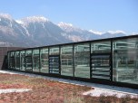
From Beaux Arts artists to modern day color experts, critical evaluations of color have always been made under natural daylight. Often neglecting daylight’s wide color temperature range, people generally consider it to be the definitive reference color of light. So it might come as some surprise that daylighting can not be counted on for these qualities.
The culprit, of course, is modern building glass. We all know that ordinary plate glass can cast a greenish tint, but that is only the beginning. Considering the many various tints of glass is only part of the clue. The real hidden culprit is modern Low-E glass. In order to reduce infrared heat transmission, red light is reduced too, and transmitted light can turn greenish-blue. It’s not uncommon for the glazing system to reduce the CRI of “daylight” to less than 80.
It’s possible to predict the resulting color rendering of just about any glazing system using Window software. Free from Lawrence Berkeley National Laboratory, and designed to assist architects in assessing the qualities of composite glazing systems, Window also calculates the CRI of the resulting daylight. Window takes a little work to be able to use on a regular basis, but it an indispensable tool with at least one very useful feature that a lighting designer could really use.