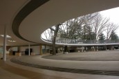
![MoMA’s website "should reflect the way visitors experience the museum, not how [employees] experience it," says Allegra Burnette, the museum's creative director for digital media. A thorough revamp of the site makes that more possible.](https://www.architectmagazine.com/wp-content/uploads/sites/5/2009/tmp792-2etmp-tcm20-187509.jpg?w=1024)
Museum visits are intensely physical experiences, but how do you replicate that in a website? This is a question the Museum of Modern Art (MoMA) sought to answer when, in 2007, it began an overhaul of its digital presence—a fussy, text-based destination that didn’t adequately represent an institution devoted to contemporary art and design and one of New York City’s most animated spaces.
The site’s overseers hoped to reflect MoMA’s architecture in the site itself. “One conversation we had [during] the redesign is what role the physical building plays in the website,” explains Allegra Burnette, the museum’s creative director for digital media. Like MoMA’s home at 11 West 53rd St., which underwent its own renovation earlier this decade, the site is conceived as a modified grid system—one enlivened, of course, by art and people. “We wanted to make it more image driven,” says Burnette, because the site should “reflect the experience” of being there. To this end, moma.org now offers a wealth of images, including works not on display.
The redesign, done in conjunction with Manhattan design firm For Office Use Only and rolled out this past March, overhauls the site’s logic. Previously divided into departments like painting and photography, moma.org is now structured into broad categories: visit, explore, learn, support, and shop. The new site allows for personal accounts—teachers, for example, can create image suites and invite students to view them, along with related audio and video content—and there is tighter integration with the museum’s presence on major social networking sites.
For those who have some familiarity with MoMA, the new site is about “continuing the excitement and learning something” each time they go online, says Burnette. For those who haven’t visited it (yet), “we are trying to give them a sense of the place, the people, and the experience of being in the museum.”