“Diagrams are not passive. They’re not just records of thought—they are thoughts in action.” —Rem Koolhaas
Decoding a Graphic World
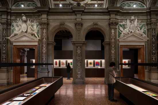
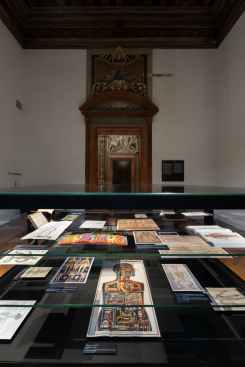
Exhibition view of “Diagrams: A Project by AMO/OMA” Fondazione Prada, Venice Photo: Marco Cappelletti Courtesy: Fondazione Prada.
In a moment defined by data deluge and digital distraction, architects are rethinking not just how buildings are shaped, but how information shapes us. Enter “Diagrams,” a sweeping, genre-defying exhibition by AMO/OMA, on view at Fondazione Prada’s Ca’ Corner della Regina in Venice through November 24, 2025.
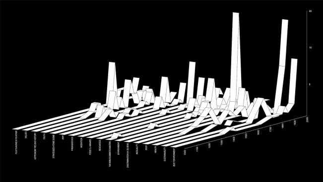
AMO/OMA Timeline, 2025. Distribution of diagrams on display by topic and year of production. Courtesy AMO/OMA.
The exhibition, curated by Rem Koolhaas and architect Giulio Margheri, spans centuries and civilizations, assembling over 300 diagrams, infographics, and visual artifacts. Together, they form a speculative atlas of how humans have visualized knowledge—and how those visualizations have reshaped politics, cities, bodies, and belief systems.
Nine Urgencies, One Question
Organized around nine central themes—Built Environment, Health, Inequality, Migration, Environment, Resources, War, Truth, and Value—the exhibition turns the diagram into both subject and structure.
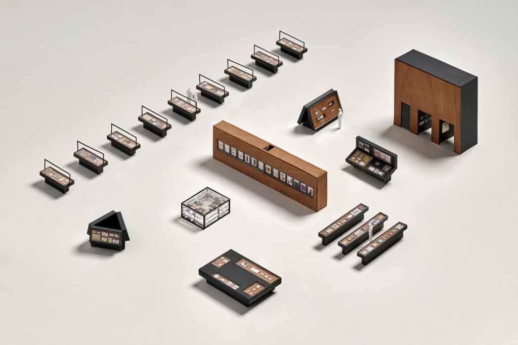
A central gallery presents these categories in parallel vitrines, each surrounded by immersive side rooms that dive deeper into subthemes. The show’s opening installation is a meta-diagram: a spatial map of “Diagrams” itself. Designed by AMO, it lays bare the exhibition’s own conceptual logic.
“We’re interested in how the representation of information becomes a form of agency,” Koolhaas says. “The diagram is never neutral.”
AMO-s Meta-Diagram
Visitors entering Ca’ Corner are greeted by a spatial diagram of “Diagrams” itself. Designed by AMO, this opening installation reveals the taxonomy and logic of the show—literally diagramming the diagram. It’s a recursive gesture that embodies Koolhaas’s lifelong belief that architecture is not merely about buildings, but about systems of thought.
This reflexivity is baked into AMO’s DNA. Born as the think tank counterpart to OMA, AMO has long deployed infographics, timelines, and flowcharts as provocations—used not just to describe cities, but to reshape them. From their “Content” exhibition at the Neue Nationalgalerie in 2003 to their strategies for European Union branding in the 2000s, diagrams have undergirded the firm’s identity.
W.E.B. Du Bois and the Origins of Visual Resistance
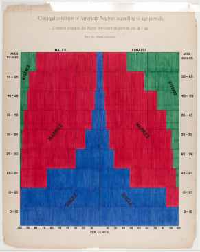
W.E.B. Du Bois Conjugal condition of American Negroes according to age periods , c . 1900 Exhibition copy of a statistical chart illustrating the condition of the descendants of former African slaves now in residence in the United States of America, Atlanta University. Ink and watercolor on paper. Daniel Murray Collection, Prints and Photographs Division, Library of Congress, Washington, D.C. Courtesy Library of Congress, Prints and Photographs Division Washington, D.C., Daniel Murray Collection
The exhibition opens with W.E.B. Du Bois’s groundbreaking 1900 infographics on Black American life. Created for the Exposition Universelle in Paris, these charts redefined how marginalized communities could narrate their own conditions through graphic form.
For Koolhaas, this isn’t a detour into social history, but a core architectural concern: “We’re interested in how the representation of information becomes a form of agency. The diagram is never neutral.”
It’s a fitting beginning for a show that positions the diagram as both a political tool and a design methodology.
Other case studies include:
- Florence Nightingale’s “coxcomb” charts, which helped revolutionize British health policy.
- Charles Minard’s visual chronicle of Napoleon’s failed Russian campaign—a 19th-century masterpiece of statistical storytelling.
- William Playfair’s bar graphs and pie charts, foundational to modern economic visualization.
Architecture as Diagrammatic Practice
For AMO/OMA, this isn’t just curatorial interest—it’s a return to origins. Since the 1970s, Koolhaas’s studio has used diagrams not as illustrations, but as engines of form-making. From “Exodus” to CCTV Headquarters to the EU Barcode Flag, diagrams have functioned as a design language.
“Diagrams were the physical burden of proof,” Koolhaas explains. “They helped us articulate ideas that otherwise couldn’t be built.”
Objectivity, Myth, and Misinformation
One of the most pressing themes in “Diagrams” is the seductive aura of objectivity. As Koolhaas notes, “The diagram gives complexity a shape. But that shape is never innocent.” In the era of climate disinformation and algorithmic bias, this becomes particularly urgent.
The exhibition’s section on “Truth” highlights this tension. Ancient star maps, Islamic cosmograms, and Mesoamerican calendars remind us that data visualization long predated Western rationalism—and that even sacred knowledge could be diagrammed. But the show doesn’t merely romanticize these historical examples. Instead, it frames them as early expressions of a recurring dilemma: how do you represent what you cannot yet fully understand?
In today’s fragmented media landscape, Koolhaas warns, the diagram’s persuasive power can be weaponized. The exhibition illustrates this with 20th-century propaganda graphics and contemporary disinformation flows. Through these juxtapositions, “Diagrams” urges architects to scrutinize their own tools—especially those that appear most clinical or detached.
The 19th Century’s Visual Revolution
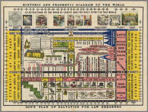
Elwin J. Woodward Historic and prophetic diagram of the world: God’s plan of salvation for law breakers , 1912 Colored lithograph, exhibition copy David Rumsey Map Collection, David Rumsey Map Center, Stanford University Libraries Courtesy David Rumsey Map Collection, David Rumsey Map Center, Stanford University Libraries.
A recurring thread in the exhibition is the “Golden Age of Infographics”—a 19th-century boom sparked by mass printing, rising literacy, and colonial expansion.
Innovators like Emma Willard, an American educator, created innovative temporal maps to teach history. Alexander von Humboldt’s ecological visualizations—also on display—laid the foundation for scientific visualization and prefigured today’s climate models.
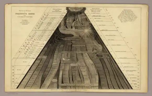
Perspective sketch of the universal history from the creation to the empire of Napoleon , 1836 Exhibition copy from a printed book In Emma Willard, Universal History in Perspective (Hartford: F.J. Huntington, 1836) David Rumsey Map Collection, David Rumsey Map Center, Stanford University Libraries Courtesy David Rumsey Map Collection, David Rumsey Map Center, Stanford University Libraries.
But Koolhaas and his team are careful not to idealize the past. Their framing insists: these tools were never neutral, and their cultural impact is inseparable from the narratives they helped construct—or erase.
Diagrams as Built Arguments
“Diagrams” proposes that architects reclaim the diagram as more than a tool for explaining work. Instead, diagrams become a way to do the work—a method of modeling complexity, contradiction, and transformation.
Throughout the exhibition, visitors encounter work by:
- Transsolar and Atmos Lab, exploring environmental systems and resilience
- Theo Deutinger, whose geopolitical mappings unsettle borders and nation-states
- SITU Research, whose spatial analysis supports legal and humanitarian causes
All offer a vision of architecture not limited to form, but engaged with flows of power, data, and meaning.
The Book as Object and Extension
The exhibition is accompanied by a visually ambitious publication, designed by Irma Boom. It features writing by scholars including Kate Crawford, Alberto Cairo, Malkit Shoshan, and Philippe Rekacewicz.
In her introduction, Miuccia Prada frames the book—and exhibition—as a call to action:
“Our goal is to raise awareness of the value and risks inherent in a medium increasingly used to shape public life.”
Why “Diagrams” Matters Now
Exhibition view of “Diagrams: A Project by AMO/OMA” Fondazione Prada, Venice Photo: Marco Cappelletti Courtesy: Fondazione Prada.
In a profession where graphics often serve marketing more than meaning, “Diagrams” offers a critical reset. It invites architects, designers, and urbanists to rethink how they visualize knowledge—and why it matters.
In Koolhaas’s view, diagrams are not relics of early-stage design. They’re the DNA of future architectures. From regional master plans to spatial justice frameworks, the ability to diagram may be the profession’s most potent skill.
Visit the Exhibition
Fondazione Prada, Ca’ Corner della Regina, Venice, until 24 November 2025