A decade ago, about a year after Daniel Libeskind, AIA, was appointed master planner of the World Trade Center site, I asked him a question: “In 10 years’ time, will this place look like New York City?” His charming and evasive reply: “When the famous portrait of Gertrude Stein was painted by Picasso, she said to him, ‘It’s a beautiful portrait, but it doesn’t look like me.’ And he said, ‘But it will.’ ”
Picasso’s iconic portrait, of course, cast Stein as a cubist Mona Lisa. And Libeskind, something of a cubist himself, seemed to have the idea that he was remaking not just the 16 acres nominally under his command, but New York City itself, dragging the wounded, architecturally recalcitrant metropolis into the 21st century.
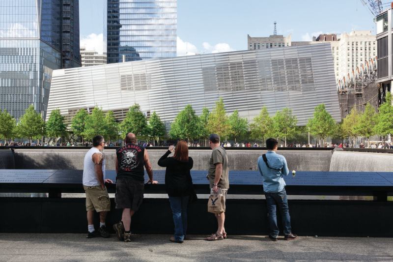
Today, I’m still trying to answer the same question. Every time I’ve visited the National September 11 Memorial, since it opened in 2011, I ask myself: What is this place and who is it for? The site continues to grow and change as many of the components lurch toward completion, but what I find here isn’t exactly New York. It lacks the energy typical of the city’s best public places. That’s to be expected in a site dominated by a memorial, but it isn’t well suited to contemplation either. There are too many visitors, tourists mostly. There are endless rules: no demonstrations, no rallies, no third-party vending. No sports. No loitering, littering, or smoking. No throwing anything into the pools. No animals. But all those injunctions don’t add up to tranquility. If there is peace to be had on this memorial plaza, I have yet to experience it.
Nor is the site exactly Libeskind’s. His influence quickly waned as his grandest symbolic gestures encountered the turbulence with which New York City customarily confronts newcomers. His Wedge of Light, for instance, a plaza that Libeskind claimed would be bathed in sunlight during the morning hours each Sept. 11, was revealed as a fiction by Eli Attia, the architect of the neighboring Millenium Hilton. This shouldn’t have been a surprise given that the sun rises in the east and the World Trade Center (WTC) is located at what used to be the western edge of Manhattan.
Then Libeskind’s 1,776-foot-tall Freedom Tower, which was supposed to be an abstract homage to the Statue of Liberty—robes swirling and torch held aloft—got whittled into a far more normative tower, with corners neatly chamfered by David Childs, FAIA, of Skidmore, Owings & Merrill (SOM). The tower was further reined in by the New York Police Department’s demands for maximum blast protection at street level. And, finally, developer Douglas Durst (who bought a stake in the building in 2010) de-chamfered the corners at the base and rid the antenna at the top of the tower of its distinctive sculptural sheathing. And now the former Freedom Tower looks a lot like something you might find in any second-tier Asian city.
But more damning, perhaps, than Libeskind’s poetry being pummeled into prose, was the fact that a new, rather spectacular New York began sprouting up elsewhere, most notably in West Chelsea, where the innovation spurred by the High Line has begun to merge with the 26-acre Hudson Yards, a project that promises to mix high-end office space, residential towers, and cultural venues to create a lively new part of Midtown.
The WTC that finally emerged from behind its security fence this spring is certainly not the old place—where 1960s ideas about radically reshaping cities reached some sort of apotheosis—but it also isn’t the best example of 21st-century urban design in New York. It is a development shaped—and restrained—by too many forces and driven by very powerful conflicting desires: to commemorate the horrific thing that happened and to render the evidence of that cataclysm invisible.
On the other hand, I’m sometimes surprised by the quality of the architecture on—and near—the site: The best building is still 7 WTC. SOM, working closely with glass specialist James Carpenter, designed the 52-story tower, clad in a low-iron water white glass, for the north side of Vesey Street. A replacement for a clunky 1980s granite-covered building that fell on Sept. 11, it was built quickly, completed in late 2005, with no scrutiny from the site’s “stakeholders” because Consolidated Edison badly needed the power substations that were at the base of the old 7 WTC. The result is a sensually pleasing tower that channels Lever House without imitating it. And the Jenny Holzer installation behind the reception desk remains one of the smartest, most eye-catching artworks I’ve ever seen in an office-building lobby.
While 7 WTC snuck up on me, I watched 4 WTC, designed by Fumihiko Maki, Hon. FAIA, as it was being built and wrote it off as dull work of architecture, cheapened by the intense reflectivity of the glass. But suddenly, on completion, it has emerged as something rather different. It’s restrained, in a Japanese way, and not boring at all. Off the white marble lobby is a trio of elevator corridors, each lined with shiny brown African anigre wood, each culminating in a video installation—wind, trees, sky—accompanied by a Philip Glass composition. From the higher floors, the views south and west are astounding, and from the 57th-floor terrace, 1 WTC looks somewhat as its various architects imagined—slender and angular—rather than the clunky, value-engineered bunker you currently see at street level. And the effect of the façade mirroring the sky on a sunny day is positively cinematic.
While I’ve come to admire 4 WTC, my misgivings about the memorial have only intensified since its completion. Maybe this is because the one piece of Libeskind’s plan that always resonated with me was his vision of the slurry wall as heroic object. Originally built to keep the Hudson River out of the Twin Towers’ excavation site, the wall was, after all, the last remaining artifact that conveyed any of the monumental nature of the old WTC. Although the towers fell, the slurry wall stood, and prevented the river from inundating Lower Manhattan. Libeskind’s winning proposal for the site was built around the wall’s symbolic beauty. His drawings showed a series of towers, stair-stepped in height and arranged around a greensward, sheltered by the top 30 feet of what could have become New York’s Wailing Wall.
But, of course, a memorial in which you could see the slurry wall would have to be set below grade, and the site’s nearest residential neighbors, the good people of Battery Park City, rebelled against the idea: too sad, too much of an impediment to their ability to cut across the site on their way to work. (I can’t imagine that the site’s commercial interests warmed to a depressed memorial, either.) And so Libeskind’s most powerful concept evaporated, replaced by Michael Arad, AIA’s massive, square fountains. In theory, I like Arad’s idea of commemorating the two footprints, but there’s something about the execution, particularly the way the fountains are framed by heavy ribbons of bronze into which the names of those who died on Sept. 11 have been inscribed, that feels wrong to me. The memorial’s aesthetic reads like a rebuke of the deceptive lightness of Minoru Yamasaki’s vision.
And it strikes me as almost immoral that, above ground at the memorial, there is nothing left of the old WTC except for a single tree, a callery pear pulled from the rubble, replanted, and named the Survivor Tree. Visitors, hungry for some connection to what was once there, crowd around the tree and take pictures.
Many visitors to the memorial, myself among them, used to press their noses to the glass of Snøhetta’s asymmetrical entry pavilion, completed years before the National September 11 Memorial & Museum opened its doors in May, to see the remnant of the WTC visible within, a pair of the complex’s familiar steel tridents. So it was exciting to finally go inside and see the tridents accompanied with a large photo that showed them in context at the base of the Twin Towers.
Much has been made of the museum’s gaffes–appalling products on sale at the gift shop (the cheese board!), a capsule history of Jihad that some Muslims found offensive—but in truth, the museum does what it’s supposed to do, diligently and surprisingly well, with a level of detail so conscientious that it’s overwhelming. What I realized as I made my way through the multimedia re-creation of Sept. 11 is that most events of great historic significance are far enough in the past that the amount of related ephemera has been winnowed by time. Not so Sept. 11. It seems like the museum has every sad missing poster, every victims’ artifact, and countless objects like dry cleaner hangers commemorating the first responders. There is simply too much. The onslaught, after a while, is numbing.
Some aspects of the panoramic documentation of that day are genuinely stunning. There are alcoves where you can sit down and listen to first-person accounts from people who were in the towers, with schematic diagrams pinpointing their locations. The simple graphics and the fact that you actually have to stop and focus on one story at a time makes these displays unusually powerful.
Aside from Snøhetta’s crystalline pavilion, the impact of which is undermined by the airport-style security maze you must negotiate to get inside, the museum has two defining architectural gestures. Davis Brody Bond (DBB), the firm that designed the underground portion of the building, created a series of ramps that lead you downward, 70 feet into the earth, to the spots where the old towers met bedrock. Access to bedrock is, in fact, one of the highlights of the museum. The bases of the buildings’ box beams and other elements of the foundations are treated as if they were archaeological finds, remnants of some lost civilization—which, arguably, they are.
But DBB’s best architectural moment is what’s known as the Foundation Hall. It is a compelling open space, where Libeskind’s 68-foot-tall slurry wall actually fulfils its symbolic destiny. At first, you see the wall, rough and conspicuously undesigned, from a balcony at the end of one of the long ramps. Then, after you walk further downhill, you reach the hall itself. I spent a long time sitting on a bench looking up at this powerful object, something I wish it was possible to do above ground. In the Foundation Hall, I was reminded of a meeting I attended years ago where people came to discuss their responses to design proposals for the memorial. I remember listening to a man who had lost his wife in the attacks. He said that what he was hoping to find was a design that had the power of a cathedral, a place where “you don’t have to think.”
Architecturally and emotionally, the Foundation Hall is the strongest component of the museum. It’s a dramatic space, one that borders on sacred. It could be the place where you “don’t have to think,” if only the curators had left out the interactive information display that is projected on adjacent walls. I found myself wishing the museum would, occasionally, pull back on its programming and give visitors room to simply reflect.
Strangely, though, the most powerful experience I had during my recent visits to the WTC was not in the expected places. It wasn’t at the memorial or in the museum, but in a newly opened underground passageway called the West Concourse. All white, with a dramatically ribbed ceiling, it made me feel as if I had walked into one of Santiago Calatrava, FAIA’s renderings of the WTC Transportation Hub—which, pretty much, I had. The concourse, connecting the existing temporary commuter rail station with Brookfield Place (formerly the World Financial Center) across West Street from the WTC, is the first bit of Calatrava-designed space to be completed. While it may get crowded at rush hour (or next year, when 1 WTC fills up with Condé Nast employees), I walked through in mid-afternoon and found it lovely, serene, and slightly spooky. Maybe because there is something about Calatrava’s modernism that resurrects the feeling of Yamasaki’s, it allowed me to sense a connection to the old WTC that eludes me elsewhere.
The Transportation Hub is notorious for cost overruns—its $4 billion budget is double the original projection—and it’s weirdly impractical (the mechanical systems are housed in the completed floors of the adjacent, stalled, 3 WTC). It’s had nothing but bad press for years. But for the first time in a long time, I was eagerly anticipating the hub’s full unveiling. With its Stegosaurus spikes and crazy grandeur, Calatrava’s station might turn out to be the transcendent space that the WTC badly needs.
While the architects who designed the towers dialed down their formalist impulses in deference to the memorial, Calatrava didn’t. If anything, he cranked them up. I am starting to think that Calatrava had it right, that the commuters who ride the PATH trains back and forth to New Jersey every day may enjoy the one place at Ground Zero that possesses some of the boldness of the old WTC, that has the audacity to look like New York.