Clean lines and primary colors have class. I mean that in both senses of the word. They are classy, indicating a discerning eye at work in both the making of designs and the commissioning or use of such work. They have also traditionally been the prerogative of those who could pay to hide the reality of what it takes to make things appear simple, who have been educated to appreciate such clarity, and who do not see ornament as a sign of wealth.
If a recent trip I took across country with my husband, the artist Peter Haberkorn, and our visiting teaching fellow, the German architect and historian Felix Martin, on our semi-annual migration between Spring Green, Wis., the summer home of the School of Architecture at Taliesin, and Scottsdale, Ariz., our winter home, is any indication, we are seeing a democratization of modernist design—and this despite a role model in the White House elected by the states through which we traveled who sees gilt as good.
courtesy Red Architecture + Planning
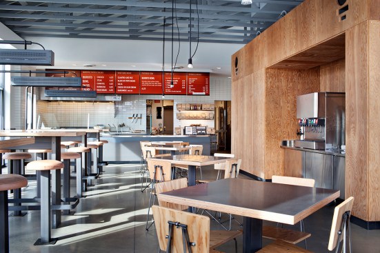
In the last few years, even the major fast food chains have redone their establishments to evoke anything from Prairie Style-extending forms (McDonald’s) to midcentury modern (Jack in the Box). Newer establishments such as Chipotle have taken the fast forms further into the realm of the Neo-Loft, exposing structure and using plywood and concrete floors to evoke a sense of urban chic.
RPBW
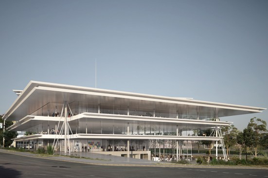
Rendering of west view.
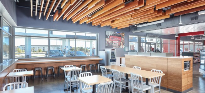
Now gas stations are getting into the act. A leader in that area has been the Des Moines, Iowa–based Kum & Go, whose new headquarters was designed by Renzo Piano, Hon. FAIA. Their latest stations, designed by BRR Architecture of Kansas City, Kan., are hipster heaven on the high plains. The ones we patronized on our trip had not only a gas pump apron that was simple (something that is fairly common these days), but their requisite convenience stores evoked lofts, with exposed metal rafters. Plywood-covered condiment stations and concrete floors, tables with tapering wooden legs, and wood slats on the ceiling to mark the eating area all sheltered in a standard box BBR broke up on the outside into cubes and horizontal planes. Supergraphics rather than pictograms showed you were you might find what you were looking for, with my favorite touch being the ampersand floating over the cashier station.
Alistair Tutton
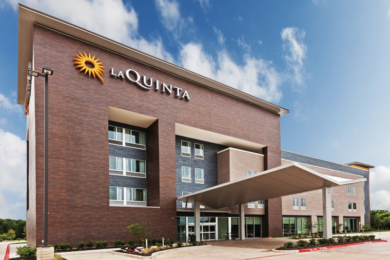
The real surprise came when we checked into a La Quinta Inns & Suites in Kansas. This is a motel chain whose name indicates its origins as an exercise in Spanish Colonial Revival, meant to give guests the sense that they were staying in something with roots and romance. The latest model, currently being rolled out across the country, is called Del Sol and, despite evoking the same Spanish Colonial heritage, it is an exercise in reduction and clarity.
Peter Christian Haberkorn
Designed by 5G Studio Collaborative in Dallas, these La Quintas take the basic four-story rectangle with between 80 to 120 rooms arranged around double-loaded corridors, and, as BRR did for Kum & Go, break it apart. They frame the area around the entrance with a protruding and higher element (I am not sure whether to call it a tower or a pavilion), adding a butterfly-roof metal-clad canopy over the door. They even dissolved the main box by breaking it into a lower front volume and a larger block in the back, while also making the fire stairs into an honest-to-goodness tower. The whole composition calms down considerably on the non-highway facing back, but all these manipulations had to have added considerable costs over the FGRC ornament festooning un-modulated boxes that are the norm in the other such inns.

Peter Christian Haberkorn
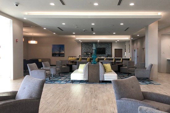
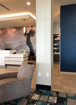
The interior continues this daring-do. The check-in desks sit in a volume that extends all the way from a bar to the left, past a series of sitting and working areas, to a wall on the right that screens off the breakfast serving space. Suspended ceilings define the various areas, and some of the floor appears to be (fake?) bamboo. All the major elements are rectangular, including the light fixtures, and area rugs emphasize the geometry with a busy pattern of squares and lines crossing. The furniture, though more traditional, is about as stripped-down as you can get without creating discomfort.
Aaron Betsky
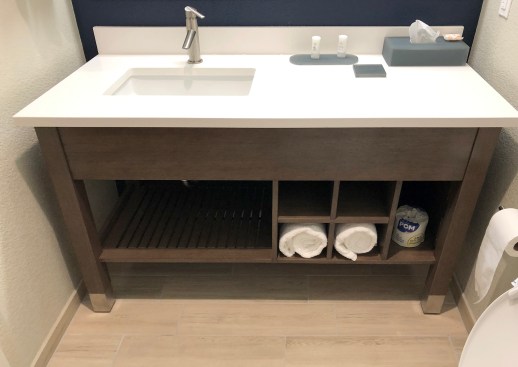
What is even more remarkable is the look of the rooms. Completely standard in layout and still with cottage-cheese ceilings, they have a few wall areas painted deep blue, others teal, simple furnishings, and a Scandinavian Modern vibe as a result of these choices. The bathrooms go Philippe Starck (the postmodern designer who changed the way we look at hotels at the Paramount, the Mondrian, and the Delano), with the sinks sitting in wood tables with the towels rolled beneath the basin and faucets that do more than a little homage to that French designer.
Aaron Betsky
You might say that this is all nothing more than styling (although of course all these companies claim that their material choices are also more sustainable than they had been in the past), but I would say that styling matters. It creates environments where all of us live, shop, play, or work (if only for a night), which signal openness, clarity, simplicity, and an acceptance of our modern realities. That is not completely true, of course: There is much that still hides behind these thin walls and dropped ceilings. It is, however, a step in the right direction, towards environments that do not try to tell us we are in another place or time, but present us with the here and now, organized and presented with panache.
The best architecture is able to take the world as it is and refine it, frame it, and make it more comfortable. To see companies and architects doing that not just in the aeries of the rich and the offices of the powerful, but along the great American road, gives me hope. It even makes me feel that the Jeffersonian ideals of democracy, embodied in the neutral grid in which all these structures are placed, still has some life that architects can nurture and extend in their designs.