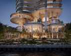
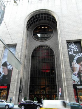
One of the strangest and strongest skyscrapers in New York is under threat. It will not be torn down, but it will be emasculated. That act might make the city a better place, but it will cost us a modern monument of note.
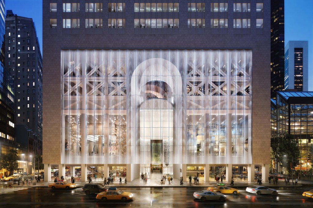
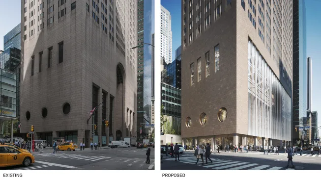
There is strange thing about historic preservation: It tends to keep buildings around that might be bad for public space. The AT&T Building, the Philip Johnson–designed pop art version of a Chippendale armoire at the scale of a corporate office block, is the latest structure to raise this issue. In decline since its namesake corporate patron left shortly after the building’s completion during the era of “Greed Is Good,” the building will, thank heavens, not be torn down but instead reborn as another home for one-percenters with a base that will, according to the renovation architects, offer an “inviting street front” with a “lush outdoor garden” replacing the always awkward mid-block passage at the rear. Designed by the Norwegian-American firm Snøhetta, the design will strip away most the building’s stone base, revealing the steel structure that has always been hiding behind the seemingly ponderous red granite skin.
The result looks dreadful in the renderings—but the base indeed appears to be more open and inviting than the current gallery, long-since filled with badly designed and unpopular stores. The redesign, however, which is already the target of street protests and letters from a Who’s Who of architects (including Robert A.M Stern, FAIA, seen holding a protest sign in front of the building), does have a logic to it, both socially and aesthetically. It lightens the building’s appearance and creates a great deal more street-level public space, but it also continues Johnson’s postmodern joke by showing that image and structure are completely separate.
So why does it seem to be so wrong?
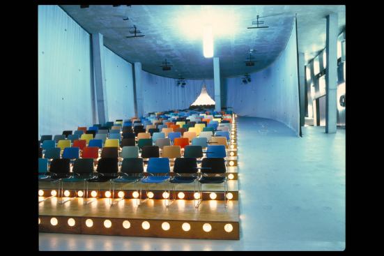
DBOX
The whole affair reminds me about my ambivalent feelings about another attack by Snøhetta on a postmodern icon: their addition to and detraction from Mario Botta, Hon. FAIA’s San Francisco Museum of Modern Art (SFMOMA). I worked at that institution for six years during the late 1990s and, although I was critical of the building’s design at first, came to appreciate it as fully representing the institution and beautifully housing its collections and exhibitions. But current thinking in the museum world says that art-oriented structures need to shed their mausoleum associations to be open, even welcoming, and should mix spaces for the display of art on white walls with accommodations for site-specific installations, performances, events (including those that generate extra revenue), and places to browse the internet while seeing art out of the corner of your eye and sipping a coffee.
Henrik Kam
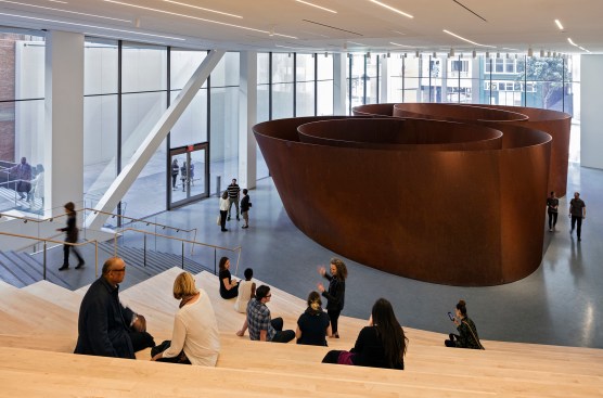
Roberts Family Gallery featuring Richard Serra’s Sequence at SFMOMA.
Snøhetta’s solution was to pare SFMOMA’s rear section, switch its main entrance to a side street so that the public could avoid the front façade’s deep and dark arcade (similar in effect, though not in scale, to AT&T’s front), and create an enclosed public space with peeks up to the galleries. They filled that semi-public space with a Richard Serra sculpture and—what seems to be a necessity for most artsy buildings these days since OMA first employed the trick in the 1992 Rotterdam Kunsthal—an auditorium-like set of steps that serves both performances and lounging, as well as as a way to get to the main floor. Moreover, Snøhetta removed the grand staircase that focused the skylit atrium at the heart of Botta’s design and replaced it with a zigzag of ascension that—I guess—enlivens the (still) rather grandiloquent space.
Hans Werlemann / Copyright OMA
Circa 1992
Though I think most of the rest of the addition is dreadful—a stack of meandering and badly scaled galleries squeezing their way around a convoluted circulation route, the whole clad-with-GRFC-panel skin meant to evoke, of all things, waves—I can understand the logic of Snøhetta’s desires to open and invite. It seems to have worked: The public has been streaming in since the addition opened almost three years ago, and recent visits showed me the hipsters populating the steps and the cafés (though not that jazzy stair) exactly as the renderings promised they would.
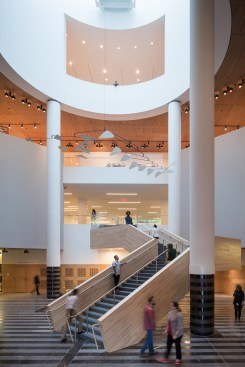
Iwan Baan
Alexander Calder’s 1963" Untitled" on view in the Evelyn and Walter Haas, Jr. Atrium at the new SFMOMA.
Snøhetta’s twin attack on monumentality makes social and practical sense. We have way too many buildings that close themselves off, impress us, lie about how they are put together, and otherwise remove themselves from the movement of people, ideas, and goods that are the reality of a democratic society. They also fit with the philosophy of a firm that (in addition to having created scores of other admirable designs) covered an opera house in Oslo with a publicly accessible hill, created one of the most successful learning spaces I have seen recently for Ryerson library in Toronto, and has taken care to organize itself as a democratic and non-hierarchical company.
So why do I feel so nostalgic for the grandeur and seeming clarity of the old SFMOMA and what remains of the AT&T Building? If I can strip away my personal attachments and memories, I think that what I (will) miss is the ability to experience power. The original SFMOMA represented the power of modern art, but also of the collectors and funders who turned this art museum into the second most important institution of its kind in the country. AT&T was a paean to corporate might, rising above us mere mortals with a soaring entrance and a top connecting it to the traditions (or at least the aesthetics) of the Founding Fathers. That these buildings had to hide their guts and made references to sources that were not really fully appropriate (a piece of furniture for AT&T, a cross between a church and a shopping mall for SFMOMA) made the force of their designs all the more present.
https://flic.kr/p/dtKTk2
Now we have art museums that claim to be community centers whose art produces selfie backdrops rather than shock and awe, and corporations that hide behind complex financial structures that make it difficult to identify who controls what and how. Their architecture represents this dissimulation. I believe that art, if it is good enough to be in a museum, should make you either wonder or enter a state of wonder. I think that corporations should be held accountable and should show themselves. I believe that architecture should contribute to these displays of power and clarity.
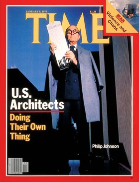
Time
On a practical note, both the AT&T Building and SFMOMA are thoroughly designed works of architecture. They are among the best works their architects ever did and their influence was substantial. They deserve our respect and landmarks protection no less than the old Penn Station did, or that the currently fashionably work of Paul Rudolph—often equally, if not more, forbidding in its presence—is receiving.
I would argue that we should leave the AT&T Building as a reminder of the power of corporations that still lurk behind the scenes, but also as an empty space that leaves us in awe, in terror, perhaps in anger. Let it be a place where homeless people shelter and commuters scurry away from the rain and snow, but also let it be a reminder that good architecture can and sometimes should do the wrong things.