If it’s a museum, it is a stack of boxes. If it is a stadium, it is either a forest of sails or a bulbous arch. If it is an office building, it is a warped tower with either an angle or a curve and a double height lobby. Or, it is just a tube that reveals some of its structure. If it is an academic building, it is a bar with an angled lobby that must have a stair/seating element. If it is a home –another bar for the bedrooms, a higher living room element, and some angled element, usually in the roof, that refers to supposed local vernacular. If it is a hospital, you get a bigger box with another expressive element, usually leading to a skylit area for patients to wait it out. We are reverting to type.
It is remarkable how easy to predict what new buildings will be when their competitions or programs are announced. For all the experimentation and all the new technologies we have focused on solving building problems and doing….something…with the opportunities buildings offer that might make them somehow more distinctive, beautiful, or just better as places to use, we seem to have decided a number of years ago that there really is one way to address any particular problem. Copy paste repeat.
At the Ecole des Beaux-Arts, the French school that ruled the architecture education roost for well over a century starting at the end of the eighteenth century, they engaged in scientific inquiry, or so they said, to come up with “types” or answers to the limited programs and institutions that true architecture had to address. When new types such as railroad stations or apartment buildings appeared, the teachers and theoreticians developed approaches for them based on what was already on hand: a railroad station became an urban palace with a greenhouse at the back, while an apartment building was that same dwelling stretched out as high as it needed to be to satisfy the developer.
Architects, of course, rebelled, and continue to do so. They felt that there must be other ways to organize and express these functions, especially those that were new. Moreover, technologies such as steel, mass-produced glass, and concrete were making different and larger spaces possible. Finally, what self-respecting architect wanted to follow rules set by a previous generation? After all, the designer was a genius who could produce much better –more interesting, more appropriate, more exciting—forms than what was already built. For over a century, that tensions between type and style, set forms and innovation, and logic and experimentation, has ruled architecture.
What has changed recently is, I believe, that the notion of type, which has always continued to lurk behind any architecture that appeared innovative, has become embedded in such a mass of codes and regulations, building practices, and modes of utilization as to make the choices architects have extremely limited. Hence the concentration, which I have noted before, on those lobbies as the one place where something different and expressive is possible. Façade treatments are the other place of paper-thin creative freedom. In larger buildings, such as those office buildings, with repetitive elements that need to differentiate themselves in the market and sometimes address special zoning, load, or environmental conditions (earthquakes, winds), some twists, turns, and angles are possible. Try something different, and the hospital specialists will tell you only one floor plan is possible or the zoning board will tell you your envelope just doesn’t fit.
Only stadia, where the need to move and house large groups of people, cover them without interrupting their sightlines, and creating a civic object that also brands the sports organization housed in these bulging behemoths, would seem to offer the architect a chance to kick out the jams. So why do almost all stadia now look the same? Because engineers have figured out how to optimize structure and circulation, because the mass marketing of sports has developed an image of what you can expect in such structures and, finally, because only a few firms design almost all the sports venues.
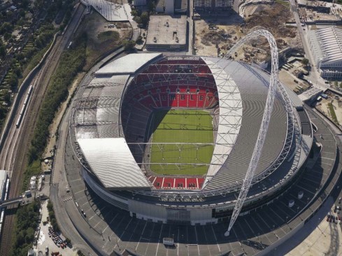
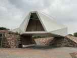
Flickr via 準建築人手札網站 Forgemind ArchiMedia.
Wembley Stadium by Populous and Foster + Partners.
That last point actually offers the built-in counterpoint to the reversion to type that is all around us. Populous designs stadia in certain ways, and Foster or Herzog & de Meuron do them in other ways.
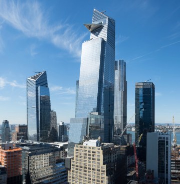
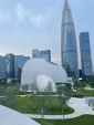
10 and 30 Hudson Yards by KPF.
The designer’s style, in other words, distinguishes an office building by Bjarke Ingles from that by Kohn Pedersen Fox. A building by Diller Scofidio + Renfro will has a distinctive appearance no matter what it’s type might be.
Even then, the typology of typologies is so limited that variation can be difficult to find. Sometimes this is because of the complexity of programs, which is the usual excuse for hospitals’ deadly sameness. As a former museum director, I know reasonably well how that art exhibition type works. I know that the galleries seem to demand to be boxes, and that the sequence of public spaces is pretty invariable. The most radical gestures possible, whether they are Libeskind’s angles in all his equally similar museum designs, or the elimination of much of the public drama in Sejima’s New Museum or Piano’s Whitney Museum, rarely work out well for either users or aesthetic pleasure.
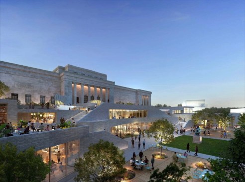
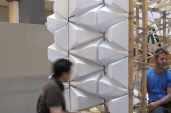
Studio Gang via Malcolm Reading
Nelson Atkins Competition entry by Studio Gang.
Take the current proposals for an addition to the Nelson Atkins Museum in Kansas City. Meant to mirror the wing designed by Steven Holl and built in 2007, the finalist proposals have none of the sculptural beauty and quirky genius of the Holl structure. In some ways, that’s a good thing: not all the spaces Holl designed worked particularly well. Yet, I cannot help but feel that the new addition’s architecture will be a sad comedown from one of the most thrilling museum experiences this country has to offer.
What gets you out of this rut is, ironically, to reuse existing buildings in imaginative ways. The conditions you find will force variations, although the latest spate of museum renovations seem to also have found a type: the deep trench cut through the museum complex,
The current hope is that AI will help loosen some of these webs of logical and functional restrictions we have built around our buildings. Yet, as I watch students and young architects experiment with those tools, they seem to only affirm what we already know and do. Your layout possibilities are limited, your spatial opportunities restricted to a few choices about what goes left, right, up or down around a snazzy atrium, and the façade the place where you can mine the past, apply new materials, express the client’s or site’s character, or just have fun. Beyond that, there is extreme abstraction, which undresses the building to its bare minimum or diagram, or, by contrast, extreme historicism, as in some of the proposals for Penn Station.
I certainly hope that architects will continue to fight to make their work different. Every museum building, hospital, stadium, or housing project that confirms the way things just work also confirms current political, economic, and social power relations. You might not be able to start a revolution through architecture, but at least you can show that other worlds, modes of living and working together, and just being are possible. This remains the task of architecture beyond organizing the elements of building.
The views and conclusions from this author are not necessarily those of ARCHITECT magazine.
Read more: The latest from columnist Aaron Betsky includes reviews of: Book on Frank Israel | Legacy of Ric Scofidio| Fredrik Jonsson and Liam Young | DSR’s New Book | the Stupinigi Palace | Living in a Diagram | Bruce Goff | Biopartners 5 |Handshake Urbanism | the MONA | Elon Musk’s Space X | AMAA | DIGSAU | Art Biennales | B+ | William Morris’s Red House | Dhaka | Marlon Blackwell’s new mixed-use development | Eric Höweler’s social media posts,| Peter Braithwaite’s architecture in Nova Scotia,| Powerhouse Arts, | the Mercer Museum, | and MoMA’s Ed Ruscha exhibition.
Keep the conversation going—sign up to our newsletter for exclusive content and updates. Sign up for free.