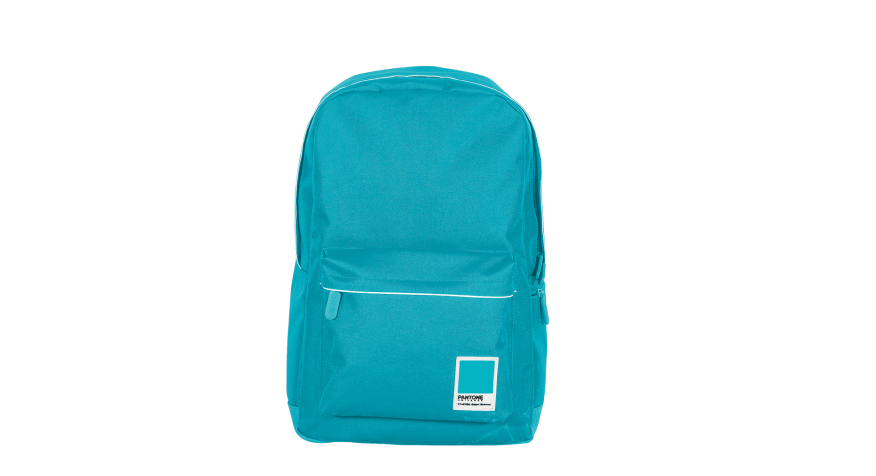
Pantone Universe Bags, Redland London
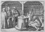
British designer Max Roberts enjoys fiddling with subway maps—in some cases making them easier to follow, and in others just adding to the confusion. “I’ve deliberately designed maps that are deliberately horrible to look at,” he told CityLab in 2013. However antithetical that seems, his rogue cartography highlights the broader need for good design for public transportation. (Though that didn’t stop him from tinkering with Massimo Vignelli’s iconic 1972 map of the New York City subway system, as shown above.) More recent work includes a Frank Lloyd Wright–inspired rendition of Chicago’s elevated train system. tubemapcentral.com
Speaking of subways, Swiss watchmaker Mondaine updated its classic Helvetica No1 edition with a new design that pays homage to the New York City transit system. A black strap and facing contrast white numerals and colorful stitching in the Swiss company’s ode to Gotham and the ever-versatile typeface that binds them. (More on Helvetica, Swiss design, and New York’s subway.) mondaine-usa.com
French industrial designer Inga Sempé drew on the form of her earlier creation for the Italian homewares brand, an elegant serving spoon, in this minimalist line of flatware and cutlery. Collo-Alto is named for the Italian term for “long neck,” a feature subtly achieved in the narrow, elongated connection that balances the weight of each piece’s head and handle. alessi.com
Your plastic and stainless steel drawing implements will feel the burn of being replaced with this hoity etched brass set. Cut from a single sheet of the material, the package includes a ruler, protractor, set square, and paper clips with etched measurements. Now if only they worked with BIM. poketo.com
For more gift ideas for you and yours, check out the 2015 ARCHITECT Gift Guide.