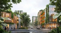
Office design has evolved significantly from the Dickensian counting houses of the 19th century, informed in no small part by an ever-growing body of workplace research. Yet today’s offices tend to be generally uninspiring places. The soul-sucking atmosphere of the modern cubicle farm is a widely accepted phenomenon and the subject of parody in popular media the likes of “Dilbert” and Office Space. Our supposed savior, the open-plan layout, isn’t doing much better. Roughly 70 percent of today’s offices have an open floor plan, and studies of experiences in such spaces reveal higher rates of illness and distraction that often exceed whatever benefits come from working shoulder to shoulder. It wasn’t supposed to be like this. Explains author Nikil Saval in Cubed: A Secret History of the Workplace (Knopf Doubleday, 2014), “offices were never meant to be icons of tedium,” but rather “the source of some of the most Utopian ideas and sentiments about American working life.”
The modernization of the workplace throughout the 20th century reveals a slow Balkanization of design disciplines. The more open the spaces have become, the greater the perceived separation between the container and the contained. This has resulted in “a massive migration of problem-solving from architecture into office furniture,” explains British architect Frank Duffy in author Stewart Brand’s How Buildings Learn: What Happens After They’re Built (Penguin, 1995). The flexible, column-free work environments ushered in during the 20th century were intentionally generic, with settings defined by characterless acoustic ceiling grids, fluorescent lighting, and modular carpet tiles. Since then, design attention has shifted to focus on furniture solutions, fueling the commercial success of manufacturers like Herman Miller, Knoll, and Steelcase. Materials-wise, the wood-paneled and coffer-ceiling rooms of workspaces past have given way to the re-configurable tabletops and fabric-wrapped panels of today’s modular office furniture. This approach has unintentionally prioritized adaptable micro-environments while downplaying the importance of place. As a result, the imperative for design innovation is now placed on mobile elements rather than on the space they occupy.
A set from AMC's "Mad Men," which explores midcentury office culture and features prominently the open-yet-staid office plan that encouraged the design focus on office furniture systems.
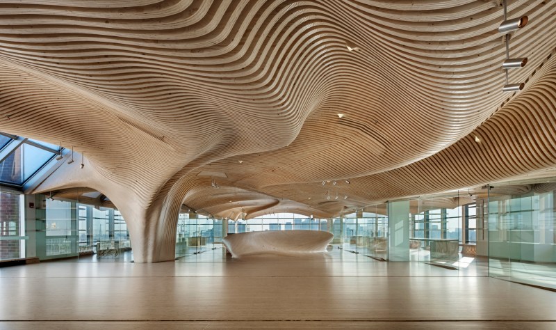
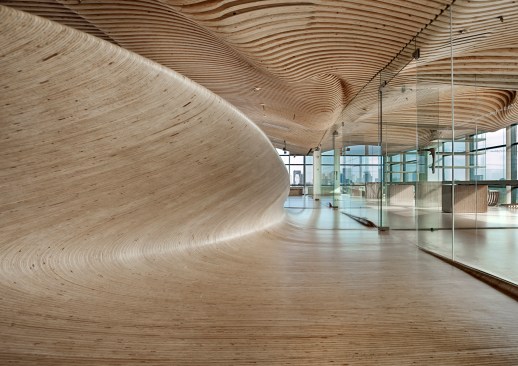
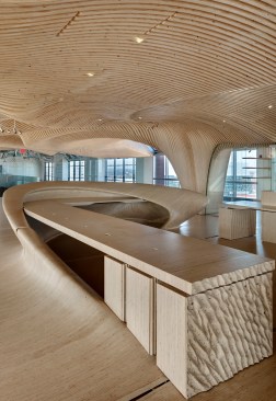
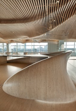
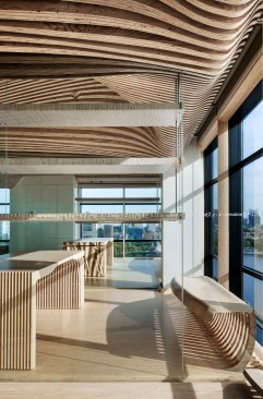
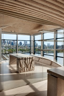
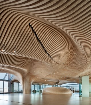
I’ll explore a third example of this trend, the Boston-based DECOi Architects’ local project One Main, in greater detail. The 10,000-square-foot space is enveloped in undulating waves of digitally milled plywood that shape both the interior architecture and the furniture. Designed for a green-building and clean-energy investor, One Main was inspired by DECOi principal Mark Goulthorpe’s previous installations In the Shadow of Ledoux (1993) and the Galerie Miran (2003), each composed of layers of milled plywood.
Anton Grassl
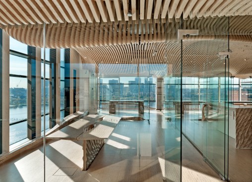
Aiming to distinguish itself from its industry competitors, the client requested a bold environmental statement that would be clear to visitors as soon as they stepped out of the elevator. Goulthorpe interpreted this directive by creating a gesamtkunstwerk of sustainably forested spruce laminated plywood. The formally exuberant design assimilates multiple conventionally separate elements into a cohesive whole: the ceiling distends downward to form a column, for example, while the floor swells upward to create a reception desk. “The goal was to execute as much of the interior as possible using this natural material,” Goulthorpe says, “and to displace as many fixtures and fittings as possible by directly milling things like ventilation grilles, light cowlings, and door handles, as possible—even eliminating any other armature for the glass walls by embedding the glass directly into milled slots in the ply-lam.”
Anton Grassl
Anton Grassl
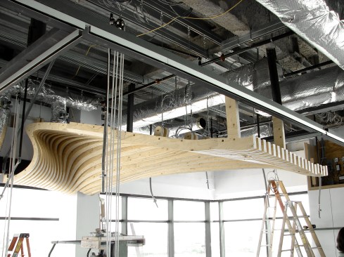
The biggest challenge was developing and executing the custom computer-aided design and manufacturing protocols required for the complex spruce ply geometry. “We wrote scripts to fully automate the production of all the tool paths,” says Goulthorpe, adding that the role of the architect became a “critical part of the fabrication protocol” since the milling machines were all piloted from DECOi’s files. “The risks we took were not only that our efforts to code the project would fail, but that the front-loaded time necessary to produce the code would slow down the project to such an extent that the various project stakeholders would become too frustrated with the speed of progress,” said Matt Trimble, principal at the Boston-based consulting firm Radlab, who helped code the design with collaborating project architect Raphael Crespin. Initially the client was unhappy with how long it would take to finesse this part of the process, requiring the team to work a series of late-night shifts. “Once attained, [the process] was remarkably effective, generating files overnight,” Goulthorpe says.
Construction was relatively painless, and the onsite team was enthusiastic and determined to achieve a high-quality result. “Once we had mastered how to manipulate the large elements, it became very efficient to install with a skeletal team,” Goulthorpe says. And with only two trades involved—a millwork shop and a glass installer—the job afforded contractual simplicity.
DECOi Architects
Anton Grassl
Certainly the material approach to One Main’s thoughtfully crafted interior is one way to reinforce the corporeality of place while differentiating client identity. To make a difference, therefore, architecture must not only facilitate users’ activities but also create meaningful destinations. Office design should not focus on making a better cubicle but rather on ensuring that the workplace is an environment that employees would choose freely above others—a place in which they are inspired to do their best work.
Anton Grassl
Anton Grassl
Anton Grassl