Few objects in modern design have achieved the strange status of Alvar Aalto’s vase. It is simultaneously a piece of tableware, a sculpture, a souvenir of Finnish modernism, and one of those rare objects recognizable almost entirely by silhouette.
Ninety years after its creation, that silhouette is being asked to do something new: become a city.
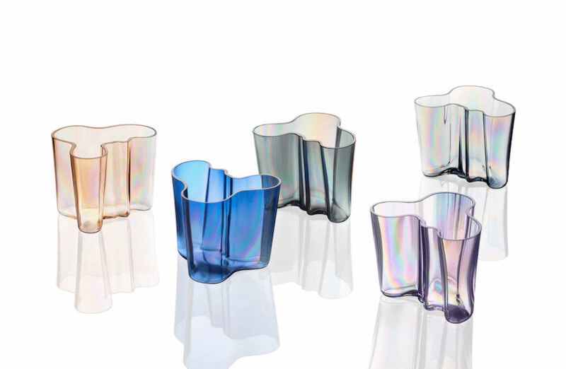
To mark the vase’s 90th anniversary, Iittala has created the Aalto 90 City Vase Collection, a limited-edition series inspired by six cities with particularly strong design identities: Helsinki, Tokyo, Amsterdam, Copenhagen, Berlin, and New York. Each takes Aalto’s familiar undulating form and gives it a different color and character intended to evoke its namesake metropolis.
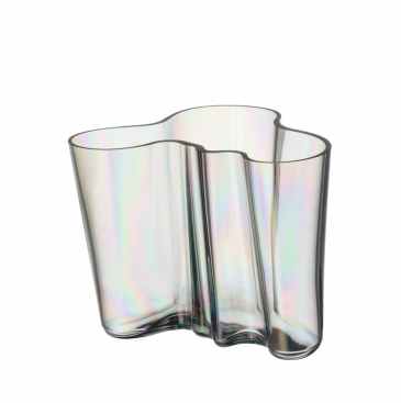
Helsinki Aalto vase.
Berlin becomes ultramarine blue. Tokyo is lilac. Helsinki is pale grey. Amsterdam goes dark grey. Copenhagen is warm brown. New York, perhaps appropriately for a city increasingly defined by glass, is clear.
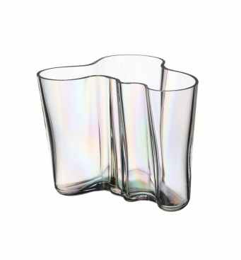
New York Aalto vase.
It is an intriguing exercise in translating urban identity into an object. How do you reduce something as sprawling and contradictory as Berlin or New York to a single color? And what happens when one of the most enduring objects of 20th-century Scandinavian design becomes a canvas for representing cities thousands of miles from the place where it was created?
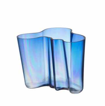
Berlin Aalto vase.
The collection also underscores something remarkable about Aalto’s vase itself: after nine decades, it remains sufficiently open-ended to absorb yet another interpretation.
A Vase That Refused the Straight Line
When Aalto developed the vase in the 1930s, its fluid contours represented a striking departure from the geometry that had come to define much of European modernism. Instead of the straight line, the grid, or the machine-made appearance of industrial production, Aalto offered something irregular and organic.
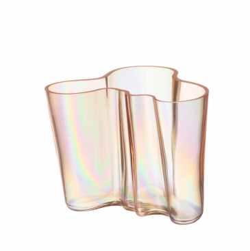
Copenhagen Aalto vase.
The vase became one of the most recognizable expressions of his broader approach to modernism—one in which nature, material, craftsmanship, and human experience complicated the movement’s harder-edged rationalism.
Its outline has subsequently become almost inseparable from Finnish design itself.
The new anniversary collection doesn’t alter that fundamental form. Instead, it uses surface and color to change the way the object is perceived. The vases are mouth-blown in Finland and given an iridescent lustre finish developed specifically for the anniversary year. As light moves across the glass, the surface changes with it, creating reflections that Iittala uses to connect the static object with the movement and atmosphere of a city.
The premise is less about literal representation than association. These are not skylines etched into glass or architectural landmarks transformed into decorative objects. Instead, each city is reduced to a particular mood.
Berlin Is Blue. Tokyo Is Lilac.
Berlin receives perhaps the collection’s most emphatic color: ultramarine blue with a lustre effect.
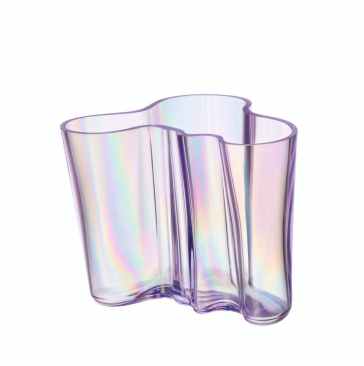
Tokyo Aalto vase.
“Berlin is a city of contrasts. Creative energy meets historical depth; innovation rises from resilience. The Ultramarine Blue reflects Berlin’s bold, ever-evolving identity. Deep and modern, it echoes the city’s creative pulse and its endless capacity to reinvent itself. Like the Aalto form, Berlin’s beauty lies in its fluidity, never static, always forward-looking.”
Tokyo is interpreted more delicately, through lilac glass.
“A colour of serenity and subtle strength, Lilac mirrors Tokyo’s unique harmony between tradition and future. From cherry blossom hues to neon-lit nights, it embodies the city’s delicate balance of nature and technology. The Tokyo vase celebrates this refined contrast: soft yet sophisticated, calm yet vibrant, just like the rhythm of the city itself.”
There is an inevitable amount of romanticization involved in these descriptions. No color could reasonably encompass cities of millions of people, much less their architectural, social, and cultural contradictions.
But that simplification is also what makes the experiment interesting. The collection isn’t really documenting cities. It is revealing the visual shorthand through which contemporary design culture imagines them.
Berlin becomes reinvention. Tokyo becomes a negotiation between technology and tradition. Copenhagen is warmth and sociability. Helsinki is quiet and elemental. New York is transparency and motion.
They are cities transformed into design archetypes.
Helsinki Comes Home
Helsinki may be the most natural pairing in the collection. Aalto’s work is deeply embedded in Finnish cultural identity, and the vase’s relationship to the city is therefore less imagined than inherited.
For Helsinki, Iittala chose grey with a lustre finish.
“Helsinki’s design language is rooted in simplicity, nature and light. The Light Grey tone captures the Nordic calm and the ever-changing atmosphere of the capital: the mist over the sea, the pale winter skies, the quiet strength of Finnish minimalism. It’s a reflection of home. Understated, balanced and beautifully timeless.”
That final phrase—“a reflection of home”—distinguishes Helsinki from the other editions. Here the anniversary vase isn’t traveling outward so much as returning to its origins.
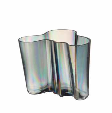
Amsterdam Aalto vase.
Amsterdam receives a darker grey, intended to recall its canal houses, iron bridges, and northern European light.
“Refined yet relaxed, Dark Grey captures Amsterdam’s modern poise; the quiet elegance of canal-side architecture, cast-iron bridges, and moody North Sea light. It reflects a city that balances heritage with forward thinking: understated, human-scaled, and effortlessly contemporary.”
Copenhagen, meanwhile, becomes Rio brown—a substantially warmer proposition.
“Warm and welcoming, Rio Brown evokes Copenhagen’s timber tones, coppery rooftops at sunset, and café-lit streets. It’s a hue of connection and craft, echoing the city’s love of natural materials, convivial living, and design that feels good in the hand and at home.”
Together, the three northern European interpretations suggest how closely contemporary ideas about cities have become tied to material and atmosphere. Helsinki is mist and sky. Amsterdam is iron and water. Copenhagen is timber, copper, and café light.
Architecture isn’t represented through buildings so much as through the sensory memory of being among them.
New York Becomes Glass
Then there is New York.
Instead of attempting to assign the city a defining color—a nearly impossible proposition—Iittala essentially removes color altogether. The New York edition is clear glass with the anniversary lustre effect.
“Bold, open, and endlessly reflective, this vase captures New York’s essence as a city of possibility. Transparent yet powerful, it mirrors the verticality of glass skyscrapers, the shifting light of avenues at dawn, and the layered stories visible through every window. The lustre finish adds movement and energy, echoing the city’s constant motion — never still, always becoming.”
Of all six editions, New York’s interpretation may be the one most explicitly connected to architecture. Its transparency evokes the glass curtain walls that transformed Manhattan’s postwar skyline and continue to define much of the city’s contemporary architecture.
But the choice of clear glass is also conceptually useful. New York has always been difficult to reduce to a single identity precisely because reinvention is one of its defining characteristics. A transparent vase changes according to what surrounds it. Light, objects, interiors, and people are visible through it.
In that sense, the object becomes less a portrait of New York than a frame for it.
The New York edition will also be the most geographically specific American release. It launches July 7 and will be available exclusively through the MoMA Design Store in New York.
From Modernist Experiment to Collectible
The anniversary collection inevitably raises another question about what happens to modern design icons as they age.
Objects originally associated with experimentation eventually become classics. Classics become museum pieces. Museum pieces become collectibles. And collectibles become platforms for anniversary editions, new colors, collaborations, and reinterpretations.
That trajectory can easily descend into nostalgia.
Yet Aalto’s vase has proved unusually resistant to becoming a historical relic, in part because its identity has never depended on a single material effect or decorative treatment. Its defining characteristic is its shape, and that shape can accommodate continual variation.
The City Vase project exploits precisely that flexibility.
Rather than redesigning the vase for its 90th birthday, Iittala changes the atmosphere around it. The familiar object becomes a device for talking about geography, cultural identity, and the ways cities acquire visual personalities.
The collection is also emphatically physical. At a moment when sophisticated manufacturing can produce objects with extraordinary precision, each vase continues to be mouth-blown in Finland. The anniversary lustre adds another layer of unpredictability, allowing reflections and changing light to become part of the design.
That combination—an established industrial-design icon still dependent upon glassmaking craft—is central to the vase’s longevity.
Ninety Years, Six Cities, One Shape
The Aalto 90 Anniversary Edition City Vases are limited editions, each carrying a special anniversary stamp on its base. Most of the collection launched June 10, 2026, in the markets associated with their respective cities, with broader availability through Iittala’s website. The New York edition followed on July 7 exclusively at the MoMA Design Store, while the Tokyo edition, available only in Japan, is scheduled for later in autumn 2026. The recommended retail price is €390.
The scarcity is part of the proposition: these are as much collectibles as functional vessels.
But the more interesting story is not that a famous vase has received six new finishes for an anniversary. It is that a design created nine decades ago remains culturally legible enough to carry all these new associations.
Aalto’s vase has survived dramatic changes in architecture, domestic life, manufacturing, taste, and technology. It emerged before the glass towers that now define New York’s skyline, before Tokyo became synonymous with the collision of neon technology and tradition, and before Copenhagen’s particular brand of convivial Scandinavian design became an international lifestyle ideal.
Those cities have changed almost beyond recognition.
The vase hasn’t.
And perhaps that is what makes the collection compelling. Rather than redesigning an icon to make it contemporary, Iittala allows the contemporary world to gather around it. Six cities become six surfaces. Ninety years of design history remain contained within the same wandering line.