
London Olympic Games' font and logo
Did you realize that that was the world’s largest Damien Hirst that dancers were dancing on during the Olympic Games closing ceremony? For that matter, did you ever notice the Zaha Hadid architecture curving around the divers and swimmers at the Aquatic Center? Do you remember that the Olymmpic Park’s site plan, designed by Foreign Office Architects, was to be a model of landscape urbanism? Somewhere deep inside the Olympics there was art and design, but you would have had a hard time finding it on television.
There was, of course, the cauldron. Designed by maverick Thomas Heatherwick, who has created everything from extruded benches to the new London double-decker buses, the cauldron consisted of a spray of copper petals that came together into a mass of many stemmed candles, before opening up again at the closing ceremony. Heatherwick is great at gizmos, but his sense of proportion leaves something to be desired, and his cauldron left me strangely cold.
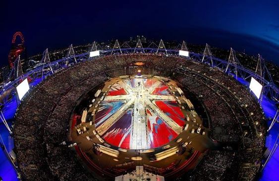
There was also the ArcelorMittal Tower, Anish Kapoor’s mass of twisted, red-painted metal rising up right next to the Olympic Stadium, but only visible in the occasional helicopter shot as NBC hurried to catch the next American triumph. There was the Olympic Stadium itself, by Populous, but what I could see of its jaunty juts of steel trusses seemed to match the utter horridness of the Games’ graphic design for useless athleticism in the service of bad branding.
What particularly upset me about the games (which I along with millions of others, enjoyed DVRing) was the way in which it seemed to reinforce the idea that the new is bad and the old is good. Whenever NBC took its eye off the pursuit of the prize, it focused on the grandeur of London’s past, ignoring the wonders of contemporary art, architecture, and design that have dotted the city in the last few decades. Did you realize that the open water swimmers passed the Lady Diana Memorial and the Serpentine, with its pavilion by Herzog & de Meuron and Ai Weiwei, six times? You wouldn’t know it from what you saw on television.
The irony was that while youth and its achievements were on display in the competitions, old age dominated and tired ideas dominated everything that surrounded their achievements. From the glorification of England’s past to the aging rock stars and boy banders who tried to strut during the ceremonies—the games, through the filter of the mummified NBC anchor presenter, American coverage, and British staging gave the message that the best days were over.
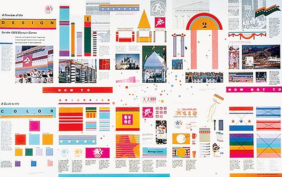
It did not have to be this way. The United Kingdom is home to some of the world’s greatest designers and artists in almost every field. Some of them even worked on the Olympics, only to have their work trampled, such as Hirst’s spin-painted Union Jack, by the athletes and the coverage. The lessons of the Los Angeles Olympics, which unified Southern California with not much more than a judicious use of paint and cardboard tubes in Jon Jerde’s and Deborah Sussman’s design, seem to mean nothing. Instead, the United Kingdom spent billions and all it got in return was a few more gold medals than usual.
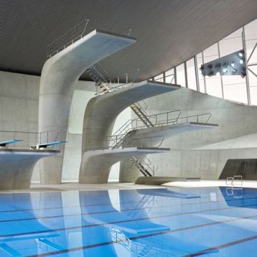
Soon they will take the protruding wings off Hadid’s swimming center, leaving its curving forms exposed. They will find ways to reuse the park, or so we hope. Those graphics will be scraped off and thrown in the trash, where they belong. Then London can go about its business, picking up the few pieces the Olympics have left them, and we can look forward to Sochi, Russia’s Winter Games in two years. Don’t hold your breath, though: the Olympics are descending further and further into visual and spatial mediocrity even as we see more and more of better and better performances in higher and higher definition.