A couple of decades ago, I had a boyfriend who liked to work at McDonald’s. He didn’t flip burgers for the global fast-food giant; rather, he adopted it as his version of Starbucks. He’d sit at a table with his computer for hours, absorbing caffeine from a monumental Diet Coke, maybe munching on some fries. At the time I was mystified by his habit, but I recently experienced a much-belated glimmer of empathy. In early September, I had a leisurely lunch at the new McDonald’s flagship in the River North neighborhood of Chicago, which has long been a stronghold of flamboyant chain restaurant architecture.
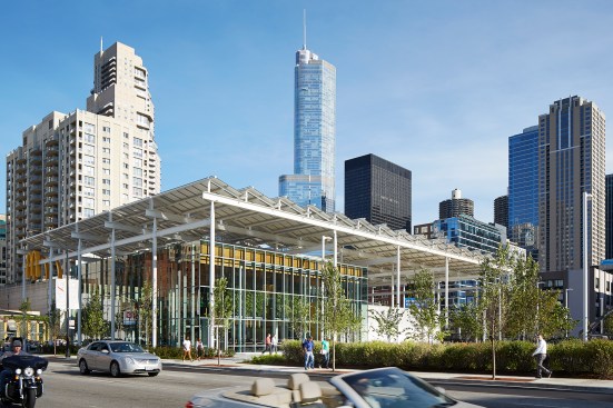
The new McDonald’s, a sparkling 19,000-square-foot-glass box, is a dramatic replacement for the Rock ’n’ Roll version of the franchise that previously occupied the site. It is a surprisingly exuberant work of architecture. Ross Barney Architects, whose offices are five short blocks away, designed the building in close cooperation with the McDonald’s creative team and Sydney-based interior design firm Landini Associates, which has been conjuring up a future-forward version of the hamburger purveyor, mostly in Australian and Asian cities, since 2014.

Kendall McCaugherty/Hall+MerricK
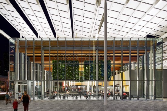
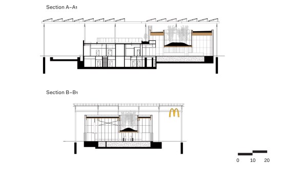
The light-filled dining area, which features 27-foot-high ceilings
I visited on a bright afternoon and found myself in an arcade of touch screens, mounted on posts around eye level. I’d describe them as hamburger ATMs, although McDonald’s regards the setup as “kiosk ordering.” I chose a Filet-O-Fish meal, found a place to sit, and waited for my sandwich, fries, and Diet Coke to be delivered to my table. It didn’t take long.
As novel, and oddly luxurious, as the kiosk/table service combination seemed to me, it’s not unique to this location; the new system has been rolled out in more than a third of the 14,000 McDonald’s in the United States. The real attraction, however, is the dining area, an epic, light-filled room beneath a 27-foot-high wood ceiling. Visible outside through the windows is a branch of the Rainforest Café with a giant frog on the roof, and a Hard Rock Cafe designed by Stanley Tigerman, FAIA, in high 1980s PoMo style, with a sign in the shape of a monster-sized, illuminated electric guitar. Nevertheless, as I ate my Filet-O-Fish, I felt as though I’d been transported from the American Midwest to Scandinavia. All around me were elemental-looking modern chairs and tables. Some longer tables were lined with lovely minimalist stools that have wire-frame legs and upholstered plywood seats. (The furnishings are mostly from a Landini design package known in-house as “Ray,” for McDonald’s founder Ray Kroc.)
Kendall McCaugherty/Hall+MerricK
Solar panels generate 60 percent of the building’s energy
The space struck me as remarkably generous. It was also uncommonly quiet on the day I visited. The ambient music was so soft that I could hear a gentle murmur of voices. I later learned that the low volume of the music was an accident, a sound system malfunction. Still, my fellow customers seemed to be on best behavior (no intrusive cellphone monologues), as if they were in a library or a shrine. The effect was magical.
As I savored my fries and Diet Coke, I considered the question of what this building represents. Or, as I scribbled in my notebook: “Like who is this for?”
Building on a Chicago Connection
At the Ross Barney offices, on the top floor of a building that formerly housed the firm of legendary Chicago architect Harry Weese, I asked architect Max Carmona, AIA, the McDonald’s senior director of global design and development, what the company expected from its new flagship. “There’s a couple of things,” he said. “One is that it had to be impactful. It had to speak to the future of our brand.”
“While we’re really proud of our history,” Carmona continued, “we’ve got to evolve. We’ve always talked about not being Howard Johnson’s,” he said, referencing the nearly extinct restaurant chain that once dominated American highway rest stops.
Kendall McCaugherty/Hall+MerricK
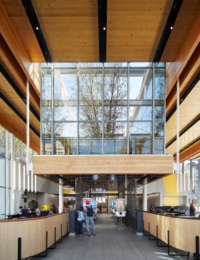
Birch trees on the roof rise above digital kiosks that customers use to order
The building is also intended to reaffirm the brand’s connection to Chicago. McDonald’s drive-in restaurants first appeared in Southern California in the late 1940s, but the corporate empire was launched in Chicago in the 1950s by Kroc, who aggressively franchised the limited menu/speedy service concept. In 1971, McDonald’s relocated its headquarters to suburban Oak Brook, Ill. Now, like many American corporations looking to attract a younger workforce and rejuvenate the office culture, McDonald’s has returned to the city. Earlier this year it moved into a newly constructed office building in Chicago, on the former site of Oprah Winfrey’s Harpo Studios. The headquarters has a restaurant on the ground floor, open to the general public, which features McDonald’s menu items from other countries.
Carmona points out that the corporation could have made a lot of money selling the Rock ’n’ Roll site, which is in a neighborhood teaming with new luxury rental and condo towers. Instead, McDonald’s CEO Steve Easterbrook “felt it was really critical, especially with our new headquarters in Chicago, to make a statement,” Carmona explains. “It’s the closest flagship restaurant to the global headquarters that we have. It was really important to do it right.”
Kendall McCaugherty/Hall+MerricK
McDonald’s considered hiring John Ronan, FAIA, who designed the luminous Poetry Foundation building in Chicago, or David Woodhouse, FAIA, whose Robert Crown Community Center in Evanston, Ill., contains the most photogenic gymnasium imaginable. “They interviewed colleagues of mine that I really respect,” says Carol Ross Barney, FAIA, best known for her work on the Chicago Riverwalk. “But we competed and we won.”
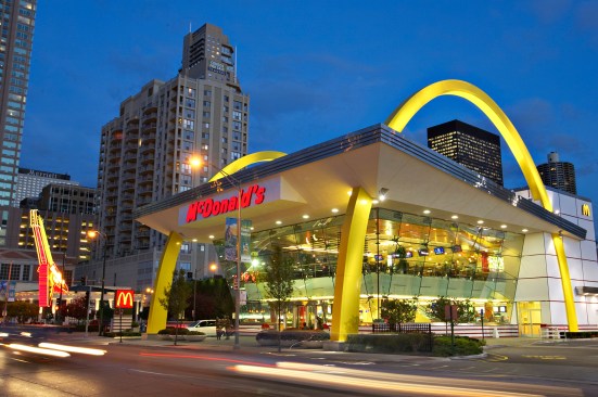
The firm was on a tight schedule. The building was designed and built within the space of a year. The original Rock ’n’ Roll outpost, constructed here in 1983, had sported a red mansard roof; a more recent model, which was built in 2005 and demolished last year, represented what Ross Barney describes as the “supersized era.” It was a 1950s-style McDonald’s pumped up to epic proportions, demarcated by 60-foot-tall golden arches.
Kim Karpeles
The Rock ’n’ Roll McDonald’s that was demolished last year

Bruce Leighty
A 1955 prototype McDonald’s, which inspired the 2005 Rock 'n' Roll version
McDonald’s made a conscious decision to turn its back on kitsch, however, and embrace a set of principles that are curiously new age. The corporate players on the design team crafted a set of goals, including “pure simplicity,” which is defined as “a functional, restrained, quiet use of shape, form, and color that allows the experience to shine.” They also were looking for “enduring authenticity,” “inviting warmth,” “surprising delight,” and “genuine informality.”
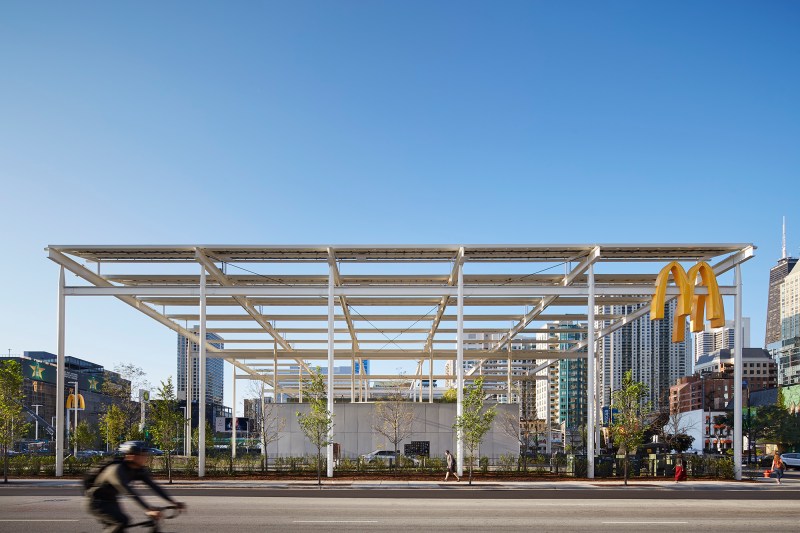
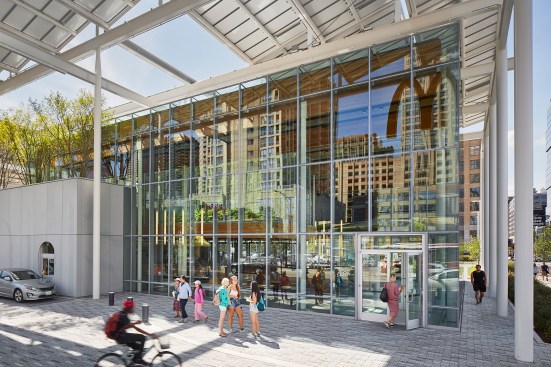
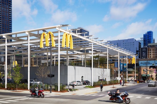
The corporation plans to update all of its U.S. stores, some in the techno-chic style of the outposts in Hong Kong and Sydney. The Times Square McDonald’s in New York, for instance, will reopen in December with a version of the “Ray” look. In Chicago, the flagship reflects this newly dialed-down approach to branding. Relatively dainty golden arches are mounted high on the Clark Street corners of the restaurant’s shade structure, a massive pergola supported by steel columns. A white steel colonnade topped by a sawtooth roofline has, in this particular location, usurped the primacy of the arches and become the trademark.
Kendall McCaugherty/Hall+MerricK
To some extent, Ross Barney took design cues from Landini’s cool approach to the brand, but she knew that there needed to be a big gesture. “We still had to hold this block down. It couldn’t look abandoned in the middle of the city.” The shade structure, she contends, “gives it an urban footprint which you appreciate when you see it compete with the frog and the guitar.”
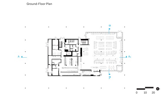
Ross Barney’s experience designing public space clearly colored her approach to the project. The firm conducted a study of green space in River North and realized that there wasn’t much of it. The architects determined that the best thing a new McDonald’s could do was to provide a bit of greenery in a rapidly redeveloping neighborhood that’s short on parks. They planted additional trees in and around the parking lot (which is covered with permeable pavers) and created a grassy outdoor play area. The shade structure covers part of an adjacent “park,” where diners can sit at a giant communal picnic table (which might double as a stage). And, working with a local green roof expert, the firm installed a quartet of birch trees in a glass box above the digital kiosks, planted apple trees, broccoli, and Swiss chard elsewhere on the roof, and used a hanging green “tapestry” to symbolically divide the big room. Including the roof, the site now boasts more than 10,000 plants. It’s an exaggeration to call the outdoor space a park, but it aspires to be one.
Kendall McCaugherty/Hall+MerricK
For all the site’s sustainable features, it still includes a drive thru
More than Just a Glass Box
In its critique of the new flagship, Chicago magazine likened it to the city’s other glass box du jour, the Foster+Partners-designed Apple Store (Ross Barney also played a role in that project), and lamented what was lost in the redesign: “The Rock ’n’ Roll McDonald’s kitschiness once fit perfectly into its stretch of River North.”
But the new building wants to be more than just a glass box. It’s a jumbo sci-fi energy-saving machine, a physical manifestation of the corporation’s best intentions. Despite the fact that methane emissions from cattle are a major contributor to climate change, or maybe precisely because it’s in the hamburger business, McDonald’s has lately become very serious about sustainability. The company is a convener, for example, of the “NextGen Cup Consortium and Challenge,” a concerted effort to design a truly recyclable or compostable single-use coffee cup. It has also affirmed a commitment to the reduction of greenhouse gases mandated in the Paris Agreement, even as our political leaders have backed out.
Courtesy Ross Barney Architects
Courtesy Ross Barney Architects
With the flagship project, Ross Barney worked hard to specify materials that reduce the building’s carbon footprint. The ceiling, for example, is made of cross-laminated timber. “It’s sort of like plywood on steroids,” she says. The firm also used “carbon capture cement” in the project, a substance that sequesters CO2. The pergola holds enough solar panels to furnish 60 percent of the restaurant’s electricity. And the new vegetation serves a dual purpose: “It’s beautiful to have trees but it also helps mitigate the urban heat island effect,” says Ross Barney, “so it will be cooler on this site than it was in the past.”
Yet, for all the eco-friendly touches, the corporation still hasn’t yet jettisoned its car-centric clientele: The parking lot and drive thru lanes remain. As much as the resultant building may elegantly embody our highest ideals, it still enables our worst habits. My fish sandwich may have been “sourced from sustainable fisheries,” and there may now be an Egg White Delight on the menu, a low-cholesterol version of the standard McMuffin (Ross Barney’s favorite), but this is still the house that the Big Mac built. In the big, beautiful room—one where I could happily spend an entire day with my computer and, say, a McCafé Iced Latte (made from “Rainforest Alliance Certified Espresso”)—I can’t help but be conscious of the contradictions.