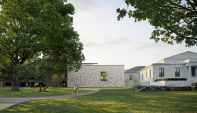
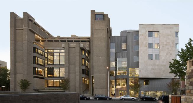
By the time Louis I. Kahn designed the Yale Center for British Art, the 69-year-old architect was already legendary. His priestly pronouncements (“What does a brick want to be?”), often delivered to his rapt students at the University of Pennsylvania, mystified his career, and virtually tattooed his late buildings with oracular certainty.
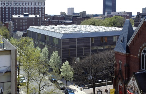
When the 114,000-square-foot museum was completed, posthumously, on Chapel and High Streets in 1976, an aura of wisdom surrounded the structure. Faced with pewter-colored, matte steel panels set in the gridded, four-story concrete-frame structure, the building was serene, a timeless classic of understatement. The façades, with their muted, patinated surfaces, deferred to the tall Gothic arches of the Old Yale Art Gallery (1928) on the opposite side of Chapel, and the building’s serenity spoke to Kahn’s own brick-walled Art Gallery, a quiet, considerate extension of the old museum, completed in 1953.
Richard Caspole
Center for British Art exterior
But Kahn’s design pointedly had nothing to say to the Art and Architecture (A & A) Building kitty corner, at Chapel and York, by Paul Rudolph. That cubic quarry of bush-hammered concrete was completed in 1963, and it was a Rubik’s cube of solid mass and spatial porosity. In the narrow corridors of architectural power at Yale, the two architects were adversaries, mid-century rivals, like Borromini and Bernini in the more grandiose arena of Rome centuries before.
Under the caring hand of New Haven architect George Knight, a Yale Architecture School graduate, the University has just completed a $33 million restoration of the Center for British Art. Its building systems were dated; the linen walls, tired; the honey-colored oak paneling, soiled or bleached; the perimeter wall panels, corroded and inadequately insulated. The three-stage restoration was started in 2008 and coordinated so that the museum was closed only from early 2015 until May 11, when it reopened.
Richard Caspole
The center's entrance court
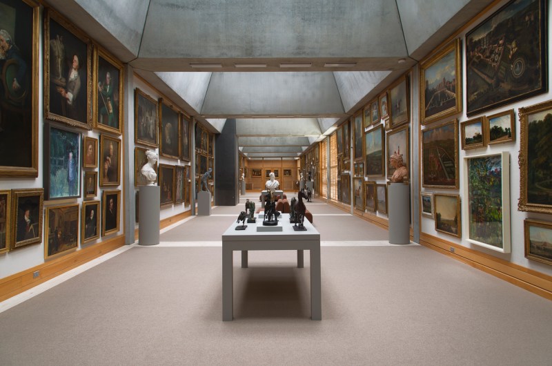
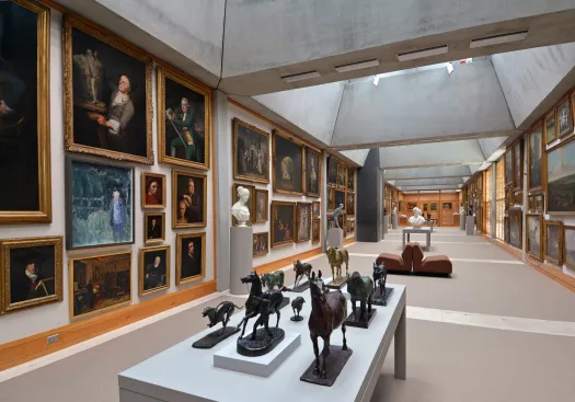
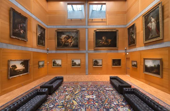
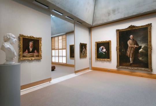
The restoration was thorough, meticulous, and sensitive. This is a building that thrives on tonal subtleties that, over the years, dulled with the simple passage of time. Knight has restored the glow and elegance: the oak paneling, floors, and trim have been refurbished or refinished, and the Belgian linen lining gallery walls, replaced. Perimeter walls were stripped to the steel panels, treated for corrosion, and re-insulated. Mechanical, electrical, fire and telecommunication systems were upgraded. Oak paneling in the library was extended, per original plans. The founders’ lounge was refurbished to standards that would make the center’s donor and patron, Paul Mellon, feel at home. The traverse walls that had been built in the fourth-floor Long Gallery were removed, and now 200 paintings, densely hung gallery-style, enjoy a 140-foot vista down the re-unified room, as originally intended.
Richard Caspole
The fourth-floor Long Gallery
Then there were the small surgical improvements, such as widening a door in the library so that flat files for prints and drawings can now be moved without being tilted. Knight rebuilt Kahn’s famous removable pogo panel walls for the galleries, with a reveal at the floor that allows space to flow through the gap beneath.
Strangely, some decisions were deferred. The track lighting, with adjustable but obtrusive fixtures, was left as is rather than being upgraded per current standards with more discreet miniaturized lights. Large plate-glass gallery windows were left unchanged, without protections from UV rays. (Protective film may be added in the future.) Meanwhile, curators use Kahn’s original sliding louvered shutters to protect the artworks from sunlight. (When Kahn’s Yale Art Gallery was restored several years ago, much attention was lavished on its window walls.)
Richard Caspole
The Library Court
That the building now looks new again invites an evaluation not only of the restoration but also of the museum itself—as if at its inauguration. Seeing it as new rather than untouchably historic lifts both the presumption of aesthetic beatitude and the onus of deference. In a time when culture wars have raged over the role, and limits, of architecture for displaying art, the restored Kahn building tells a morality tale.
The dirty little secret about Kahn’s serene museum is that it is filled with “Architecture,” little of it neutral and much of it passively aggressive. Kahn designed the building on a 20-foot grid, which he expressed consistently and even insistently. On the third floor galleries, with their low ceiling height, the cage of columns and beams that measure space so emphatically forms a pile-up of small, serial “rooms” that are all the more crowded because circular air ducts, “honestly” expressed like the structural grid, press on the spaces below. Discrete modular units define the space, as opposed to the open plan under a tetrahedral space frame ceiling Kahn had built in 1953 at the Yale University Art Gallery across the street. At the British Center, Kahn’s religiously expressed module gets the galleries into spatial trouble.
Richard Caspole
The Library Court
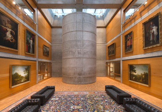
In the three-story Library Court at the core of the building, Kahn visualizes the grid on the paneled walls like a theme: paintings are regimented within the concrete grid, and many, including two monumentally large lion portraits— are hung atop the grids of paneling, which pass beneath. The concrete grid confines the paintings, and the paneling grid disturbs them: the paintings sit uneasily on the paneling.
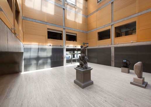
But perhaps the most unsettling parts of the design are the big planning moves in the basic parti. Kahn took as his given a rectangular prism built to the boundaries of the site, and he carved two-and-a-half volumes out of the volume: the corner entry, the four-story entry court, and the three-story Library Court in the middle of the building. Kahn placed the elevator core and its landing between the two interior courts, plus a monumental concrete cylinder housing the stairwell—a tumulus of space copied almost literally from the stairwell in his 1953 museum across the street.
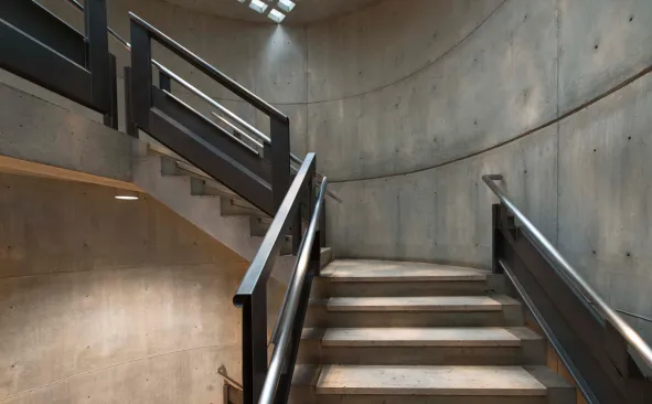
Richard Caspole
The center's circular stairs
The discomfiting result of the carved voids, the elevator core, and the cylindrical stairwell is that they marginalize the working parts of the museum—the galleries, libraries, and offices—and separate those parts from each other. Both the voids and the service core act as solids that keep the surrounding building from itself. Unlike the Guggenheim Museum in New York, where the atrium binds the galleries into a larger whole, Kahn’s atria, basically closed to the surrounding areas, divide the museum and do not bind spaces and the building into a clearly intelligible ensemble. The atria and service core act as opaque obstacles that diminish the museum’s spatial versatility, navigability, and cohesion. Of course Kahn believes in spatial stasis, but perhaps he achieved his goal too successfully.
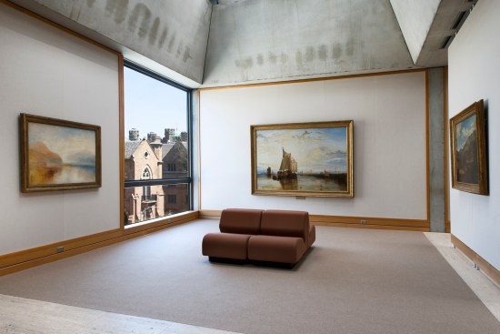
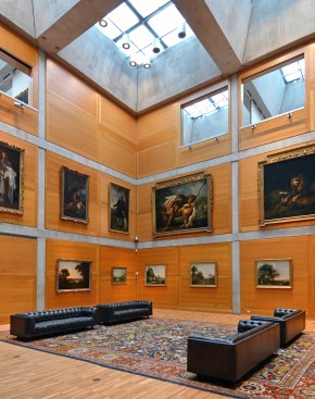
The grid, however, does pay off handsomely in the principal galleries on the top floor. Each of the 20-foot modules there forms coffered ceilings that rise inside angled, pyramidal walls up to filtered skylights. Kahn clearly believes in viewing art in natural light, though his geometries, including his striated section, do not permit bringing “heavenly” light from above to the lower galleries, where he depends instead on the large bay windows that necessitate sliding shuttered screens.
Richard Caspole
Turner Bay on the fourth floor
If Kahn’s expressive use of concrete and oak and the gridded geometry actually shape what could be called an un-neutral space—or, more charitably, a space of character—Kahn mitigates the effect by domesticating the spaces. Linen wall coverings, along with the paneling, recall great country houses. He further domesticates the building by orchestrating a mellow tonal quality throughout: the concrete is pale and smooth, cast in metal forms. He designs forgiveness into the geometry through his palette of materials and colors. The golden oak plays a major role in warming the spaces.
“You can’t get away from the architecture here, but you really don’t want to,” admits Scott Wilcox, the center’s deputy director for collections. The curatorial staff admires it so much that they have chosen to work with it rather than fight it.
Richard Caspole
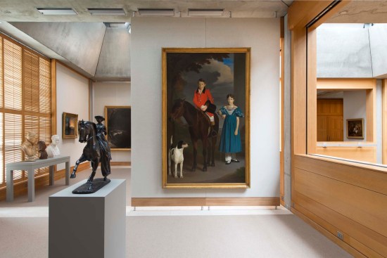
Fourth floor gallery
On returning to the center after its restoration, we discover that this priestly architect was mortal after all. It may be revisionist apostasy to even think it, but Kahn sinned. By today’s standards of museum design, his building runs interference with the art. He adopts a rigid geometric system and casts it with a strong materiality, and then he compensates with mitigating moves. Yet somehow Kahn was never accused of faulty ratios: too much architecture for the art.
Richard Caspole
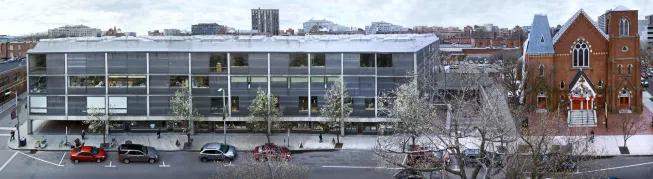
Panorama of the Center for British Art exterior
Peter Aaron/Esto
Paul Rudolph's A & A building (left)
It is revealing to see the British Center through the reciprocal gaze of Rudolph’s A & A Building across the street, and through the antagonistic relationship between the two masters. Kahn was building volumetrically stable buildings in noble materials that made a pitch for eternity. In his lectures, Kahn said that Rudolph’s fault was that he did not follow the “order of nature.” “Order” here is the telling word for an architect who clearly considered the freedoms of the A & A building “disordered.”
But if the A & A building is used as a standard to critique the Center for British Art, the comparison reveals that Kahn uses the grid to form boxes rather than to liberate space from the box. Kahn’s center suffers from an almost disciplinarian excess of order; paintings are over-controlled by the three-dimensional grid. Rudolph deliberately created spaces that open to each other horizontally, diagonally, and vertically, and they flow level to level, floor to floor. Kahn, a proponent of architectural gravitas and static rather than dynamic space, compartmentalizes spaces within his grid: the two atria are big boxes, and the gridded galleries on the second and third floors, especially when outfitted with the pogo panels, tend to closure because Kahn emphasizes the discreteness of each modular unit.
Richard Caspole
Fourth floor gallery
At a time when other architects have had their wrists slapped for over-exercised designs that upstage the art, Kahn somehow has gotten a pass. Critics then and now seem to have practiced a double standard, lauding the serene but geometrically and materially expressive Kahn building while criticizing other architects practicing ideologies that might seem inhospitable to art.
The point, however, is not that the British Center is an overrated design: the museum survives its architecture. Rather, the principles by which it was designed led Kahn to a museum with its own formal and spatial integrity.
Richard Caspole
The Library Court
Recognizing its committed aesthetic establishes a precedent for other architects to argue for other forms of character. Kahn clearly eschewed the cold abstraction of the white box in favor of concretizing ideas with material weight, rendered in soft tonalities. He dials up gentleness once he establishes stern ground rules. At the British Center, he built a strong example of non-neutrality that establishes a strategic precedent for other architects.
The trick is to design strong architecture that curators “don’t really want to get away from.” Kahn knew the trick: ingratiating surfaces.
To view more photos of the restoration, visit our project gallery.
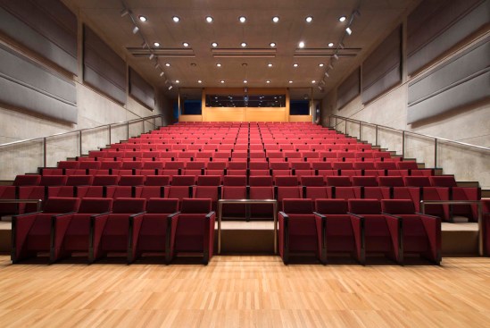
Richard Caspole
Lecture hall