Is the plan still the generator? For generations, architects have used Le Corbusier’s phrase to base their designs on an apportionment of spaces that looks good on paper. How much of that beauty came from the graphic balance on a sheet and how much from how those notations represent a harmonious relation and sequence of spaces is always a subject open to debate. Nowadays, however, architectural beauty is something we associate more with the fluidity of form allowed by technology or the articulation of elements in a way that highlights what remains of the discipline’s craft. Computer skills allow us to think and visualize our spaces fully in three dimensions, so is the way the plan looks and works still relevant?
I thought about this dilemma as I was teaching first-year graduate students in a design studio I am co-directing with Chicago architect Brad Lynch at the School of Architecture at Taliesin this summer. After two semesters, most of them are proficient at the basic computer programs and are beginning to figure out how to put buildings together—at least on (virtual) paper. As I gave desk crits, I found myself not only helping them discover the ways in which they could do something better, but also focusing on how they could shape their plans so that they were more attractive and logical in and of themselves—“sexy” was the word I found myself using.
Part of our shared effort was to avoid mistakes that might be minor, but irritating or even dangerous in real life: bathrooms that opened directly into lobbies, cores that left unusable slivers of spaces on one level as the students sought to align them from floor to floor, oddly proportioned rooms, corridors that were small enough to create traffic jams, and, above all else, spaces that had only one means of egress—or none at all.
OLYMPUS DIGITAL CAMERA
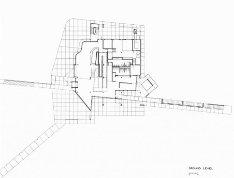
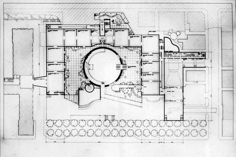
Richard Meier & Partners Architects
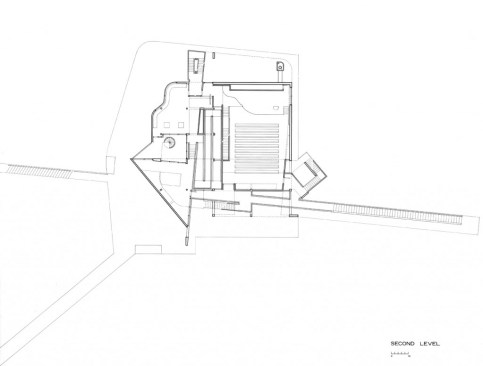
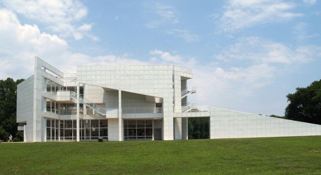
Richard Meier & Partners Architects
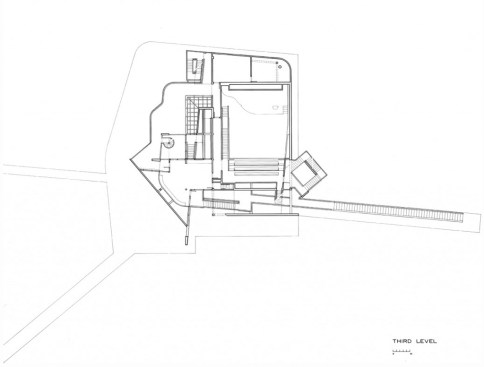
Richard Meier & Partners Architects
Beyond such repair work, I found myself asking them to massage their plans so that they had an elegance that I realized was based on my own training. Because of the nature of their brief—a “maker space” inside a large volume that is also intended to contain an arts magnet school and an afterschool program—I was sending them to look at Richard Meier, FAIA’s early buildings whose play between structure, space, and circulation elements had always delighted me. For the more adventuresome students, there were the “upside-down axonometrics” that James Stirling used in his three German museum designs of the 1970s. And always, of course, there were the sequences of spaces Frank Lloyd Wright laid out, those in which we were sitting as we spoke—I do teach at Taliesin, after all—and that lead us every day from light to dark to light again, turning us along the way, narrowing around us, opening up, and making us aware of where we are and where we are going.
SANAA
I did not send the students to look at much contemporary work. That is not because I am one of those people who believe that everything was better once, but because the making of such beautiful plans seems to be less of a concern to designers today. In some cases, as in the work of the Japanese firm SANAA, the use of deliberately “bad” or banal plans seems to be the point: At the New Museum in New York, the elevator opens directly into the major exhibition spaces and the circulation is a fire stairs tucked behind that vertical shaft. In the work of architects who delight in the freedom that computational innovation delivers, the shaping of space happens in three dimensions to such a complex degree that it is almost impossible to represent in plan—such as in UNStudio’s Arnhem train station in the Netherlands.
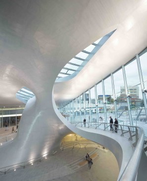
©Ronald Tilleman
11/18/2015: Transfer Hall of the newly opened Arnhem Central Station
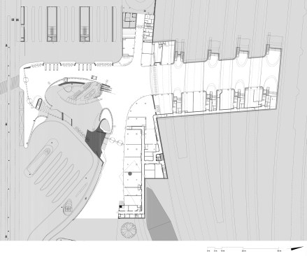
UNStudio
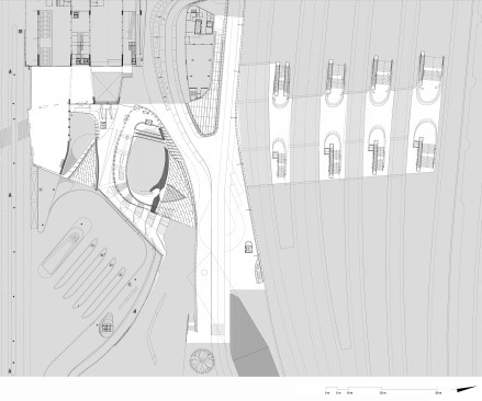
UNStudio
For younger practitioners, plans seem to be so irrelevant that they rarely publish them, preferring to show us renderings that are so realistic that you find yourself wondering whether you are looking at a promise or a real building. It is the effect, which itself can be an evanescent image, that matters, not how you move through or even use the spaces.
Both the best students I have taught in the last few years and the best young practitioners I know still make good plans—ones that work and are sexy—but they do them almost as a matter of fact while concentrating on more three-dimensional or visual heroics. The plan is just too abstract and static to matter.
That abstraction is a fundamental problem. If the plan generates anything, it does so as a starting point, a foundation that has to be good, but that does not yet guarantee a functional and attractive sequence of spaces or a coherent building. When architects fixate too much on plans, they often create designs that delight only their own tribe who see the skill and appreciate the tricks the architect has built into the rhythm of black lines on white paper. The plan is the ultimate nerd’s tool, and, in a way, it is good that students have moved beyond its lack of dimensions.
For all that, I still love that sexy plan. It promises me that I will be delighted and amazed as I move through a future building’s spaces, even if I have to ignore bad detailing or its other faults. It promises me that I will be able to find my way to the bathroom and understand how the building fits together as I rush there. And it promises me that I will be able to get out of the structure when I need to. To paraphrase Daniel Burnham, I still believe that you should make no bad plans, they have no power to move men’s minds.