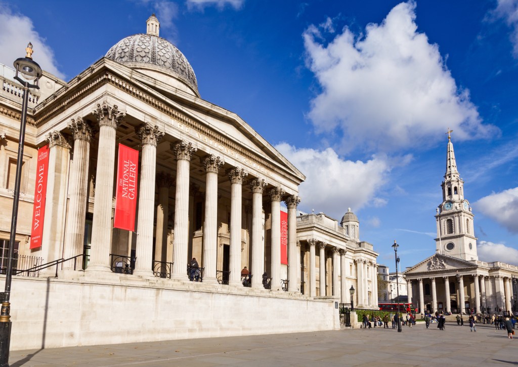
Once again, Annabelle Selldorf, FAIA, and the legacy of Venturi, Scott Brown and Associates are facing off. After the Selldorf Architects principal buried VSBA’s quirky and not particularly effective additions to the Museum of Contemporary Art San Diego in a blandly functional addition that opened a few years ago, the battle has now moved to a much larger site: VSBA’s 1986-to-1991 addition to the England’s National Gallery, right in the middle of London. There Selldorf is proposing opening up the Sainsbury Wing, as it now called, to let it function as the gallery’s main entrance, while also adding increased visitor service spaces, a member’s room, and a study center. In this case, it seems to me, Selldorf probably should win but, given the immense opposition to the project, probably will not.
The proposed renovations resurrect the battle over the appropriate style for a building at the center of cultural and geographic import that helped bring upon the victory of Postmodernism. The timing is especially apt or perhaps ironic. The construction of the Sainsbury Wing turned into a national and even international debate by then-Prince Charles; now, as that self-appointed arbiter of good architecture is about to be crowned king, we are all wondering if the King will continue his activism against Modernist architecture in his new position.
This is relevant because the former Prince of Wales proclaimed the original proposal by British firm Ahrends, Burton and Koralek—the winner of an invite-only competition for the addition in 1981—a “monstrous carbuncle on the face of a much-loved and elegant friend.” There is no escape from such eloquent damnation by an heir apparent; the pronouncement was both the death knell for the proposal (it was denied planning permission three years later) and the launch of a revivalist onslaught that soon swept over London and the rest of the world.
The proposed renovations resurrect the battle over the appropriate style for a building at the center of cultural and geographic import that helped bring upon the victory of Postmodernism.
Some of us back then thought that the result of the competition was indeed unfortunate, but for another reason. The simpler, more forthrightly modern proposals by Richard Rogers, Hon. FAIA, seemed much more logical and confident. In any case, the National Gallery threw the whole process out, started again, and in 1986 hired VSBA, which won the job by showing sketches of a Neoclassical architecture that mimicked the William Wilkins-designed original building’s parade of Corinthian columns on the outside and highly shaped, skylit galleries on the inside.
Little did the National Gallery’s trustees know—though they could have, with a little research—that VSBA was constitutionally unable to do much more than gesture at such references. Instead, the firm used the semiotics of style to advertise allegiance to a certain tradition, and then carried its buildings out with functional straightforwardness that usually meant there was little spatial substance to the illusion.
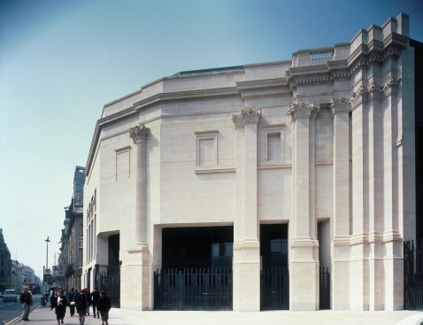
© The National Gallery, London
Exterior of the Sainsbury Wing
So it was in the case of what, after one of those grand donations that help large projects such as this turn into reality, became the Sainsbury Wing—named for the donors, a family that owns one of the largest supermarket chains in the U.K. The building is a rectangular box with wholly undesigned sides and back that peel off into an awkward curve where the structure faces Trafalgar Square and the 1838 Wilkins edifice. A stuttering row of something between columns and pasted-on imitations thereof festoon that façade on top of a base that tries to reach the imposing heights of the original building, but only serves to unbalance the whole composition. Framed in green-painted metal, a second façade of dark glass oozes from behind that codpiece, perhaps evoking the mediocre office buildings then being built nearby. A few cut-out arches and gates complete the confusion between Modernism and Neoclassicism.
On the inside, a low and dark lobby area again tries to compete with its grand parent building through a few thin stone paste-ons meant to evoke a rusticated base. A staircase quickly detracts you from this dismal space to lead you—in forced perspective, to alleviate the pain—past the dark-tinted glass to the main floor. If you are not willing or able to make that ascension, an elevator is tucked away in an obscure corner.
After an awkward turn at the top of the stair, you then get the big pay-off: a series of beautifully proportioned, tall, and skylit rooms. Here the VSBA tics, such as Doric columns floating in wedges of white-painted walls and a few other abstracted fragments of a Greek temple strewn around the rooms, can’t distract from the grandeur of the spaces. It is a wonderful place to see the Renaissance art that hangs there, although the organization of this floor into three parallel lines of galleries without a clear beginning, end, or center, makes it also just as confusing as the National Gallery’s main buildings—products of a century of other additions carried out with less controversy than the Sainsbury Wing. Perhaps VSBA was paying tribute to these mediocrities as well.
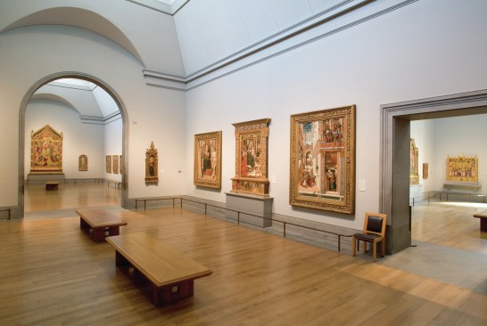
© National Gallery, London
Inside the Sainsbury Wing
The problems with the Sainsbury Wing have been exacerbated over the years because the National Gallery has chosen to turn it into the main entrance. That unwelcome lobby at the edge of the property turned out to be the only place the institution could accommodate the crowds that have become central to (and have overwhelmed) this and most older art museums. The main entrance is just too cramped and difficult to reach, never mind that entering through the side door starts you off apart from any chronological sequence as you march through the centuries’ worth of treasures the National Gallery holds.
The Selldorf renovation seeks to make that main-entrance-by-default at least more pleasant by hacking away at the VSBA ceiling, opening up some of the walls, adding more circulation, and generally cleaning up the extraneous elements, such as decorative bands and steel gates with elaborately decorative grates. The same goes for the façade, where some of the allusive detail , especially around the base, will make room for an abstraction that, although equally overwhelming, at least will not be silly and distracting.
The problem is that the Sainsbury Wing is “Grade 1 listed,” per British law: This late 20th-century attempt to add to and evoke a 19th-century translation of temple architecture into public monument is itself a protected piece of architecture. Whether the National Gallery will receive permission to circumvent these regulations is highly doubtful, especially with English Heritage and other groups already standing in objection and critics such as the venerable Hugh Pearman screaming their disapproval from the many platforms they have at their disposal.
It is hard to believe some of the objections. Pearman claims, for instance, that the “crypt-like character of the entrance floor with its fat columns and its coffered ceiling were inspired by the architectural characteristics contemporary with the works in the Renaissance galleries on the top floor.” I would love to walk through those galleries with Mr. Pearman and ask him to explain that relationship to me. “The whole experience of moving through the spaces,” he goes on to say, “was very carefully considered.” He seems to believe that the whole design, including its dark and cramped spaces, difficult routing, and Neoclassical confetti, should be preserved. I am at a loss to understand why, given the less than stellar qualities of that design.
There is a kind of virtue to the Sainsbury Wing, however, and that is exactly its awkward collage of spaces and gestures. Referring to the stutter step of columns on the façade, one student in the reuse and renovation class I teach at Virginia Tech commented: “It looks like a glitch in the Matrix.” “I like it exactly because it is so weird,” said another.
Whether such tenuous qualities are enough to resist the renovation is doubtful. I do agree with Pearman that the National Gallery should find a way to excavate and renovate the main gallery so that you can enter there, perhaps in the manner of the massive work Frank Gehry, FAIA, is directing at the Philadelphia Museum of Art. That, however, would be not only more complicated, but also probably considerably more expensive than the renovations to the Sainsbury Wing.
What Selldorf is proposing strikes a good balance between preserving what is decent about the Sainsbury Wing and making it a more pleasant and inviting place to use. It will provide needed amenities and solve some aspects of the National Gallery’s awful circulation problems. That it will do so at the expense of what is one of the most awkward and badly designed extensions of Neoclassical architecture is, for me, not a dealbreaker. We should learn not just from our achievements, but also our mistakes—and dare to do something about them, as I believe Selldorf is here.
The views and conclusions from this author are not necessarily those of ARCHITECT magazine or of The American Institute of Architects.
Read more: The latest from columnist Aaron Betsky includes rethinking habitation on the island of Capri, a new arts- and crafts-focused school in Colombia, and a review of a book on postnatural architecture and landscapes.