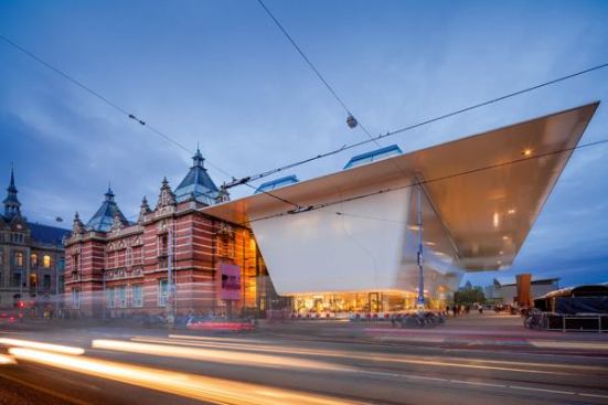
Many Americans don’t know the Stedelijk (Municipal) Museum Amsterdam, that city’s museum of modern and contemporary art, but they should. The 19th-century structure kitty-corner from the more well-known Rijksmuseum (home of all those Rembrandts) contains a spectacular collection of 19th- and 20th-century art and for a while was a showcase for some of the best new contemporary work being produced. Decades of mismanagement have ruined that latter function, while the same short-sightedness has left the Malevichs and Mondrians languishing with little public attention. The latest insult is a chaotic and dysfunctional—not to mention expensive—installation that Rem Koolhaas, Hon. FAIA, and his research band, AMO, have helped the outgoing director of the museum, Beatrix Ruf, foist on the public.
Why care about a mere exhibition design in a faraway country? (Granted, it is a country where I grew up and a museum that I had visited often and with great pleasure.) Because it shows the hubris of architects who think that they are something they are not—whether that be graphic designers, artists (Richard Meier, FAIA’s collages come to mind), furniture designers (Koolhaas’ own bizarre efforts for Knoll), or exhibition designers. The failure in this case is especially surprising because Koolhaas has always understood the need to collaborate and has in fact helped support and launch the careers of superb and talented specialist in various fields, ranging from Joep van Lieshout to Petra Blaisse, Bruce Mau, and, more recently, Iwan Baan.
Gert Jan van Rooij/Courtesy Stedelijk Museum Amsterdam
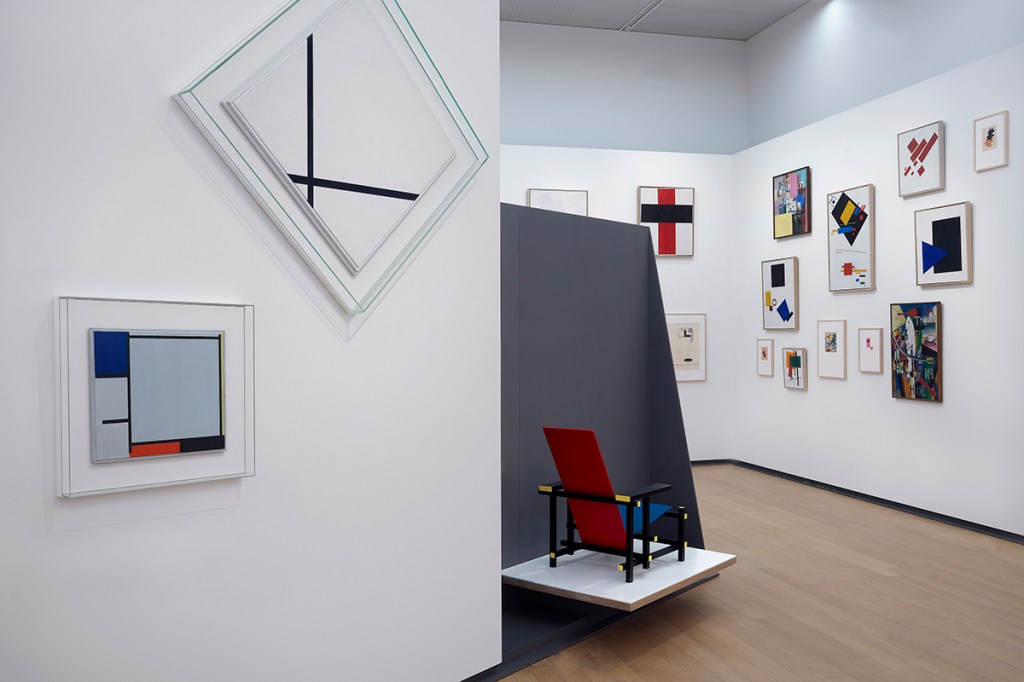
What Ruf (apparently fired for such minor missteps as buying a collection she had helped build as a paid consultant for the museum she ran. Oops!) and Koolhaas decided was to take the permanent collection out of the 19th-century galleries that five years ago had been fixed up to perfection by the Amsterdam-based firm Benthem Crouwel Architects and place the works in the new addition, also designed by Benthem Crouwel. This in itself was, I believe, a bizarre choice. Benthem Crouwel had crafted the new addition specifically to house temporary exhibitions, creating two large, flexible, and quite serviceable spaces below and above a new entrance lobby, shop, and café. The permanent collection was then able to re-inhabit the galleries for which it was largely collected, and where most of the paintings and objects looked glorious in the original building’s stately progression of skylit renovated spaces.
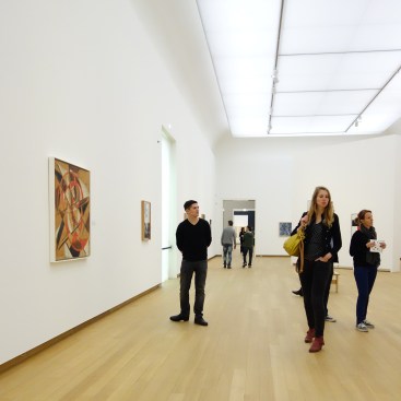
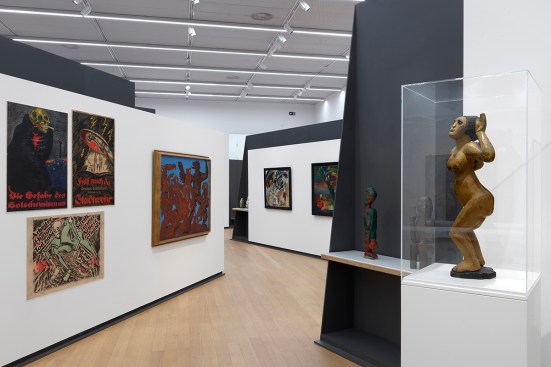
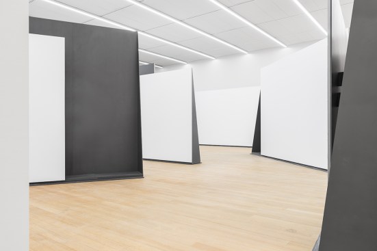
Those halls now look empty as they host the fatuous forms of the Borgmann Collection that Ruf bought for the museum. The temporary halls, meanwhile, had to be retrofitted to accept the collection—at a cost of well over $3 million. What Koolhaas and his crew concocted for the first half of the exhibition is an array of leaning metal panels scattered across the almost 12,000-square-foot expanse of the basement gallery. Called “BASE” (clever, no?), it presents the viewer with a labyrinth that is meant to offer many different paths through history (the second half of the display is in the upper-floor gallery, which is less “designed,” and thus considerably more reasonable).
© Jannes Linders
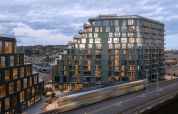
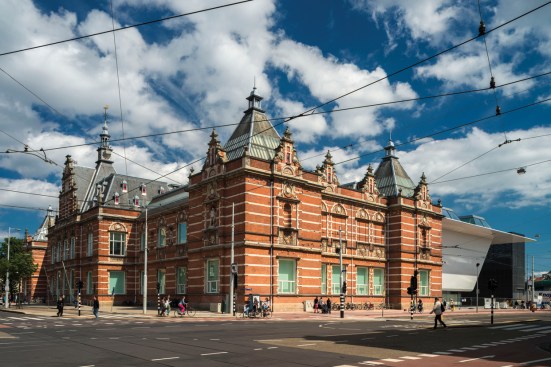
Stedelijk Museum, Amsterdam, by Benthem Crouwel Architekten.
What you get in the basement level is pure chaos. The curators and installers have jammed so many objects together that you can’t properly see those Malevichs through the Mondrians and vice versa. I tried to take in giant set pieces, such as a two-panel Clyfford Still painting, and could not get far enough away from it to see its outlines, especially as the edges were obscured by people trying to look at other canvases hanging just inches away from it. Sometimes I felt like I needed blinders just to look at one piece. It made me think that Ruf, pressured to reinstall old stuff she didn’t really like, said: “Well, if they want their conservative garbage, I will just heap it up for them.”
Delfino Sisto Legnani and Marco Cappelletti/Courtesy OMA
Koolhaas claims innovation not only in the overall exhibition layout, but also in the design of those walls. These are super thin and had to be specially formulated at the Netherlands’ one remaining steel mill. A video at the exhibition opening tells you not about the art, but about what an amazing achievement this was. (I hope Tata Steel gave them a discount for that one.) Unfortunately, these Serra-esque plates were then painted gray and mostly hidden behind white panels. All you see of them is a few edges and the unseemly struts that hold up the thin—but, I assume, very heavy—planes. You can’t see real steel, the dividers work less elegantly than old-fashioned wood- or metal-stud framed walls would, and they cannot be moved. The advantage is … ?
With BASE, Koolhaas and Ruf have done all of art and architecture a signal disservice. They have shown an example of self-proclaimed experts failing to honor and take forward a great tradition of exhibitions while squandering money and making it impossible for all of us to enjoy beautiful art. It is moves like this that give contemporary art history and architecture a bad name.
See more images of AMO’s Stedelijk BASE installation and read a description from the firm here.