
The United States is embarking on something it has never seriously attempted before: treating itself like a designed system.
At the center of that effort is a newly formed National Design Studio, led by U.S. Chief Design Officer Joe Gebbia, the Airbnb co-founder, and now joined by Peter Arnell as the nation’s first-ever Chief Brand Architect.
Arnell arrives with more than four decades of experience shaping and overhauling global brands across industries ranging from technology and automotive to fashion and consumer products, as well as public and nonprofit institutions such as the Special Olympics and the FDNY Foundation.
In his new role, he is tasked with defining and unifying how the United States expresses itself—bringing identity, systems, and user experience into a single, coherent framework intended to strengthen public trust while sharpening the country’s global image and competitiveness.
He will oversee the strategic and creative development of a unified national design and brand system, with the goal of ensuring that every interaction with government is clear, consistent, and designed with the American public in mind.
The ambition is sweeping—nothing less than rethinking how the federal government looks, communicates, and functions across more than 27,000 websites and countless citizen touchpoints.
But behind the rhetoric of “design excellence” is a more pointed thesis: that the failure of government is often not political—it is experiential.
From Six Months to Six Minutes

Airbnb cofounder, Joe Gebbia, is the U.S. Chief Design Office. Photo Courtesy of Samara.
Gebbia’s entry into government did not begin with ideology so much as with a broken workflow that had gone unchallenged for decades.
“When I was asking myself the same question… in April of 2025,” he said during a Wall Street Journal Future of Everything Summit panel, “I entered the government for a six month stint to fix a very broken process for federal employees when they go to retire.”
The system, he explained, was still paper-based, riddled with errors, and capable of dragging on for half a year, with something as minor as a missing signature forcing applicants to restart the process entirely. In a matter of months, however, a small team was able to bring the entire workflow online, collapsing what had been a six-month ordeal into what, in some cases, became a six-minute transaction.
That result—achieved quickly and with relatively modest resources—sparked a broader realization inside Washington that the problem was not confined to one agency, but embedded across the entire federal apparatus.
The Lobby vs. the Website
Gebbia’s central argument is both intuitive and quietly radical: the government has failed to recognize where it actually exists in the lives of citizens.
“At a certain point in history, people used to access the government by walking into buildings,” he said. “The lobbies of those buildings are beautifully designed… The reality is that the way people access the government is through a website.”
In that sense, the digital interface has replaced the civic lobby, yet without inheriting its architectural ambition or symbolic weight. If government buildings once communicated authority, clarity, and permanence through design, their digital counterparts have done the opposite—fragmenting the experience into confusion, redundancy, and frustration.
“So why wouldn’t we give websites the same investment, character, design and intention?” Gebbia asked, reframing the problem as one of misplaced priorities rather than technological limitation.
“Do Your Eyes Bleed?”
If Gebbia articulates the system, Arnell delivers the blunt critique.
When asked directly about government websites, “Do Your Eyes Bleed?”
Arnell responded with a single word: “Yes.”
Yet he is careful to distinguish the project from a conventional rebrand. “The United States of America is the greatest brand in the world,” he said, suggesting that the issue is not identity but expression. What is needed, in his view, is “a consistency, unified look and feel and experience,” one that can begin to rebuild trust through coherence rather than reinvention.
This is branding not as marketing veneer, but as infrastructure—a system that aligns communication, usability, and perception into a single, legible experience.
The UX of Trust
At the core of the initiative is a concept that rarely appears in policy discussions: trust as a function of user experience.
Gebbia illustrates this not through abstraction but through friction, describing how a routine task on a government website could require as many as 87 clicks before his team reduced it to 12, with further optimizations expected. The significance of that improvement, he argues, extends beyond efficiency, shaping how citizens perceive their relationship to the state.
“The first is time back,” he said, emphasizing the tangible recovery of hours otherwise lost to bureaucratic navigation. “The second thing is… dignity back,” a reference to the frustration and helplessness users often feel when systems fail them. “And the third thing is… pride,” suggesting that a well-designed interface can restore confidence in public institutions.
These are not traditional performance metrics, but experiential outcomes, borrowed from the logic of consumer technology and applied to governance.
The Airbnb Logic Applied to the State
The intellectual framework underpinning the initiative is unmistakably rooted in Silicon Valley, particularly in the ethos that defined Airbnb’s early success.
“We just made this easy, delightful, secure, safe, trustworthy,” Gebbia said, recalling how the company simplified what had once been a cumbersome and anxiety-ridden process. The implication is that government, despite its complexity, can be approached with the same clarity of intent.
Even seemingly minor barriers, he argues, can have outsized consequences. He described speaking with a designer who had postponed changing her last name after marriage simply because she anticipated the difficulty of navigating government systems.
“She goes, ‘I just know it’s going to be so painful to do that on government websites,’” he recalled, pointing to what he described as “one of the darkest UX patterns you can think of”—a system so intimidating that it discourages engagement altogether.
Designing at National Scale
If the philosophy is clear, the scale remains daunting.
“There’s 27,000 websites,” Arnell noted, underscoring the enormity of the task ahead. The challenge is not simply to redesign individual interfaces, but to impose coherence across a sprawling and decentralized ecosystem.
The proposed solution involves establishing a unified national brand architecture, standardizing user experience across agencies, modernizing access to federal services, and integrating emerging technologies such as AI-driven interfaces. Early prototypes suggest a shift away from traditional navigation toward conversational systems, in which users articulate their needs and the platform assembles responses in real time.
“You tell the website what you need,” Gebbia said, describing a model that reverses the burden of discovery, placing it on the system rather than the user.
Bureaucracy vs. Build Culture
Perhaps the most unexpected element of the initiative is the degree of institutional alignment it appears to have achieved.
“There’s a spirit of building right now in DC like never before,” Gebbia said, suggesting that agencies, cabinet officials, and the White House are, at least in this moment, aligned around the need for transformation. The proposition is straightforward: if given the opportunity to operate at the level of a best-in-class consumer application, most agencies would embrace it.
Whether that alignment can be sustained through the realities of implementation remains an open question, but it marks a departure from the inertia that has historically defined government modernization efforts.
Beyond Aesthetics
For Arnell, the stakes extend beyond usability into the realm of culture and identity.
“Branding normally tries to sell things,” he said. “In this case… we’re trying to have people live in something.”
It is a formulation that positions design not as surface, but as environment—an immersive system that shapes how citizens experience their relationship to the state.
The Risk—and the Bet
The initiative arrives at a moment when trust in institutions is fragile and often contested. The idea that design—through clarity, usability, and coherence—could play a meaningful role in rebuilding that trust may seem ambitious, if not improbable.
Yet it also reframes the problem in terms that architects and designers understand intuitively: that the systems people inhabit, whether physical or digital, shape their behavior, expectations, and sense of agency.
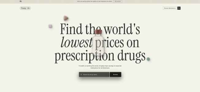
TrumpRx.gov is a website designed under the direction of Jeo Gebbia and the National Design Studio.
If the effort succeeds, it will not simply result in better websites, but in a redefinition of what government feels like in everyday life. If it fails, it may reinforce a more sobering conclusion—that even the most thoughtful design cannot overcome the structural complexities of the systems it seeks to improve.