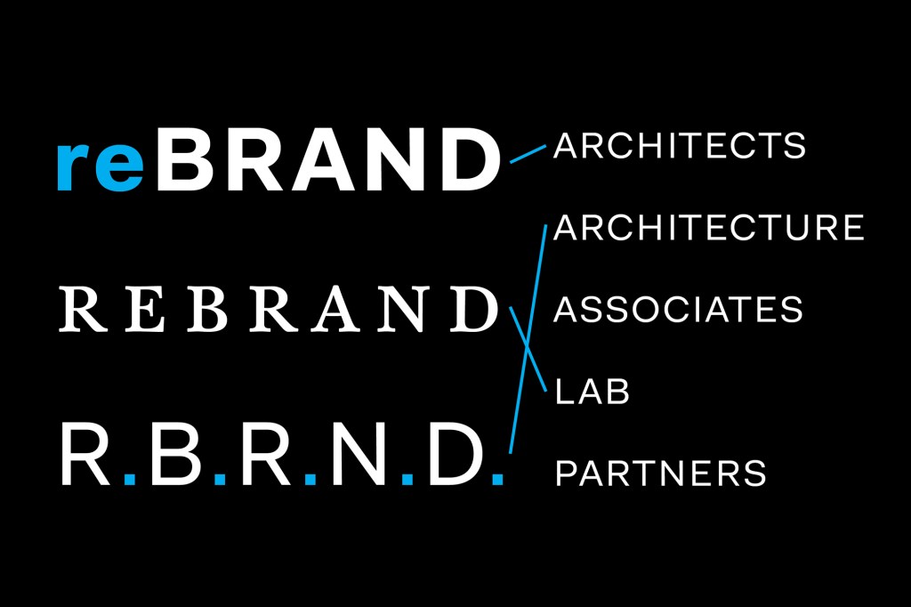
From tweaking the tone of your firm’s marketing materials to changing its name and logo, rebranding can clarify your studio’s messaging and ultimately win you more business. Below, brand strategists and architects offer advice for those interested in reappraising their identity and value proposition.
Consider Your Goals
For New York–based FXCollaborative—founded as Fox & Fowle Architects in 1978 and known more recently as FXFowle—the decision to rebrand started more than two years ago when the partners and principals began re-examining the firm’s mission, says managing partner Guy Geier, FAIA. After agreeing to shift the practice away from recognizing a single individual, firm leaders consulted with branding agency The Seventh Art to understand clients’ and consultants’ perceptions of the firm, and to assess the key components of the existing name.
A branding exercise revealed that “FX” was the memorable hook for clients and consultants speaking of the firm. The group decided to keep that part of the name, but sought to combine it with a term to describe the practice’s working style. A word cloud generated from expressed client perceptions coalesced around the word “collaborative,” understood as both a noun and an adjective. With the resulting name FXCollaborative, the firm was pleased to touch its history while also distinguishing itself from the saturated New York market. “We examined the names of many other firms and we were the only firm of our peer group that had a name that talked about our work style and culture,” Geier says. “Everyone else had last names or sets of initials.”
For international firm Page, the decision to shorten its name from Page Southerland Page in 2013 reflected both an internal restructuring to an employee stock ownership model and a desire to highlight the firm’s ambitions. “If we had just made a business change without rebranding, people would have been a little more reticent to alter the roles they had been playing,” says senior principal Larry Speck, FAIA. “[The rebrand] opened possibilities from an internal operational perspective, greatly enlarged our identity, and increased the knowledge clients have of us.”
More Than a Name
A rebrand also can include a new communication style guide, mission statement, color palette, and even a new headquarters. “Think of a rebrand as a reset,” says John Gass, brand strategist in Gensler’s Chicago office. “You’re leaving whatever equity you had behind. That’s a risky and emotional proposition.”
When California’s Williams + Paddon hired branding agency Wow in 2010 to assist with a full-scale rebrand, it altered virtually every aspect of the company except the name. The addition of a three-word tagline—“Involve, Connect, Delight”—signaled to potential clients and employees “who we are and the work we do,” says principal Naaz Alihkan.
Then, earlier this year, in an effort to attract new clients and candidates for staff roles, the firm refreshed its look again, working with Wow to update its website with a softer, less stridently orange color palette, add quirky staff bios, and incorporate a more prominent social media presence. “Our website was kind of old school,” says principal Terry Green, AIA. “In the last eight years or so, architecture websites have begun to present differently. People want a window into your culture and the way you think.”
Engage Your Team
Before a firm considers how to express a new verbal and visual identity, the staff needs to “get their story straight,” Gass says. Employee participation and consultation with a third-party branding and design consultancy can help leadership summon the support of key internal ambassadors and reduce the possibility of a mixed message.
Page turned to consultant Herman Dyal, FAIA—who has since joined Page as a principal and creative director—as well as a small committee of senior principals and members of its internal branding team to help with the refresh. Together, they amended every element of the firm’s visual identity, including its website, email and presentation templates, and print collateral—letterhead, business cards, and formatting for internal documents.
The result is “not too corporate, not too buttoned up,” Speck says, and the changes have streamlined project pursuits, thereby saving time and improving the firm’s brand recognition.
And, in the end, the little things matter. At Williams + Paddon, bespoke business cards introduced during the latest branding refresh have become a way to win business and make employees feel valued, Green says. For example, Green’s card features his name handwritten in Mandarin characters, which appeals to Chinese clients. In fact, all new hires at Williams + Paddon handwrite their signatures on the backs of their business cards. “It’s really helped with onboarding,” Green says. “It’s something people can relate to and it brings out our more personal side.”