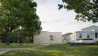
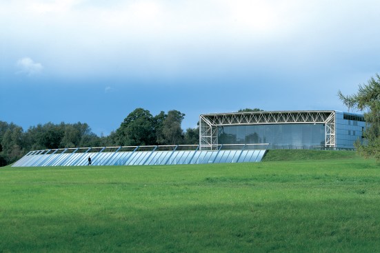
Most readers will be familiar with the Sainsbury Wing, Robert Venturi, FAIA, and Denise Scott Brown, Hon. FAIA’s postmodern addition to the National Gallery in London. But there is an earlier Sainsbury museum, the Sainsbury Centre for Visual Arts, named for a different branch of the same family. The building is located in the southeast corner of England and is part of the University of East Anglia, a campus planned and designed by Sir Denys Lasdun in the 1960s. Lasdun’s Brutalist megastructure, all heavy massing and exposed concrete, appears dated and somewhat forlorn, while the Sainsbury Centre, which was designed by Sir Norman Foster, Hon. FAIA, only a dozen years later, still manages to look visionary. In the opinion of many, including this author, it remains one of the architect’s best works.
The Sainsbury Centre is notable in another respect. Over the years, Foster has been called back to expand, refurbish, and reorganize the building. This is rare in the museum world. Major museums are usually designed by established practitioners, and by the time more space is required, three or more decades have passed and the original architect is retired or deceased. Such was the case with Frank Lloyd Wright’s Guggenheim, Marcel Breuer’s Whitney, and Louis Kahn’s Kimbell. Alternatively, the original architect may be passed over—the result of a new director, an opinionated donor, or just “let’s try someone different.” This happened to Venturi and Scott Brown with the Seattle Art Museum, Richard Meier, FAIA, with the High Museum of Art, and Mario Botta, Hon. FAIA, with the San Francisco Museum of Modern Art. The Sainsbury Centre falls into neither of these categories. Foster was young when he designed it, and his client was steadfast.
In 2011, I wrote a book about the Sainsbury Centre. It was titled The Biography of a Building (Thames and Hudson), but it was equally a biography of the architect, since the center represents a built chronicle of Foster’s evolution as a designer. Two years ago, the architect was called back to refurbish the building once again, adding another chapter to his four-decades-long involvement.
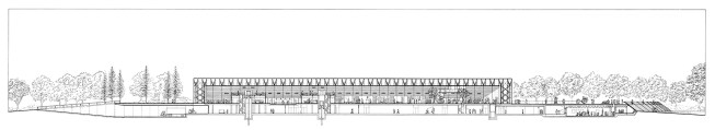
Section of the Sainsbury Centre (2006)
Foster + Partners
An architect’s biography is a crowded place, peopled by coworkers, consultants, contractors, and not least, clients. The driving force behind the Sainsbury Centre was an unusual pair of collectors, Sir Robert and Lady Sainsbury, better known to the London art world as Bob and Lisa. Bob started collecting art early; he bought his first Henry Moore sculpture in 1932 when he was only 26. He worked in the family business, and with his brother Alan expanded a group of grocery stores established by their grandfather into a nationwide supermarket chain. But Bob was not simply a successful businessman amassing cultural trophies; he sought out—and befriended—unknown artists such as Moore, Alberto Giacometti, and Francis Bacon. His and Lisa’s collection was unorthodox: In addition to contemporary art it included what was then called primitive art from Polynesia and the Orient, as well as Asian, European, and pre-Columbian antiquities. The common thread was depictions of the human figure.
In the early 1970s, when Bob Sainsbury retired, he and his wife decided to donate their valuable collection—more than 400 objects—to an educational institution. They chose the University of East Anglia, with whose vice-chancellor, Frank Thistlethwaite, they had struck up a friendship. They also provided the money for a new building to house the collection. The canny Sainsburys set strict terms on the gift: They reserved the right to approve the building’s architect, as well as its design. They selected Foster.
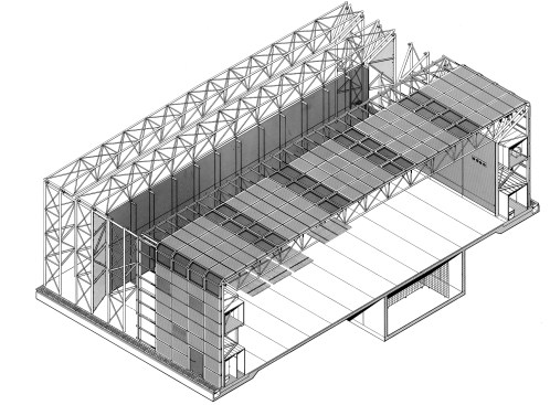
Foster + Partners
Axonometric of Sainsbury Centre (1977)
It was an unexpected choice: The 38-year-old architect had never designed a public building, let alone a museum; in fact his fledgling firm, barely six years old, was known chiefly for utilitarian, albeit elegant, industrial buildings. It was the striking reflective façade of a small office building on the London docks for Fred Olsen Lines, a shipping company, that caught Bob Sainsbury’s eye. “I decided that the man who designed that building was the man for me,” he later recalled.
Sainsbury wanted his collection to be integrated with the life of the university, so he and Thistlethwaite concocted a potpourri program that included not only an art gallery but also a new home for the university’s fine arts department, an art history library, a senior common room (faculty club), and, because the university did not have college dining halls, a student cafeteria.
The conventional solution would have been to situate the different functions in a cluster of buildings. Instead, Foster Associates—Foster’s architect-wife, Wendy, was an active partner (she died in 1989)—combined the disparate uses within a single space. While the firm was known for its technical expertise, the chief rationale for this non-hierarchical arrangement was not technical but social—that is, a desire to foster human interaction. Another consideration was adaptability, a theme that would emerge in later Foster buildings such as the Hongkong and Shanghai Bank headquarters in Hong Kong and Stansted Airport in England.

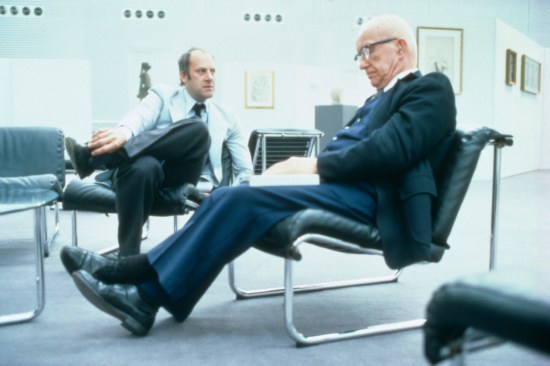
Norman Foster
Sketch made during the design of the Sainsbury Centre
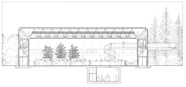
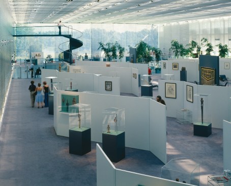
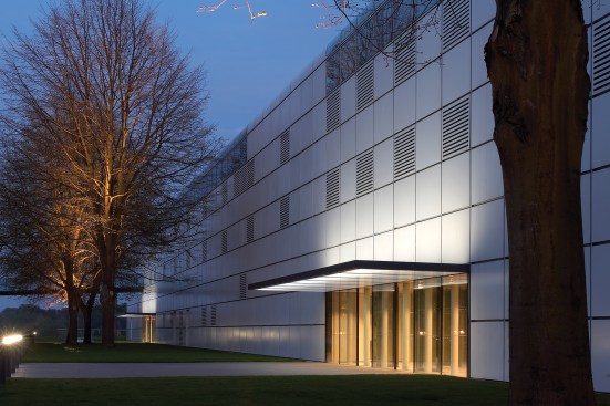
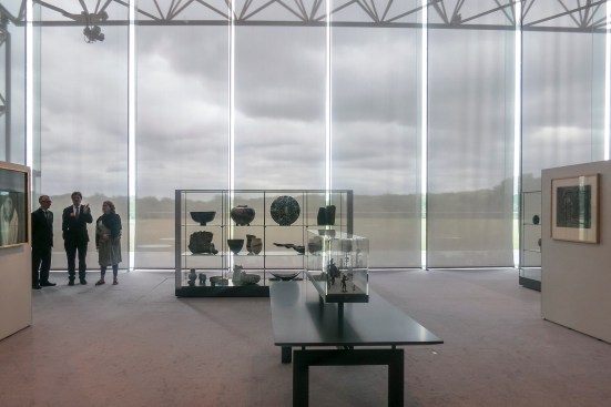
The Sainsbury Centre, a vast column-free space, 500 feet long, spanned by portal frames, resembles an aircraft hangar. The lightweight steel structure was the work of engineer Tony Hunt; Birkin Haward, Loren Butt, and a young Ian Ritchie, Hon. FAIA, were also members of Foster’s team. Skylights illuminate the interior, the light modulated by movable louvers; lighting and exhibits were the responsibility of two American consultants, Claude R. Engle and George Sexton, respectively. The art is displayed in cases and hung on freestanding, movable panels. Easy chairs and low tables are scattered among the artworks creating a relaxed, almost domestic atmosphere. Although sometimes described as “high tech,” Foster’s design had little in common with the contemporaneous and rather theatrical Centre Pompidou, designed by his ex-partner Sir Richard Rogers, Hon. FAIA, with Renzo Piano, Hon. FAIA—Foster concealed rather than dramatized the structure and mechanical services. Nor did the Sainsbury Centre share the Pompidou’s high construction cost; it was a no-frills building, almost Calvinist in its unpretentious simplicity.
Ken Kirkwood
Norman Foster and Buckminster Fuller in the Sainsbury Centre, 1978
The Sainsbury Centre was completed in 1978, shortly before the curvy glass Willis Faber & Dumas headquarters in Ipswich, England. These two acclaimed projects, which put Foster on the architectural map, were the work of a young idealist, ambitious, adventurous, pushing the boundaries of building construction. He was interested in designers such as Charles Eames and Buckminster Fuller. All this set him apart from his contemporaries. The late 1970s was the heyday of architectural Postmodernism, exemplified by the work of Venturi and Michael Graves, but Foster was uninterested in historic references and traditional symbolism—he was a technology man. Foster associate Richard Horden put it this way in a 1984 Blueprint interview. “I think we [architects] are all like mountaineers. Michael Graves is the kind of chap who goes all the way up alone with a walking stick. We use crampons, pitons, and oxygen … and we go up higher.”
Ken Kirkwood
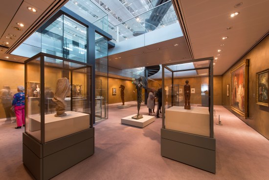
Gallery space in original center (1980)
Nigel Young / Foster + Partners
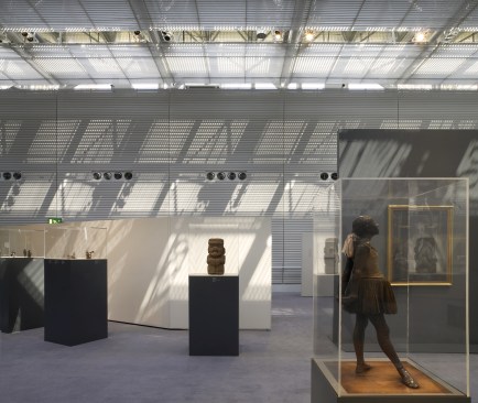
Gallery detail with "The Dancer" by Edgar Degas
But even well-equipped climbers have mishaps. The prefabricated insulated panels that covered the walls and roof of the Sainsbury Centre were made of superplastic aluminum, a material previously used only in aircraft construction. Seven years after the building opened, this innovative solution developed problems. It remains unclear who was to blame, but the outcome was that the entire skin had to be replaced with more conventional aluminum panels. Bob Sainsbury, a supportive patron who called the building “the gem of my collection,” stepped forward to cover the cost, and the original corrugated silver panels were replaced by a sleek white skin.
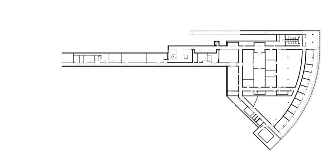
During the following decade, Foster was called back to enlarge the center. There was a need for more exhibition space and an open reserve, as well as back-of-the-house functions such as a conservation lab, workshops, art storage, and office space. Although it would have been easy to simply extend the linear design, the Sainsburys, who as before were active participants in the design process, didn’t want any visible alterations to the original building. The large extension, whose footprint was two-thirds that of the original building, was underground, its grass-covered roof interrupted by a sweeping arc of glass where the building emerged from the slope.
The architecture of what became known as the Crescent Wing was a departure from the original building, less rectilinear and more organic. Graham Phillips, who led the Foster team, told me, “We reasoned that it could be different, plainer, and more sculptural, more minimalist, and more about space.” The shift signaled an evolution in Foster’s architectural thinking. In the intervening decade he had built two important museums, the Maison Carré in Nîmes, France, and the Sackler Galleries at the Royal Academy of Art in London. The latter, a remodeling of a Victorian building, showed a different Foster, not just a technological maven but a stylish minimalist. Interestingly, it would be the restrained minimalism of the Sackler and the Crescent Wing, rather than the structural high jinks of the Hongkong Bank, that would come to characterize Foster’s later work. At the same time, he continued to push boundaries: The glazed arc of the Crescent Wing is a very early example of fritted glass.
Nigel Young / Foster + Partners
Crescent Wing
Foster + Partners
Crescent Wing drawing
When the Sainsbury Centre first opened, Sir Peter Cook of Archigram fame speculated in Architectural Review about the future of the building: “A strong object can take the addition of crap, high jinks, or inconsequentiality on the inside, without the destruction of the idea or the atmosphere,” he wrote approvingly. In fact, Foster’s brand of immaculate precision is easily undermined by even a small amount of “crap”—a dented panel, a rust stain, a piece of worn carpet. In 2003, David Sainsbury, who had chaired the family firm and was a cabinet minister in the Labour government, commissioned a study that found the 25-year-old building required refurbishing. David felt a responsibility to safeguard the legacy of his father, Bob, who had died in 2000, and he insisted that Foster oversee the work. The interior was stripped bare. Mechanical systems were improved, high-performance glazing was installed in the skylights, exhibition lighting was upgraded. Foster, who had dealt with historic buildings such as the Reichstag in Berlin and the British Museum in London, treated the refit as an exercise in preservation: the same Eames-designed chairs in the cafeteria, new but almost identical exhibition panels in the art gallery, the same patterned carpeting. The glass canopies added to the two entrances were a concession to practicality.
Nigel Young / Foster + Partners
Entrances with retrofitted canopies
The refurbishment of the building also included new classrooms and studios for an expanded educational program, a relocated and enlarged museum shop, and a public underground link to the Crescent Wing. The last required excavating a section of the main floor of the existing building. Foster’s style had become, if anything, even more stripped down, and also—paradoxically—more upmarket. David Sainsbury’s charitable foundation funded the refit and alterations, which took almost two years, and, adjusted for inflation, represented three-quarters of the cost of the original building.
Nigel Young / Foster + Partners
The museum shop before the 2013 renovation
Nigel Young / Foster + Partners
The museum shop after the 2013 renovation, when it was converted into exhibition space
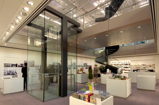
George Sexton continued to consult on the exhibition design and lighting. “Bob and Lisa knew exactly what they wanted; now our client was the university,” he told me. “Inevitably, there were different visions and agendas.” In 2013, following the arrival of a new director, the center saw another round of changes. Under Foster’s supervision, the museum shop was relocated yet again, the open storage was moved to the main building, and galleries for special exhibits were consolidated in the Crescent Wing. As part of the reorganization, a large mezzanine that had previously been occupied by the senior common room (which had long-since closed down) was converted into a gallery for visiting exhibitions. Since lenders require highly controlled lighting conditions, floor-to-ceiling scrim-like screens were installed across the full width of the building. The screens, which the museum staff refers to as “shower curtains,” seem to me an insensitive intrusion that visually interrupts the open interior.
Nigel Young / Foster + Partners
The east end of the gallery after the 2013 renovation
I ask Spencer de Grey, Foster + Partners’ head of design, about the curtains, which were not designed by the architects. “I haven’t seen them,” he says, “but they are only temporary, as far as I know.” He seems reluctant to comment, and steers the conversation back to other changes. “Swapping the galleries has located the Sainsbury collection together upstairs, which is nice,” he tells me. “It has also made a huge difference to the way the center can operate, since it gives the opportunity for hosting major international exhibitions.” De Grey mentions the recent “Francis Bacon and the Masters” show, organized with the State Hermitage Museum in St. Petersburg, Russia. He makes the point that the recent alterations didn’t require massive physical changes, but rather a redefinition of how spaces are used. The flexible Sainsbury Centre has adapted to these changes. “A building is a living thing; it shouldn’t remain static,” he says. “I think it’s important that architects can revisit their buildings, otherwise you can lose the original ethos.”
In 1974, when Norman Foster was being considered for the Sainsbury job, one of his references was Sir Hugh Casson, the dean of British architects at that time. “[Foster] is a man of great energy, drive, and enthusiasm,” Casson wrote to Thistlethwaite, “with enough granite beneath the charm to ensure consistency in any project to which he lays his hand.” That consistency is evident in the various stages of the Sainsbury Centre. While Foster Associates grew from a small practice—about two dozen at the time of the East Anglia building—to an international operation with a staff of 1,500, and its architectural vocabulary became more refined, the ethos persisted, a curious combination of Calvinism and technological legerdemain. The result is a unique museum: delicate Tang-dynasty figurines and implacable Francis Bacons, side by side in a numinous aircraft hangar.