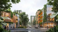
For Rand Elliott, every building starts with the light—the quality of the light, its feel, color, and directionality. An Oklahoma City–based architect, he considers light a universal question for his practice that is as vital to his designs as any “big idea.” While it would seem obvious that light, both natural and electric, would be a critical part of the museums and residences in his portfolio, what makes Elliott’s work remarkable is the care and sensibility he brings to even the most everyday typologies: parking lots, office buildings, gas stations, and more.
“An architect reaches a point of maturity when you can begin to think about the results of lighting, form, and the idea of bringing joy,” he explains. “The question of light is so big and infinite in its capabilities that I will never run out of inspiration just chasing the light for the rest of my life.”
Courtesy Elliott + Associates
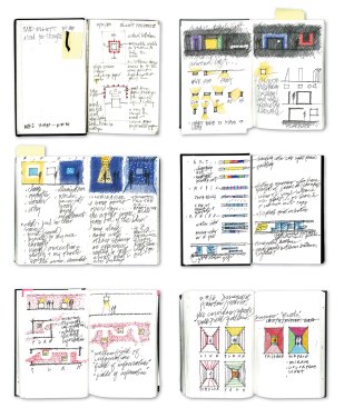
Sketchbooks, 1977 to present Sketching is an integral part of Rand Elliott's design process. Over the course of his 40-year career, he has produced more than 10,000 sketchbook pages, a visual record of his daily design observations.
With some 40 years in practice (he started his firm, Elliott + Associates Architects, at age 27), Elliott approaches his work with the confidence of an artist or dancer. Every day, the muscle memory of his profession—the skills of observation, documentation, and detailing—leads him to his sketchbook, where he jots down concepts, experiences, and research alongside abstract squiggly lines and what he self-deprecatingly calls “ugly drawings.” He also uses his sketchbooks to write poetry, or “word paintings.” Those texts are his way of trying to describe a building before it happens, to establish an attitude toward structure and program, but also sketch out what is possible and, importantly, to ask “Where’s the light coming from?”
Each mark in his sketchbook is an act of practice and ritual. “With my early sketchbooks, I would spend two years on a single one and I would labor over them and be intimidated by them,” Elliott says. “But within the last year or so, I finished one in 92 days—210 pages filled to the absolute brim.” He’s accepting of a wide range of ideas, from the shape of a crack in the sidewalk to the daylight that spills across the rough floorboards of his own 1920s-era house.
Scott McDonald © Hedrich Blessing
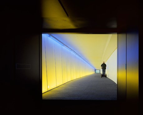
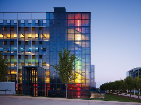
Underground, Oklahoma City, 2008This project—the recipient of the 2008 AL Light & Architecture Design Awards Best Use of Color—is a three-quarter-mile tunnel system that connects 16 blocks and more than 30 buildings in downtown Oklahoma City. Color is the navigational element.
Yet decades earlier, Elliott’s career could have taken a different turn, one that would have veered away from light and place and into the competitive world of New York City architecture. He tells a story of a time in the early 1980s when his young Oklahoma City practice was hit hard by the economic realities of the oil bust. The downturn sent him to New York to pursue other opportunities, including an interview with Philip Johnson. The famously dapper and bespectacled architect sat across from him in a Ludwig Mies van der Rohe Brno chair and offered him a job. Elliott turned him down. He recalls saying, “Mr. Johnson, you’ve fulfilled a dream. I can’t thank you enough. I have decided to go back to Oklahoma City.”
Scott McDonald © Hedrich Blessing
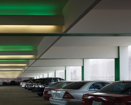
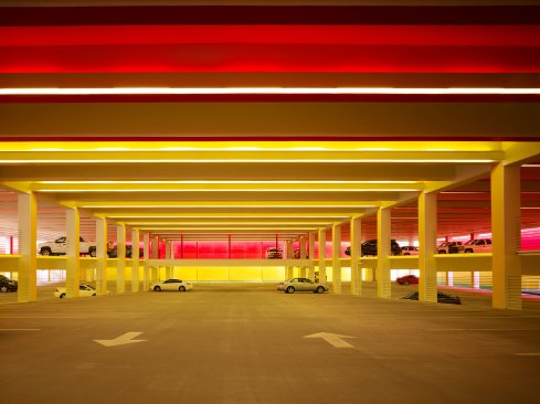
Car Park Three, Chesapeake Energy Corporation, Oklahoma City, 2013As the company's headquarters in Oklahoma City, has grown, Elliott has played with color in myriad ways: as a wayfinding device, as a spatial organizer, and as a sensory experience. The result is a unique architectural color-blocking vocabulary.
Instead of joining forces with one of the most powerful architects in the country, the young architect decided to root himself in the landscape and the people of Oklahoma. Not long after, he found himself at a Chickasaw tribe pow wow—his wife, Janette, was at the time, writing about the Chickasaw population in Oklahoma. And it was there, in the middle of nowhere, with the dark lit by a bonfire the size of a building and the bodies dancing around him, that he felt truly connected to the spirit of the place.
“There was an appreciation of the spirit of the land, the great starry skies, the wonderful sunsets, the hailstorms, the tornadoes, all of the weather events; and so I decided that I would use those as the beginnings of my inspiration,” Elliott says. “I think that the importance and appreciation for light, appreciation of place, begins right under your feet.”
Scott McDonald © Hedrich Blessing
Car Park Three, Chesapeake Energy Corporation, Oklahoma City, 2013, in the background. The company's childcare center, built in 2011, is in the foreground.
Or where you park your car. Elliott’s firm has worked for the Chesapeake Energy Corp. for nearly three decades, designing dozens of projects for them. It’s the car parks, however, that stand out as a pure expression of Elliott’s guiding philosophy. Each one features wayfinding lighting in a rainbow of primary colors with each floor dedicated to a single hue: red, yellow, green, blue, or white.
Scott McDonald © Hedrich Blessing
Car Park Two, Chesapeake Energy Corporation, Oklahoma City, 2008
The success of these projects could be quantified in the awards they’ve garnered. The nearly 300,000-square-foot Car Park Two took home an AL Light & Architecture Design Award in 2009 for Outstanding Achievement in the Whole Building category, among others, (at the time, the project was referred to as Car Park One; the campus plan has since been updated and buildings renamed) and the 383,250-square-foot Car Park One from 2011 reaped multiple honors from the American Institute of Architects. But perhaps the greatest success is how Elliott’s designs defy the stereotype of parking structures as dark and scary places; instead, they are beacons for Chesapeake employees, who in the winter arrive and leave work while it’s still dark. Safety and wayfinding are primary issues. His hope is that arriving is a positive and uplifting experience. “[It’s] like a friend saying, ‘Good morning,’ ” he jokes. He spins a long, illustrative tale about the importance of place, color, and light. It ends with a killer punch line: “Sir, I drive a yellow car, I park on the yellow level. That’s all there is to it.”
Scott McDonald © Hedrich Blessing
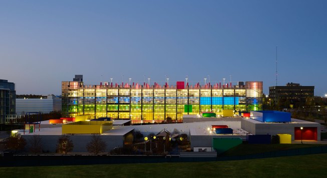
Chesapeake Central Park, Chesapeake Energy Corporation, Oklahoma City, 2012At the main entrance, a two-story central ramp and the color wayfinding system begins to unfold. The entire perimeter is an open atrium and allows sunlight to move in and out of the space. The changing shadows animate the room. A grass playing field sits atop the underground facility.
Technically, every garage follows a similar pattern: Fluorescent T8 3500K lamps, sheathed in colored polyester gels, line the air circulation atrium and stairwells of the poured-in-place concrete structures so that each parking level is bathed in a saturated hue. T8s were chosen for their easy maintenance and the gels, made for the theater industry, are relatively inexpensive. The color temperature was chosen because it is neutral enough to not taint the gel hues to a warm value. Elliott notes that over time LED retrofits may replace the fluorescents for efficiency. “I’m not interested in the fixture itself. I’m interested in hiding the source,” he says, stressing that he sees lighting not as decoration, but as part of a holistic concept, an atmosphere.
Scott McDonald © Hedrich Blessing
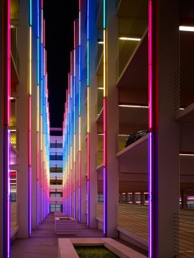
Car Park Three, Chesapeake Energy Corporation, Oklahoma City, 2013An air circulation atrium serves as a central walkway. Fluorescent T8 3500K lamps covered in theatrical colored gels, create an artistic experience.
In speaking with Elliott, it becomes clear that a central question in his work is about the translation of architecture across different physical states. If artists and architects use light to dematerialize how we comprehend buildings, Elliott also works in the opposite direction. In a series of projects for ImageNet Consulting, he uses design and light effects to illustrate things we can’t necessarily see: technology, electricity, data, and more.
Robert Shimer © Hedrich Blessing
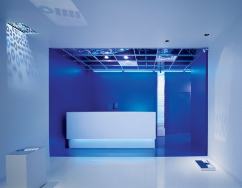
ImageNet, Dallas, 2004 In the reception area for one of ImageNet's first locations, a simple color palette of blue and white provides spatial clarity and reinforces the project's binary code theme, which is further highlighted by a supergraphic projection of “ones” and “zeros” on the side wall.
Elliott began working with ImageNet president Tom Russell some 30 years ago. Since then, the company has gone from selling copy machines to being a full information-technology provider for small businesses and large corporations. The role that technology plays in our lives has changed as well: It has become essential, but nearly invisible. In various projects in Texas, Elliott has used saturated color or translucent panels to try to create spaces where ImageNet employees can explain to clients the need for different technological solutions. The challenge is conveying something as abstract as “the cloud” through something as concrete as architecture.
Scott McDonald/Gray City Studios
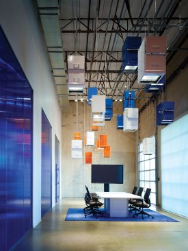
ImageNet, Carrollton, Texas, 2015 For one of ImageNet's recent offices, the architects used the company's corporate colors—blue and orange—to create distinct spaces, such as the cafe. The main conference room features a whimsical design element: a lighting installation made from repurposed filing cabinets suspended from the ceiling.
For the 2015 remodel of the company’s warehouse and showroom in Carrollton, Texas, Elliott and team decided to “dumpster dive.” To represent the company’s ethos of environmental responsibility and waste reduction, they created artful partitions made out of the trash of our digital age. One wall is composed entirely of recycled toner cartridges (recycling a single cartridge saves 3.6 pounds of solid waste). In the café, an entire wall is an assemblage of formed foam packing materials salvaged from photocopier packaging, and the whole room is painted a deep orange. In the training room, a suspended ceiling of recycled toner cartridges hang below the side-mounted T8-lamped strip fixtures and aluminum bubble wrap lines the walls, creating both texture and reflection.
Scott McDonald/Gray City Studios
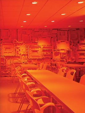
ImageNet, Carrollton, Texas, 2015 The cafe is washed in saturated orange-colored light to create a distinct environment.
But it’s the building’s lobby and conference room where the architect dares to answer that tricky question about the cloud. Used filing cabinets dangle from the ceiling—chunky blue, silver, white, and orange objects that have lost their value in the new paperless era. Each file cabinet is transformed into a pendant lamp. The design team outfitted each one with an inexpensive LED fixture (a generic lamp socket from Home Depot outfitted with an LED spot), creating little pools of light on the floor. “The whole point is to help Tom’s customers understand technology’s ones and zeros,” Elliott says.
Scott McDonald © Hedrich Blessing
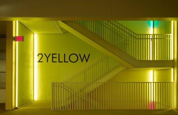
Chesapeake Car Park One, Oklahoma City, 2011The second parking level is designated with the color yellow.
While he cites architects Le Corbusier and Louis Kahn (two masters of sculpting natural light) as major influences on his work, savvy viewers may see in the colored fluorescent tubes references to the artworks of Dan Flavin and Robert Irwin, who also are well know for using gels over T8s in their perceptual installations. That’s no coincidence. Elliott has long looked to the members of the Light and Space movement as he explores how illumination can deepen even the most mundane experiences, like the daily chore of parking your car or talking about digital file storage.
“The value of the Light and Space artists is above and beyond the work itself,” he says. “James Turrell’s light works are … ephemeral. They’re taking you to a place that you’ve never imagined before. I think that’s really what architecture should do, it’s what art should do: Elevate our lives to a point where there’s a realization that we’re human.” •
Scott McDonald © Hedrich Blessing
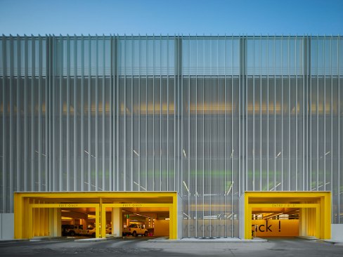
Car Park Four, Chesapeake Energy Corporation, Oklahoma City, 2015An architectural veil stretches over structural concrete and is punctuated by yellow entry portals.
Scott McDonald © Hedrich Blessing
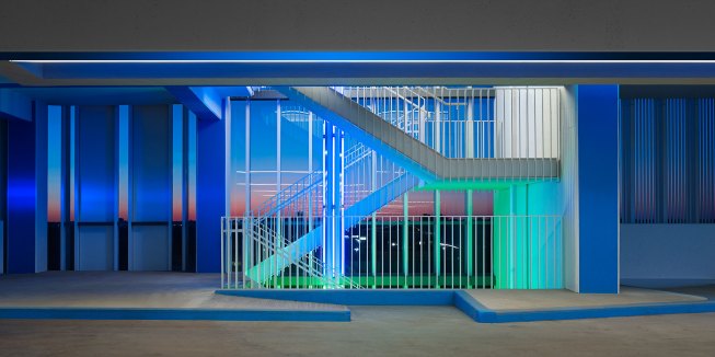
Car Park Four, Chesapeake Energy Corporation, Oklahoma City, 2015One of four stairways within the building. Colored light identifies the floor level beginning at the stair and continues into the parking level. The exterior glass provides a wind break.
This article originally appeared on the 2017 Sept/Oct issue of Architectural Lighting under the title, “Everyday Ephemerality.”